Introduction
This tutorial will quickly get you up and running with Tk 8.6 from Rust. It provides all the essentials about core Tk concepts, the various widgets, layout, events and more that you need for your application.
It's not a reference guide. It's not going to cover everything, just the essentials you need in 95% of applications. The rest you can find in reference documentation.
Tk has, for most of its lifetime, gotten a bad rap, to put it mildly. Some of this has been well deserved, most of it not so much. Like any GUI tool, it can be used to create absolutely terrible looking and outdated user interfaces. Still, with the proper care and attention, it can also be used to develop spectacularly good ones. Most people know about the crappy ones; most of the good ones people don't even know are done in Tk. In this tutorial, we're going to focus on what you need to build good user interfaces.
Installing Tk
Before using the tk crate, you have to install the native Tk distribution on your machine. Check your OS and pick the correspoding chapter to go on.
The Obligatory First Program
To make sure that everything actually did work, let's try to run a "Hello World" program in Tk.
// cargo run --example the_obligatory_first_program

use tk::*;
use tk::cmd::*;

fn main() -> TkResult<()> {
    let tk = make_tk!()?;
    let root = tk.root();
    root.add_label( -text("hello,world!") )?.pack(())?;
    Ok( main_loop() )
}
Installing Tk On Windows
On Windows, the easiest way to get Tcl/Tk onto your machine is to install the "ActiveTcl" distribution from ActiveState. In your web browser, go to activestate, and follow along the links to download the Community Edition of ActiveTcl for Windows. Make sure you're downloading an 8.6.x version. Note that you will need to create an account with ActiveState (no cost) to download it.
Run the installer, and follow along. You'll end up with a fresh install of
ActiveTcl, usually located in C:\ActiveTcl. From a command prompt, you should
then be able to run a Tcl/Tk 8.6 shell via:
% C:\ActiveTcl\bin\wish
This should pop up a small window titled "wish", which will contain your application. A second, larger window titled "Console" is where you can type in Tcl/Tk commands. To verify the exact version of Tcl/Tk that you are running, type the following:
% info patchlevel
We want this to be returning something like '8.6.9'.
Type "exit" in the console window to exit. You may also want to add
C:\ActiveTcl\bin to your PATH environment variable.
Note: verified install using ActiveTcl 8.6.9.8609-2 on Windows 10.
Installing Tk On Linux
Pretty much all Linux distributions have Tcl/Tk packages available via their
package managers, e.g., apt. Usually there are a variety of packages, providing
libraries, command-line tools, development options if you're building
extensions, and many more. On Ubuntu and many other distributions,
apt install tk8.6 should be enough.
By the way, you need to install pkg-config to compile the tcl/tk crates.
Installing Tk On FreeBSD
Tcl 8.6/Tk 8.6 are available both in ports tree and package repository. To
install Tk 8.6 by downloading binaries from repository, just run
pkg install -y tk86 in the shell. To install from source, run
make -C /usr/ports/x11-toolkits/tk86 install.
By the way, you need to install pkg-config to compile the tcl/tk crates.
A First (Real) Example
With that out of the way, let's try a slightly more substantial example, which will give you an initial feel for what the code behind a real Tk program looks like.
Design
We'll create a simple GUI tool to convert a distance in feet to the equivalent distance in meters. If we were to sketch this out, it might look something like this:
| A sketch of our feet to meters conversion program |
|---|
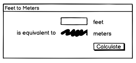 |
So it looks like we have a short text entry widget that will let us type in the number of feet. A "Calculate" button will get the value out of that entry, perform the calculation, and put the result in a label below the entry. We've also got three static labels ("feet," "is equivalent to," and "meters"), which help our user figure out how to work the application.
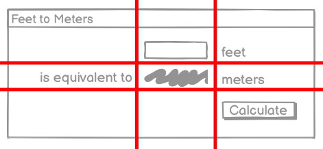
The next thing we need to do is look at the layout. The widgets that we've included seem to be naturally divided into a grid with three columns and three rows. In terms of layout, things seem to naturally divide into three columns and three rows, as illustrated below:
| The layout of our user interface, which follows a 3 x 3 grid |
|---|
 |
Code
// cargo run --example a_first_real_example

use tcl::*;
use tk::*;
use tk::cmd::*;

fn main() -> TkResult<()> {
    let tk = make_tk!()?;
    let root = tk.root();
    root.set_wm_title( "Feet to Meters" )?;

    let c = root.add_ttk_frame( "c" -padding(( 3,3,12,12 )))?
        .grid( -column(0) -row(0) -sticky("nwes") )?;

    root.grid_columnconfigure( 0, -weight(1) )?;
    root.grid_rowconfigure( 0, -weight(1) )?;

    let feet = c.add_ttk_entry( "feet" -width(7) -textvariable("feet") )?
        .grid( -column(2) -row(1) -sticky("we") )?;

    c.add_ttk_label( "meters" -textvariable("meters") )?
        .grid( -column(2) -row(2) -sticky("we") )?;

    c.add_ttk_button( "calc" -text("Calculate") -command("calculate") )?
        .grid( -column(3) -row(3) -sticky("w") )?;

    c.add_ttk_label( "flbl" -text("feet") )?
        .grid( -column(3) -row(1) -sticky("w") )?;

    c.add_ttk_label( "islbl" -text("is equivalent to") )?
        .grid( -column(1) -row(2) -sticky("e") )?;

    c.add_ttk_label( "mlbl" -text("meters") )?
        .grid( -column(3) -row(2) -sticky("w") )?;

    c.winfo_children()?
        .iter()
        .try_for_each( |child| child.grid_configure( -padx(5) -pady(5) ))?;

    feet.focus()?;

    #[proc]
    fn calculate() -> TkResult<()> {
        let interp = tcl_interp!();
        let feet = interp.get_double("feet");
        match feet {
            Ok( feet ) => {
                let meters = f64::floor( feet * 0.3048 * 10000.0 ) / 10000.0;
                interp.set_double( "meters", meters )
            },
            Err( _ ) => interp.set( "meters", "" ),
        };
        Ok(())
    }

    // it's safe because `fn calculate()` is tagged with `#[proc]`.
    unsafe{ tk.def_proc( "calculate", calculate ); }

    root.bind_more( event::key_press( TkKey::Return ), "calculate" )?;

    Ok( main_loop() )
}
Tk Concepts
With your first example behind you, you now have a basic idea of what a Tk program looks like and the type of code you need to write to make it work. In this chapter, we'll step back and look at three broad concepts that you need to know to understand Tk: widgets, geometry management, and event handling.
Widgets
Widgets are all the things that you see onscreen. In our example, we had a button, an entry, a few labels, and a frame. Others are things like checkboxes, tree views, scrollbars, text areas, and so on. Widgets are often referred to as "controls." You'll also sometimes see them referred to as "windows," particularly in Tk's documentation. This is a holdover from its X11 roots (under that terminology, both your toplevel application window and things like a button would be called windows).
Here is an example showing some of Tk's widgets, which we'll cover individually shortly.
| Several Tk Widgets |
|---|
 |
Widget Classes
Widgets are objects, instances of classes that represent buttons, frames, and so on. When you want to create a widget, the first thing you'll need to do is identify the specific class of the widget you'd like to instantiate. This tutorial and the widget roundup will help with that.
Widget Hierarchy
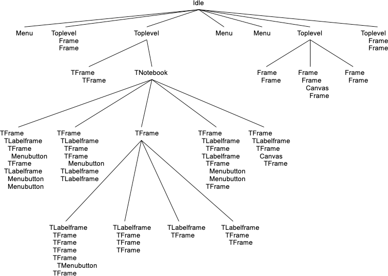
Besides the widget class, you'll need one other piece of information to create it: its parent. Widgets don't float off in space. Instead, they're contained within something else, like a window. In Tk, all widgets are part of a widget (or window) hierarchy, with a single root at the top of the hierarchy.
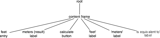
In our metric conversion example, we had a single frame that was created as a child of the root window, and that frame had all the other controls as children. The root window was a container for the frame and was, therefore, the frame's parent. The complete hierarchy for the example looked like this:
| The widget hierarchy of the metric conversion example |
|---|
 |
This hierarchy can be arbitrarily deep, so you might have a button in a frame in another frame within the root window. Even a new window in your application (often called a toplevel) is part of that same hierarchy. That window and all its contents form a subtree of the overall widget hierarchy.
| Hierarchy of a more substantial application. Leaf nodes (buttons, labels, etc.) omitted |
|---|
 |
Creating Widgets, Step By Step
Each separate widget is a Rust struct instance. When instantiating a widget, you
must call corresponding .add_xxx() method of its parent. Each widget is either
given an explicit pathname, or assigned an auto-generated one, which both
differentiates it from other widgets, and also indicates its place in the window
hierarchy.
The root of the hierarchy, the toplevel widget that Tk automatically creates, is named simply . (dot) and will contain everything else. That is automatically created when you instantiate Tk. It does not have a parent. For example:
// cargo run --example creating_widgets_step_by_step

use tk::*;
use tk::cmd::*;

fn main() -> TkResult<()> {
    let tk = make_tk!()?;
    let root = tk.root();
    let content = root
        .add_frame(())? // auto-generated name
        .pack(())?; // make visible
    let _label = content
        .add_label( "lbl" -text("step by step") )? // named "lbl"
        .pack(())?; // make visible
    let _button = content
        .add_button( "btn" -text("quit") -command("destroy .") )? // named "btn"
        .pack(())?; // make visible
    Ok( main_loop() )
}
Whether or not you save the widget object in a variable is entirely up to you, depending on whether you'll need to refer to it later.
Creating Widgets, In One Expression With Geometry
The hierarchy of widget trees, including geometry managers, can be encoded in
one single expression as the argument of tk::Widget::add_widgets().
// cargo run --example creating_widgets_in_one_expression_with_geometry

use tk::*;
use tk::cmd::*;

fn main() -> TkResult<()> {
    let tk = make_tk!()?;
    tk.root().add_widgets(
        -pack( -label( -text("all in one") ))
        -pack( -frame( -pack( -button( "btn" -text("quit") -command("destroy .") ))))
    )?;
    Ok( main_loop() )
}
Creating Widgets, In One Expression Without Geometry
Similar with the "All In One" style, except that the geometry managers are defined separatedly.
// cargo run --example creating_widgets_in_one_expression_without_geometry

use tk::*;
use tk::cmd::*;

fn main() -> TkResult<()> {
    let tk = make_tk!()?;
    tk.root().add_widgets(
        -label( "lbl" -text("geometry managers separated") )
        -frame( "fr" -button( "btn" -text("quit") -command("destroy .") ))
    )?;
    tk.pack( ".lbl .fr .fr.btn" )?;
    Ok( main_loop() )
}
Configuration Options
All widgets have several configuration options. These control how the widget is displayed or how it behaves.
The available options for a widget depend upon the widget class, of course. There is a lot of consistency between different widget classes, so options that do pretty much the same thing tend to be named the same. For example, both a button and a label have a text option to adjust the text that the widget displays, while a scrollbar would not have a text option since it's not needed. Similarly, the button has a command option telling it what to do when pushed, while a label, which holds just static text, does not.
Configuration options can be set when the widget is first created by specifying their names and values as optional parameters. Later, you can retrieve the current values of those options, and with a very small number of exceptions, change them at any time.
This is all best illustrated with the following interactive dialog.
// cargo run --example configuration_options

use tk::*;
use tk::cmd::*;

fn main() -> TkResult<()> {
    let tk = make_tk!()?;
    let root = tk.root();

    // create a button, passing two options:
    let b = root.add_ttk_button( "b" -text("Hello") -command("button_pressed") )?.grid(())?;

    // check the current value of the text option:
    assert_eq!( b.cget( text )?.to_string(), "Hello" );

    // check the current value of the command option:
    assert_eq!( b.cget( command )?.to_string(), "button_pressed" );

    // change the value of the text option:
    b.configure( -text("Goodbye") )?;

    // check the current value of the text option:
    assert_eq!( b.cget( text )?.to_string(), "Goodbye" );

    Ok( main_loop() )
}
Widget Introspection
Tk exposes a treasure trove of information about each and every widget that your application can take advantage of. Much of it is available via the winfo facility; see the winfo command reference for full details.
This short example traverses the widget hierarchy, using each widget's
winfo_children method to identify any child widgets that need to examined. For
each widget, we print some basic information, including it's class (button,
frame, etc.), it's width and height, and it's position relative to it's parent.
// cargo run --example widget_introspection

use tk::*;
use tk::cmd::*;

fn print_hierarchy<TK:TkInstance>( w: &Widget<TK>, depth: usize ) -> TkResult<()> {
    println!( "{}{} w={} h={} x={} y={}"
        , str::repeat( " ", depth )
        , w.winfo_class()?
        , w.winfo_width()?
        , w.winfo_height()?
        , w.winfo_x()?
        , w.winfo_y()?
    );
    for child in w.winfo_children()? {
        print_hierarchy( &child, depth+1 )?;
    }

    Ok(())
}

fn main() -> TkResult<()> {
    let tk = make_tk!()?;
    tk.root().add_widgets(
        -pack( -label( -text("all in one") ))
        -pack( -frame( -pack( -button( "btn" -text("quit") -command("destroy .") ))))
    )?;

    print_hierarchy( &tk.root(), 0 )?;

    Ok(())
}
The following are some of the most useful methods:
| Method | Functionality |
|---|---|
winfo_class | a class identifying the type of widget, e.g. TButton for a themed button |
winfo_children | a list of widgets that are the direct children of a widget in the hierarchy |
winfo_parent | parent of the widget in the hierarchy |
winfo_toplevel | the toplevel window containing this widget |
winfo_width | current width of the widget; not accurate until appears onscreen |
winfo_height | current height of the widget; not accurate until appears onscreen |
winfo_reqwidth | the width the widget requests of the geometry manager (more on this shortly) |
winfo_reqheight | the height the widget requests of the geometry manager (more on this shortly) |
winfo_x | the x position of the top-left corner of the widget relative to its parent |
winfo_y | the y position of the top-left corner of the widget relative to its parent |
winfo_rootx | the x position of the top-left corner of the widget relative to the entire screen |
winfo_rooty | the y position of the top-left corner of the widget relative to the entire screen |
winfo_vieweable | whether the widget is displayed or hidden (all its ancestors in the hierarchy must be viewable for it to be viewable) |
Geometry Management
If you've been running code interactively, you've probably noticed that just by creating widgets, they didn't appear onscreen. Placing widgets onscreen, and precisely where they are placed, is a separate step called geometry management.
In our example, positioning each widget was accomplished by the grid command. We specified the column and row we wanted each widget to go in, how things were to be aligned within the grid, etc. Grid is an example of a geometry manager (of which there are several in Tk, grid being the most useful). For now, we'll look at geometry management in general; we'll talk about grid in a later chapter.
A geometry manager's job is to figure out exactly where those widgets are going to be put. This turns out to be a complex optimization problem, and a good geometry manager relies on quite sophisticated algorithms. A good geometry manager provides the flexibility, power, and ease of use that makes programmers happy. It also makes it easy to create good looking user interface layouts without needing to jump through hoops. Tk's grid is, without a doubt, one of the absolute best. A poor geometry manager... well, all the Java programmers who have suffered through "GridBagLayout" please raise their hands.
We'll go into more detail in a later chapter, but grid was introduced several years after Tk became popular. Before that, an older geometry manager named pack was most commonly used. It's very powerful, but is much harder to use, and makes it extremely difficult to create layouts that look appealing today. Unfortunately, much of the example Tk code and documentation out there uses pack instead of grid (a good clue to how current it is). The widespread use of pack is one major reason that so many Tk user interfaces look terrible. Start new code with grid, and upgrade old code when you can.
The Problem
The problem for a geometry manager is to take all the different widgets the program creates, plus the program's instructions for where in the window each should go (explicitly, or more often, relative to other widgets), and then actually position them in the window.
In doing so, the geometry manager has to balance multiple constraints. Consider these situations:
-
The widgets may have a natural size, e.g., the natural width of a label would depend on the text it displays and the font used to display it. What if the application window containing all these different widgets isn't big enough to accommodate them? The geometry manager must decide which widgets to shrink to fit, by how much, etc.
-
If the application window is bigger than the natural size of all the widgets, how is the extra space used? Is extra space placed between each widget, and if so, how is that space distributed? Is it used to make certain widgets larger than they normally want to be, such as a text entry growing to fill a wider window? Which widgets should grow?
-
If the application window is resized, how does the size and position of each widgets inside it change? Will certain areas (e.g., a text entry area) expand or shrink while other parts stay the same size, or is the area distributed differently? Do certain widgets have a minimum size that you want to avoid going below? A maximum size? Does the window itself have a minimum or maximum size?
-
How can widgets in different parts of the user interface be aligned with each other? How much space should be left between them? This is needed to present a clean layout and comply with platform-specific user interface guidelines.
-
For a complex user interface, which may have many frames nested in other frames nested in the window (etc.), how can all the above be accomplished, trading off the conflicting demands of different parts of the entire user interface?
How it Works
Geometry management in Tk relies on the concept of master and slave widgets. A master is a widget, typically a toplevel application window or a frame, which contains other widgets, called slaves. You can think of a geometry manager taking control of the master widget and deciding how all the slave widgets will be displayed within.
The computing community has embraced the more general societal trend towards more diversity, sensitivity, and awareness about the impacts of language. Recognizing this, the Tk core will slowly be adopting a more inclusive set of terminology. For example, where it makes sense, "parent" and "child" will be preferred over "master" and "slave." To preserve backward compatibility, the current terminology will not be disappearing. This is something to be aware of for the future. For more details, see TIP #581.
Your program tells the geometry manager what slaves to manage within the master,
i.e., via calling grid. Your program also provides hints as to how it would
like each slave to be displayed, e.g., via the column and row options. You
can also provide other things to the geometry manager. For example, we used
columnconfigure and rowconfigure to indicate the columns and rows we'd like
to expand if there is extra space available in the window. It's worth noting
that all these parameters and hints are specific to grid; other geometry
managers would use different ones.
The geometry manager takes all the information about the slaves in the master,
as well as information about how large the master is. It then asks each slave
widget for its natural size, i.e., how large it would ideally like to be
displayed. The geometry manager's internal algorithm calculates the area each
slave will be allocated (if any!). The slave is then responsible for rendering
itself within that particular rectangle. And of course, any time the size of the
master changes (e.g., because the toplevel window was resized), the natural size
of a slave changes (e.g., because we've changed the text in a label), or any of
the geometry manager parameters change (e.g., like row, column, or sticky)
we repeat the whole thing.
This all works recursively as well. In our example, we had a content frame inside the toplevel application window, and then several other widgets inside the content frame. We, therefore, had to manage the geometry for two different masters. At the outer level, the toplevel window was the master, and the content frame was its slave. At the inner level, the content frame was the master, with each of the other widgets being slaves. Notice that the same widget, e.g., the content frame, can be both a master and a slave! As we saw previously, this widget hierarchy can be nested much more deeply.
While each master can be managed by only one geometry manager (e.g.
grid), different masters can have different geometry managers. Whilegridis the right choice most of the time, others may make sense for a particular layout used in one part of your user interface. Other Tk geometry managers includepack, which we've mentioned, andplace, which leaves all layout decisions entirely up to you. Some complex widgets likecanvasandtextlet you embed other widgets, making them de facto geometry managers.
Finally, we've been making the assumption that slave widgets are the immediate children of their master in the widget hierarchy. While this is usually the case, and mostly there's no good reason to do it any other way, it's also possible (with some restrictions) to get around this.
Event Handling
Tk, as with most other user interface toolkits, runs an event loop that receives events from the operating system. These are things like button presses, keystrokes, mouse movement, window resizing, and so on.
Generally, Tk takes care of managing this event loop for you. It will figure out what widget the event applies to (did a user click on this button? if a key was pressed, which textbox had the focus?), and dispatch it accordingly. Individual widgets know how to respond to events; for example, a button might change color when the mouse moves over it, and revert back when the mouse leaves.
It's critical in event-driven applications that the event loop not be blocked. The event loop should run continuously, normally executing dozens of steps per second. At every step, it processes an event. If your program is performing a long operation, it can potentially block the event loop. In that case, no events would be processed, no drawing would be done, and it would appear as if your application is frozen. There are many ways to avoid this happening, mostly related to the structure of your application. We'll discuss this in more detail in a later chapter.
Command Callbacks
You often want your program to handle some event in a particular way, e.g., do
something when a button is pushed. For those events that are most frequently
customized (what good is a button without something happening when you press
it?), the widget will allow you to specify a callback as a widget configuration
option. We saw this in the example with the command option of the button.
#![allow(unused)]
fn main() {
#[proc] fn calculate() { /* omitted */ }

content.add_ttk_button( ".c.calc" -text("Calculate") -command("calculate") )?;
}
Binding to Events
For events that don't have a widget-specific command callback associated with them, you can use Tk's bind to capture any event, and then (like with callbacks) execute an arbitrary piece of code.
Here's a (silly) example showing a label responding to different events. When an event occurs, a description of the event is displayed in the label.
// cargo run --example binding_to_events

use tcl::*;
use tk::*;
use tk::cmd::*;

fn main() -> TkResult<()> {
    let tk = make_tk!()?;

    let l = tk.root().add_ttk_label( "l" -text("Starting...") )?.grid(())?;

    l.bind( event::enter(), tclosure!( tk, || l.configure( -text("Moved mouse inside") )))?;

    l.bind( event::leave(), tclosure!( tk, || l.configure( -text("Moved mouse outside") )))?;

    l.bind( event::button_press_1(), tclosure!( tk, || l.configure( -text("Clicked left mouse button") )))?;

    l.bind( event::button_press_3(), tclosure!( tk, || l.configure( -text("Clicked right mouse button") )))?;

    l.bind( event::double().button_press_1(), tclosure!( tk, || l.configure( -text("Double clicked") )))?;

    l.bind( event::button_3().motion(), tclosure!( tk, |evt_rootx, evt_rooty| -> TkResult<()> {
        Ok( l.configure( -text( format!( "right button drag to {evt_rootx} {evt_rooty}" )))? )
    }))?;

    Ok( main_loop() )
}
The first two bindings are pretty straightforward, just watching for simple
events. An event::enter() event means the mouse has moved over top the widget,
while the event::Leave() event is generated when the mouse moves outside the
widget to a different one.
The next binding looks for a mouse click, specifically a event::button_press_1
event. Here, the button_press is the actual event, but the _1 is an event
detail specifying the left (main) mouse button on the mouse. The binding will
only trigger when a button_press event is generated involving the main mouse
button. If another mouse button was clicked, this binding would ignore it.
This next binding looks for a event::button_press_3 event. It will respond to
events generated when the right mouse button is clicked. The next binding,
event::double().button_press_1() adds another modifier, Double, and so will
respond to the left mouse button being double clicked.
The last binding also uses a modifier: capture mouse movement (Motion), but only
when the right mouse button button_3 is held down. This binding also shows an
example of how to use event parameters. Many events, such as mouse clicks or
movement carry additional information like the current position of the mouse. Tk
provides access to these parameters in Tcl callback scripts through the use of
percent substitutions. These percent substitutions let you capture them so they
can be used in your script.
Multiple Bindings for an Event
We've just seen how event bindings can be set up for an individual widget. When a matching event is received by that widget, the binding will trigger. But that's not all you can do.
Your binding can capture not just a single event, but a short sequence of
events. The event::double().button_press_1() binding triggers when two mouse
clicks occur in a short time. You can do the same thing to capture two keys
pressed in a row, e.g., key_press( TkKey::A ).key_press( TkKey::B ).
You can also set up an event binding on a toplevel window. When a matching event occurs anywhere in that window, the binding will be triggered. In our example, we set up a binding for the Return key on the main application toplevel window. If the Return key was pressed when any widget in the toplevel window had the focus, that binding would fire.
Less commonly, you can create event bindings that are triggered when a matching event occurs anywhere in the application, or even for events received by any widget of a given class, e.g., all buttons.
More than one binding can fire for an event. This keeps event handlers concise and limited in scope, meaning more modular code. For example, the behavior of each widget class in Tk is itself defined with script-level event bindings. These stay separate from event bindings in your application. Event bindings can also be changed or deleted. They can be modified to alter event handling for widgets of a certain class or parts of your application. You can reorder, extend, or change the sequence of event bindings that will be triggered for each widget; see the bindtags command reference if you're curious.
Available Events
The most commonly used events are described below, along with the circumstances when they are generated. Some are generated on some platforms and not others. For a complete description of all the different event names, modifiers, and the different event parameters that are available with each, the best place to look is the bind command reference.
| event name | description |
|---|---|
activate | Window has become active. |
deactivate | Window has been deactivated. |
mouse_wheel | Scroll wheel on mouse has been moved. |
key_press | Key on keyboard has been pressed down. |
key_release | Key has been released. |
button_press | A mouse button has been pressed. |
button_release | A mouse button has been released. |
motion | Mouse has been moved. |
configure | Widget has changed size or position. |
destroy | Widget is being destroyed. |
focus_in | Widget has been given keyboard focus. |
focus_out | Widget has lost keyboard focus. |
enter | Mouse pointer enters widget. |
leave | Mouse pointer leaves widget. |
Event detail for mouse events are the button that was pressed, e.g. 1, 2, or
3. For keyboard events, it's the specific key, e.g. A, 9, space, plus,
comma, equal. A complete list can be found in the keysyms command reference.
Event modifiers for include, e.g. button_1 to signify the main mouse button
being held down, double or triple for sequences of the same event. Key
modifiers for when keys on the keyboard are held down inline control, shift,
alt, option, and command.
Virtual Events
The events we've seen so far are low-level operating system events like mouse
clicks and window resizes. Many widgets also generate higher level or semantic
events called virtual events. These are indicated by event::virtual_event(),
e.g., event::virtual_event( "foo" ).
For example, a listbox widget will generate a event::listbox_select()
virtual event whenever its selection changes. The same virtual event is
generated whether a user clicked on an item, moved to it using the arrow keys,
or some other way. Virtual events avoid the problem of setting up multiple,
possibly platform-specific event bindings to capture common changes. The
available virtual events for a widget will be listed in the documentation for
the widget class.
Tk also defines virtual events for common operations that are triggered in
different ways for different platforms. These include event::cut(),
event::copy() and event::paste().
You can define your own virtual events, which can be specific to your application. This can be a useful way to keep platform-specific details isolated in a single module, while you use the virtual event throughout your application. Your own code can generate virtual events that work in exactly the same way that virtual events generated by Tk do.
#![allow(unused)]
fn main() {
root.event_generate( event::virtual_event( "MyOwnEvent" ))?;
}
Basic Widgets
This chapter introduces the basic Tk widgets that you'll find in just about any user interface: frames, labels, buttons, checkbuttons, radiobuttons, entries, and comboboxes. By the end, you'll know how to use all the widgets you'd ever need for a typical fill-in-the-form type of user interface.
You'll find it easiest to read this chapter (and those following that discuss more widgets) in order. Because there is so much commonality between many widgets, we'll introduce certain concepts when describing one widget that will also apply to a widget we describe later. Rather than going over the same ground multiple times, we'll refer back to when the concept was first introduced.
At each widget is introduced, we'll refer to the widget roundup page for the specific widget, as well as the Tk reference manual page. As a reminder, this tutorial highlights the most useful parts of Tk and how to use them to build effective modern user interfaces. The reference documentation, which details everything that can be done in Tk, serves a very different purpose.
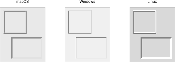
Frame
A frame is a widget that displays as a simple rectangle. Frames help to
organize your user interface, often both visually and at the coding level.
Frames often act as master widgets for a geometry manager like grid, which
manages the slave widgets contained within the frame.
| Frame widgets |
|---|
 |
Frames are created using the add_ttk_frame() method:
#![allow(unused)]
fn main() {
let f = root.add_ttk_frame( "frame" )?;
}
Frames can take several different configuration options, which can alter how they are displayed.
Requested Size
Typically, the size of a frame is determined by the size and layout of any widgets within it. In turn, this is controlled by the geometry manager that manages the contents of the frame itself.
If, for some reason, you want an empty frame that does not contain other widgets, you can instead explicitly set its size using the width and/or height configuration options (otherwise, you'll end up with a very small frame indeed).
Screen distances such as width and height are usually specified as a number of pixels screen. You can also specify them via one of several suffixes. For example, 350 means 350 pixels, 350c means 350 centimeters, 350m means 350 millimeters, 350i means 350 inches, and 350p means 350 printer's points (1/72 inch).
Remember, if you request that a frame (or any widget) to have a given size, the geometry manager has the final say. If things aren't showing up the way you want them, make sure to check there too.
Padding
The padding configuration option is used to request extra space around the inside of the widget. If you're putting other widgets inside the frame, there will be a bit of a margin all the way around. You can specify the same padding for all sides, different horizontal and vertical padding, or padding for each side separately.
#![allow(unused)]
fn main() {
// 5 pixels on all sides
frame.configure( -padding( 5 ))?;

// 5 on left and right, 10 on top and bottom
frame.configure( -padding(( 5, 10 )))?;

// left: 5, top: 7, right: 10, bottom: 12
frame.configure( -padding(( 5, 7, 10, 12 )))?;
}
Borders
You can display a border around a frame widget to visually separate it from its surroundings. You'll see this often used to make a part of the user interface look sunken or raised. To do this, you need to set the borderwidth configuration option (which defaults to 0, i.e., no border), and the relief option, which specifies the visual appearance of the border. This can be one of: flat (default), raised, sunken, solid, ridge, or groove.
#![allow(unused)]
fn main() {
frame.configure( -borderwidth(2) -relief("sunken") )?;
}
Changing Styles
Frames have a style configuration option, which is common to all of the themed widgets. This lets you control many other aspects of their appearance or behavior. This is a bit more advanced, so we won't go into it in too much detail right now. But here's a quick example of creating a "Danger" frame with a red background and a raised border.
#![allow(unused)]
fn main() {
let danger = tk.new_ttk_style( "Danger.TFrame", None );
danger.configure( -background("red") -borderwidth(5) -relief("raised") )?;

let frame = root
    .add_ttk_frame( "frame" -width(200) -height(200) -style(&danger) )?
    .grid(())?;
}
What elements of widgets can be changed by styles vary by widget and platform. On Windows and Linux, it does what you'd expect. On current macOS, the frame will have a red raised border, but the background will remain the default grey. Much more on why this is in a later chapter.
Styles mark a sharp departure from how most aspects of a widget's visual appearance were changed in the "classic" Tk widgets. In classic Tk, you could provide a wide range of options to finely control every aspect of an individual widget's behavior, e.g., foreground color, background color, font, highlight thickness, selected foreground color, and padding. When using the new themed widgets, these changes are made by modifying styles, not adding options to each widget. As such, many options you may be familiar with in certain classic widgets are not present in their themed version. However, overuse of such options was a key factor undermining the appearance of Tk applications, especially when used across different platforms. Transitioning from classic to themed widgets provides an opportune time to review and refine how (and if!) such appearance changes are made.
Run Example
cargo run --example frame
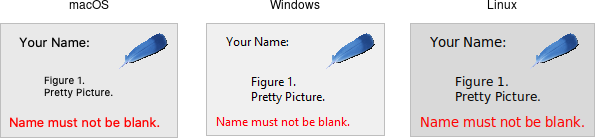
Label
A label is a widget that displays text or images, typically that users will just view but not otherwise interact with. Labels are used for to identify controls or other parts of the user interface, provide textual feedback or results, etc.
| Frame widgets |
|---|
 |
Labels are created using the add_ttk_label() method. Often, the text or image
the label will display are specified via configuration options at the same time:
#![allow(unused)]
fn main() {
parent.add_ttk_label( "label" -text("Full name") )?;
}
Like frames, labels can take several different configuration options, which can alter how they are displayed.
Displaying Text
The text configuration option (shown above when creating the label) is the most commonly used, particularly when the label is purely decorative or explanatory. You can change what text is displayed by modifying this configuration option. This can be done at any time, not only when first creating the label.
You can also have the widget monitor a variable in your script. Anytime the
variable changes, the label will display the new value of the variable. This is
done with the textvariable option:
#![allow(unused)]
fn main() {
label.configure( -textvariable("resultContents") )?;
tk.set( "resultContents", "New value to display" );
}
Variables must be global, or the fully qualified name given for those within a namespace.
Displaying Images
Labels can also display an image instead of text. If you just want an image
displayed in your user interface, this is normally the way to do it. We'll go
into images in more detail in a later chapter, but for now, let's assume you
want to display a GIF stored in a file on disk. This is a two-step process.
First, you will create an image "object." Then, you can tell the label to use
that object via its image configuration option:
#![allow(unused)]
fn main() {
let img = image_create_photo( -file("myimage.gif") )?;
label.configure( -image(img) )?;
}
Labels can also display both an image and text at the same time. You'll often
see this in toolbar buttons. To do so, use the compound configuration option.
The default value is none, meaning display only the image if present; if there
is no image, display the text specified by the text or textvariable
options. Other possible values for the compound option are: text (text
only), image (image only), center (text in the center of image), top
(image above text), left, bottom, and right.
Fonts, Colors, and More
Like with frames, you normally don't want to change things like fonts and colors directly. If you need to change them (e.g., to create a special type of label), the preferred method would be to create a new style, which is then used by the widget with the style option.
Unlike most themed widgets, the label widget also provides explicit widget-specific configuration options as an alternative. Again, you should use these only in special one-off cases when using a style didn't necessarily make sense.
You can specify the font used to display the label's text using the font configuration option. While we'll go into fonts in more detail in a later chapter, here are the names of some predefined fonts you can use:
| name | description |
|---|---|
| TkDefaultFont | Default for all GUI items not otherwise specified. |
| TkTextFont | Used for entry widgets, listboxes, etc. |
| TkFixedFont | A standard fixed-width font. |
| TkMenuFont | The font used for menu items. |
| TkHeadingFont | A font for column headings in lists and tables. |
| TkCaptionFont | A font for window and dialog caption bars. |
| TkSmallCaptionFont | Smaller captions for subwindows or tool dialogs. |
| TkIconFont | A font for icon captions. |
| TkTooltipFont | A font for tooltips. |
Because font choices are so platform-specific, be careful of hardcoding specifics (font families, sizes, etc.). This is something else you'll see in many older Tk programs that can make them look ugly.
#![allow(unused)]
fn main() {
label.configure( -font("TkDefaultFont") )?;
}
The foreground (text) and background color of the label can also be changed via
the foreground and background configuration options. Colors are covered in
detail later, but you can specify them as either color names (e.g., red) or
hex RGB codes (e.g., #ff340a).
Labels also accept the relief configuration option discussed for frames to make them appear sunken or raised.
Layout
While the overall layout of the label (i.e., where it is positioned within the user interface, and how large it is) is determined by the geometry manager, several options can help you control how the label will be displayed within the rectangle the geometry manager gives it.
If the box given to the label is larger than the label requires for its
contents, you can use the anchor option to specify what edge or corner the label
should be attached to, which would leave any empty space in the opposite edge or
corner. Possible values are specified as compass directions: n (north, or top
edge), ne, (north-east, or top right corner), e, se, s, sw, w, nw
or center.
Things not appearing where you think they should? It may be that the geometry manager is not putting the label where you think it is. For example, if you're using
grid, you may need to adjust thestickyoptions. When debugging, it can help to change the background color of each widget, so you know exactly where each is positioned. This is a good example of those "one-off" cases we just mentioned where you might use configuration options rather than styles to modify appearance.
Multi-line Labels
Labels can display more than one line of text. To do so, embed carriage returns
(\n) in the text (or textvariable) string. Labels can also automatically
wrap your text into multiple lines via the wraplength option, which specifies
the maximum length of a line (in pixels, centimeters, etc.).
Multi-line labels are a replacement for the older
messagewidgets in classic Tk.
You can also control how the text is justified via the justify option. It can
have the values left, center, or right. If you have only a single line of
text, you probably want the anchor option instead.
Run Example
cargo run --example label
Button
A button, unlike a frame or label, is very much there to interact with. Users press a button to perform an action. Like labels, they can display text or images, but accept additional options to change their behavior.
| Button widgets |
|---|
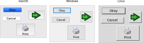 |
Buttons are created using the add_ttk_button method. Typically, their contents
and command callback are specified at the same time:
#![allow(unused)]
fn main() {
parent.add_ttk_button( "button" -text("Okay") -command("submitForm") )?;
}
Typically, their contents and command callback are specified at the same time.
As with other widgets, buttons can take several different configuration options,
including the standard style option, which can alter their appearance and
behavior.
Text or Image
Buttons take the same text, textvariable (rarely used), image, and
compound configuration options as labels. These control whether the button
displays text and/or an image.
Buttons have a default configuration option. If specified as active, this
tells Tk that the button is the default button in the user interface; otherwise
it is normal. Default buttons are invoked if users hit the Return or Enter
key). Some platforms and styles will draw this default button with a different
border or highlight. Note that setting this option doesn't create an event
binding that will make the Return or Enter key activate the button; that you
have to do yourself.
The Command Callback
The command option connects the button's action and your application. When a
user presses the button, the script provided by the option is evaluated by the
interpreter.
You can also ask the button to invoke the command callback from your application. That way, you don't need to repeat the command to be invoked several times in your program. If you change the command attached to the button, you don't need to change it elsewhere too. Sounds like a useful way to add that event binding on our default button, doesn't it?
#![allow(unused)]
fn main() {
let button = parent
    .add_ttk_button( "action" -text("Action") -default("active") -command("myaction") )?
    .pack(())?;

parent.bind(
    event::key_press( TkKey::Return ),
    tclosure!( tk, || -> InterpResult<Obj> { button.invoke() })
)?;
}
Standard behavior for dialog boxes and many other windows on most platforms is to set up a binding on the window for the Return key (
event::key_press( TkKey::Return ), to invoke the active button if it exists, as we've done here. If there is a "Close" or "Cancel" button, create a binding to the Escape key (event::key_press( TkKey::Escape )). On macOS, you should additionally bind the Enter key on the keyboard (event::key_press( TkKey::Enter )) to the active button, and Command-period (event::command().key_press( TkKey::period )) to the close or cancel button.
Button State
Buttons and many other widgets start off in a normal state. A button will respond to mouse movements, can be pressed, and will invoke its command callback. Buttons can also be put into a disabled state, where the button is greyed out, does not respond to mouse movements, and cannot be pressed. Your program would disable the button when its command is not applicable at a given point in time.
All themed widgets maintain an internal state, represented as a series of binary
flags. Each flag can either be set (on) or cleared (off). You can set or clear
these different flags, and check the current setting using the state and
instate methods. Buttons make use of the disabled flag to control whether or
not users can press the button. For example:
#![allow(unused)]
fn main() {
b.set_state(    TtkState::Disabled )?; // set the disabled flag
b.set_state(   !TtkState::Disabled )?; // clear the disabled flag
b.instate(      TtkState::Disabled )?; // 1 if disabled, else 0
b.instate(     !TtkState::Disabled )?; // 1 if not disabled, else 0
b.instate_run( !TtkState::Disabled,
                        "myaction" )?; // execute 'myaction' if not disabled
}
Run Example
cargo run --example button
Checkbutton
A checkbutton widget is like a regular button that also holds a binary value of some kind (i.e., a toggle). When pressed, a checkbutton flips the toggle and then invokes its callback. Checkbutton widgets are frequently used to allow users to turn an option on or off.
| Checkbutton widgets |
|---|
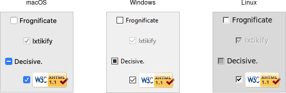 |
Checkbuttons are created using the add_ttk_checkbutton method. Typically,
their contents and behavior are specified at the same time:
#![allow(unused)]
fn main() {
parent.add_ttk_checkbutton( "check" -text("Use Metric") -command( "metricChanged" )
    -variable("measuresystem") -onvalue("metric") -offvalue("imperial") )?;
}
Checkbuttons use many of the same options as regular buttons but add a few more.
The text, textvariable, image, and compound configuration options
control the display of the label (next to the checkbox itself). Similarly, the
command option lets you specify a command to be called every time a user
toggles the checkbutton; and the invoke method will also execute the same
command. The state and instate methods allow you to manipulate the
disabled state flag to enable or disable the checkbutton.
Widget Value
Unlike regular buttons, checkbuttons also hold a value. We've seen before how
the textvariable option can link the label of a widget to a variable in your
program. The variable option for checkbuttons behaves similarly, except it
links a variable to current value of the widget. The variable is updated
whenever the widget is toggled. By default, checkbuttons use a value of 1 when
the widget is checked, and 0 when not checked. These can be changed to something
else using the onvalue and offvalue options.
A checkbutton doesn't automatically set (or create) the linked variable. Therefore, your program needs to initialize it to the appropriate starting value.
What happens when the linked variable contains neither the onvalue or the
offvalue (or even doesn't exist)? In that case, the checkbutton is put into a
special "tristate" or indeterminate mode. When in this mode, the checkbox might
display a single dash, instead of being empty or holding a checkmark.
Internally, the state flag alternate is set, which you can inspect via the
instate method:
#![allow(unused)]
fn main() {
check.instate( TtkState::Alternate )?;
}
Run Example
cargo run --example checkbutton
Radiobutton
A radiobutton widget lets you choose between one of several mutually exclusive choices. Unlike a checkbutton, they are not limited to just two options. Radiobuttons are always used together in a set, where multiple radiobutton widgets are tied to a single choice or preference. They are appropriate to use when the number of options is relatively small, e.g., 3-5.
| Radiobutton widgets |
|---|
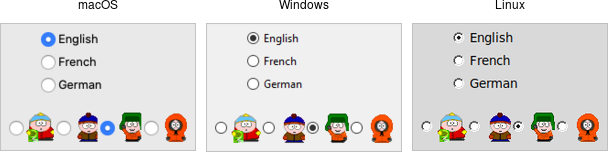 |
Radiobuttons are created using the add_ttk_radiobutton method. Typically,
you'll create and initialize several of them at once:
#![allow(unused)]
fn main() {
parent.add_ttk_radiobutton( "home"   -text("Home")   -variable("phone") -value("home")   )?;
parent.add_ttk_radiobutton( "office" -text("Office") -variable("phone") -value("office") )?;
parent.add_ttk_radiobutton( "cell"   -text("Mobile") -variable("phone") -value("cell")   )?;
}
Radiobuttons share most of the same configuration options as checkbuttons. One
exception is that the onvalue and offvalue options are replaced with a
single value option. Each radiobutton in the set will have the same linked
variable, but a different value. When the variable holds the matching value,
that radiobutton will visually indicate it is selected. If it doesn't match, the
radiobutton will be unselected. If the linked variable doesn't exist, or you
don't specify one with the variable option, radiobuttons also display as
"tristate" or indeterminate. This can be checked via the alternate state flag.
Run Example
cargo run --example radiobutton
Entry
An entry widget presents users with a single line text field where they can type in a string value. These can be just about anything: a name, a city, a password, social security number, etc.
| Entry widgets |
|---|
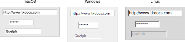 |
Entries are created using the add_ttk_entry method:
#![allow(unused)]
fn main() {
parent.add_ttk_entry( "name" -textvariable("username") )?;
}
A width configuration option may be specified to provide the number of
characters wide the entry should be. This allows you, for example, to display a
shorter entry for a zip or postal code.
Entry Contents
We've seen how checkbutton and radiobutton widgets have a value associated with
them. Entries do as well, and that value is usually accessed through a linked
variable specified by the textvariable configuration option.
Unlike the various buttons, entries don't have a text or image beside them to identify them. Use a separate label widget for that.
You can also get or change the value of the entry widget without going through
the linked variable. The get method returns the current value, and the
delete and insert methods let you change the contents, e.g.
#![allow(unused)]
fn main() {
println!( "current value is {}", name.get() );
name.delete_range( 0.. )?; // delete between two indices, 0-based
name.insert( 0, "your name" )?; // insert new text at a given index
}
Watching for Changes
Entry widgets don't have a command option to invoke a callback whenever the
entry is changed. To watch for changes, you should watch for changes to the
linked variable. See also "Validation", below.
#![allow(unused)]
fn main() {
#[proc] fn it_has_been_written() -> TkResult<()> { Ok(()) }
interpreter.trace_add_variable_write( "username", "it_has_been_written" )?;
}
You'll be fine if you stick with simple uses of trace_add_variable_write like
that shown above. You might want to know that this is a small part of a much
more complex system for observing variables and invoking callbacks when they are
read, written, or deleted. You can trigger multiple callbacks, add or delete
them (trace_remove_variable_write), and introspect them
(trace_info_variable).
Passwords
Entries can be used for passwords, where the actual contents are displayed as a
bullet or other symbol. To do this, set the show configuration option to the
character you'd like to display.
#![allow(unused)]
fn main() {
parent.add_ttk_entry( "passwd" -textvariable("password") -show("*") )?;
}
Widget States
Like the various buttons, entries can also be put into a disabled state via the
state command (and queried with instate). Entries can also use the state
flag readonly; if set, users cannot change the entry, though they can still
select the text in it (and copy it to the clipboard). There is also an invalid
state, set if the entry widget fails validation, which leads us to...
Validation
Users can type any text they like into an entry widget. However, if you'd like to restrict what they can type into the entry, you can do so with validation. For example, an entry might only accept an integer or a valid zip or postal code.
Your program can specify what makes an entry valid or invalid, as well as when to check its validity. As we'll see soon, the two are related. We'll start with a simple example, an entry that can only hold an integer up to five digits long.
The validation criteria is specified via an entry's validatecommand
configuration option. You supply a piece of code whose job is to validate the
entry. It functions like a widget callback or event binding, except that it
returns a value (whether or not the entry is valid). We'll arrange to validate
the entry on any keystroke, which is specified by providing a value of key to
the validate configuration option.
#![allow(unused)]
fn main() {
let validate_cmd = tclfn!( &tk,
    fn check_num( vldt_new: String ) -> TclResult<bool> {
       Ok( vldt_new.len() <= 5 &&
           vldt_new.chars().filter( |&ch| ch >= '0' && ch <= '9' ).count() <= 5 )
    }
);

root.add_ttk_entry( "e" -textvariable("num") -validate("key") -validatecommand(validate_cmd) )?
    .grid( -column(0) -row(2) -sticky("we") )?;
}
A few things are worth noting. First, as with event bindings, we can access more information about the conditions that triggered the validation via percent substitutions. We used one of these here: `%P is the new value of the entry if the validation passes. We'll use a simple regular expression and a length check to determine if the change is valid. To reject the change, our validation command can return a false value, and the entry will remain unchanged.
Let's extend our example so that the entry will accept a US zip code, formatted as "#####" or "#####-####" ("#" can be any digit). We'll still do some validation on each keystroke (only allowing entry of numbers or a hyphen). However, We can no longer fully validate the entry on every keystroke; if they've just typed the first digit, it's not valid yet. So full validation will only happen when the entry loses focus (e.g., a user tabs away from it). Tk refers to this as revalidation, in contrast with prevalidation (accepting changes on each keystroke).
How should we respond to errors? Let's add a message reminding users of the format. It will appear if they type a wrong key or tab away from the entry when it's not holding a valid zip code. We'll remove the message when they return to the entry or type a valid key. We'll also add a (dummy) button to "process" the zip code, which will be disabled unless the zip entry is valid. Finally, we'll also add a "name" entry so you can tab away from the zip entry.
#![allow(unused)]
fn main() {
const FORMATMSG: &'static str = "Zip should be ##### or #####-####";

let f = root.add_ttk_frame( "f" )?
    .grid( -column(0) -row(3) )?;

f.add_ttk_label( "l1" -text("Name:") )?
    .grid( -column(0) -row(4) -padx(5) -pady(5) )?;

let _e1 = f.add_ttk_entry( "e1" )?
    .grid( -column(1) -row(4) -padx(5) -pady(5) )?;

f.add_ttk_label( "l" -text("Zip:") )?
    .grid( -column(0) -row(5) -padx(5) -pady(5) )?;

let f_btn = f.add_ttk_button( "btn" -text("Process") )?
    .grid( -column(2) -row(5) -padx(5) -pady(5) )?;

f_btn.set_state( TtkState::Disabled )?;

let check_zip_cmd = tclosure!( tk, cmd: "check_zip",
    |vldt_new, vldt_op| -> TkResult<bool> {
        let interp = tcl_interp!();
        interp.set( "errmsg", "" );

        let re = r#"^[0-9]{5}(\-[0-9]{4})?$"#;
        let regex = Regex::new( re ).unwrap();
        let valid = regex.is_match( &new_val );
        f_btn.set_state( if valid{ !TtkState::Disabled } else{ TtkState::Disabled })?;
        if op == "key" {
            let regex = Regex::new( r#"^[0-9\-]*$"# ).unwrap();
            let ok_so_far = regex.is_match( &new_val ) && new_val.len() <= 10;
            if !ok_so_far {
                interp.set( "errmsg", FORMATMSG );
            }
            return Ok( true );
        } else if op == "focusout" {
            if !valid {
                interp.set( "errmsg", FORMATMSG );
            }
        }
        if valid {
            Ok( true )
        } else {
            Ok( false )
        }
    }
);

f.add_ttk_entry( "e" -textvariable("zip") -validate("all") -validatecommand(check_zip_cmd) )?
    .grid( -column(1) -row(5) -padx(5) -pady(5) )?;

f.add_ttk_label( "msg" -font("TkSmallCaptionFont") -foreground("red") -textvariable("errmsg") )?
    .grid( -column(1) -row(2) -padx(5) -pady(5) -sticky("w") )?;
}
Notice that the validate configuration option has been changed from key to
all. That arranges for the validatecommand callback to be invoked on not
only keystrokes but other triggers. The trigger is passed to the callback using
the %V percent substitution. The callback differentiated between key and
focusout triggers (you can also check for focusin).
There's a few more things to know about validation. First, if your
validatecommandever generates an error (or doesn't return a boolean), validation will be disabled for that widget. Your callback can modify the entry, e.g., change its textvariable. You can ask the widget to validate at any time by calling it'svalidatemethod, which returns true if validation passes (the%Vsubstitution is set toforced).
There is an
invalidcommandconfiguration option (which works likevalidatecommand) that is called whenever validation fails. You can use it to accomplish nasty things like forcing the focus back on the widget that didn't validate. In practice, it's rarely used. As mentioned earlier, the entry'sinvalidstate flag (which can be checked via theinstateinvalidmethod) is automatically updated as validation succeeds or fails.
Other percent substitutions allow you to get the entry's contents prior to editing (
%s), differentiate between insert and delete (%d), where an insert or delete occurs (%i), what is being inserted or deleted (%S), the current setting of thevalidateoption (%v) and the name of the widget (%W).
Run Example
cargo run --example entry
Combobox
A combobox widget combines an entry with a list of choices. This lets users either choose from a set of values you've provided (e.g., typical settings), but also put in their own value (e.g., for less common cases).
| Combobox widgets |
|---|
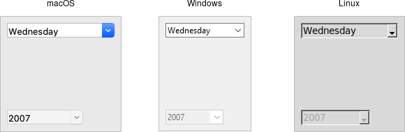 |
Comboboxes are created using the ttk_combobox command:
#![allow(unused)]
fn main() {
parent.add_ttk_combobox( "country" -textvariable("country") )?;
}
Like entries, the textvariable option links a variable in your program to the
current value of the combobox. As with other widgets, you should initialize the
linked variable in your own code.
A combobox will generate a event::virtual_event( "ComboboxSelected" ) that you
can bind to whenever its value changes. (You could also trace changes on the
textvariable, as we've seen in the previous few widgets we covered. Binding to
the event is more straightforward, and so tends to be our preferred choice.)
#![allow(unused)]
fn main() {
country.bind( event::virtual_event( "ComboboxSelected" ), script )?;
}
Predefined Values
You can provide a list of values that users can choose from using the values
configuration option:
#![allow(unused)]
fn main() {
country.configure( -values([ "USA","Canada","Australia" ].as_slice() ))?;
}
If set, the TtkState::ReadOnly state flag will restrict users to making
choices only from the list of predefined values, but not be able to enter their
own (though if the current value of the combobox is not in the list, it won't be
changed).
#![allow(unused)]
fn main() {
country.set_state( TtkState::ReadOnly )?;
}
If you're using the combobox in
TtkState::ReadOnlymode, I'd recommend that when the value changes (i.e., on aevent::virtual_event("ComboboxSelected")), that you call theselection_clearmethod. It looks a bit odd visually without doing that.
You can also get the current value using the get method, and change the
current value using the set method (which takes a single argument, the new
value).
As a complement to the get and set methods, you can also use the current
method to determine which item in the predefined values list is selected. Call
current with no arguments; it will return a 0-based index into the list, or -1
if the current value is not in the list. You can select an item in the list by
calling current with a single 0-based index argument.
Want to associate some other value with each item in the list so that your program can use one value internally, but it gets displayed in the combobox as something else? You'll want to have a look at the section entitled "Keeping Extra Item Data" when we get to the discussion of listboxes in a couple of chapters from now.
Run Example
cargo run --example combobox
The Grid Geometry Manager
We'll take a bit of a break from talking about different widgets (what to put
onscreen) and focus instead on geometry management (where to put those widgets).
We introduced the general idea of geometry management in the "Tk Concepts"
chapter. Here, we focus on one specific geometry manager: grid.
As we've seen, grid lets you layout widgets in columns and rows. If you're familiar with using HTML tables to do layout, you'll feel right at home here. This chapter illustrates the various ways you can tweak grid to give you all the control you need for your user interface.
Grid is one of several geometry managers available in Tk, but its mix of power,
flexibility, and ease of use make it the best choice for general use. Its
constraint model is a natural fit with today's layouts that rely on the
alignment of widgets. There are other geometry managers in Tk: pack is also
quite powerful, but harder to use and understand, while place gives you
complete control of positioning each element. Even widgets like paned windows,
notebooks, canvas, and text that we'll explore later can act as geometry
managers.
It's worth noting that
gridwas first introduced to Tk in 1996, several years after Tk became popular, and it took a while to catch on. Before that, developers had always usedpackto do constraint-based geometry management. Whengridcame out, many developers kept usingpack, and you'll still find it used in many Tk programs and documentation. While there's nothing technically wrong withpack, the algorithm's behavior is often hard to understand. More importantly, because the order that widgets are packed is significant in determining layout, modifying existing layouts can be more difficult. Aligning widgets in different parts of the user interface is also much trickier.
Grid has all the power of pack, produces nicer layouts (that align widgets both horizontally and vertically), and is easier to learn and use. Because of that, we think grid is the right choice for most developers most of the time. Start your new programs using grid, and switch old ones to grid as you're making changes to an existing user interface.
The reference documentation for grid provides an exhaustive description of grid, its behaviors, and all options.
Columns and Rows
In grid, widgets are assigned a column number and a row number. These
indicate each widget's position relative to other widgets. All widgets in the
same column will be above or below each other. Those in the same row will be to
the left or right of each other.
Column and row numbers must be positive integers (i.e., 0, 1, 2, ...). You don't have to start at 0 and can leave gaps in column and row numbers (e.g., column 1, 2, 10, 11, 12, 20, 21). This is useful if you plan to add more widgets in the middle of the user interface later.
The width of each column will vary depending on the width of the widgets contained within the column. Ditto for the height of each row. This means when sketching out your user interface and dividing it into rows and columns, you don't need to worry about each column or row being equal width.
Spanning Multiple Cells
Widgets can take up more than a single cell in the grid; to do this, we'll use
the columnspan and rowspan options when gridding the widget. These are
analogous to the "colspan" and "rowspan" attribute of HTML tables.
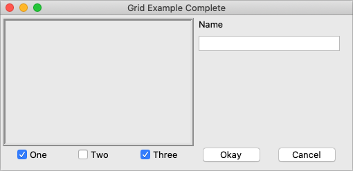
Here is an example of creating a user interface with multiple widgets, some that take up more than a single cell.
| Gridding multiple widgets |
|---|
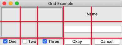 |
/// cargo run --example spanning_multiple_cells

use tk::*;
use tk::cmd::*;

fn main() -> TkResult<()> {
    let tk = make_tk!()?;
    let root = tk.root();

    let c = root.add_ttk_frame( "c" )?;
    c.add_ttk_frame( "f" -borderwidth(5) -relief("ridge") -width(200) -height(100) )?;
    c.add_ttk_label( "namelbl" -text("Name") )?;
    c.add_ttk_entry( "name" )?;
    c.add_ttk_checkbutton( "one"   -text("One")   -variable("one")   -onvalue(1) )?; tk.set( "one"  , 1 );
    c.add_ttk_checkbutton( "two"   -text("Two")   -variable("two")   -onvalue(1) )?; tk.set( "two"  , 0 );
    c.add_ttk_checkbutton( "three" -text("Three") -variable("three") -onvalue(1) )?; tk.set( "three", 1 );
    c.add_ttk_button( "ok" -text("Okay") )?;
    c.add_ttk_button( "cancel" -text("Cancel") )?;

    tk.grid( ".c"         -column(0) -row(0) )?;
    tk.grid( ".c.f"       -column(0) -row(0) -columnspan(3) -rowspan(2) )?;
    tk.grid( ".c.namelbl" -column(3) -row(0) -columnspan(2) )?;
    tk.grid( ".c.name"    -column(3) -row(1) -columnspan(2) )?;
    tk.grid( ".c.one"     -column(0) -row(3) )?;
    tk.grid( ".c.two"     -column(1) -row(3) )?;
    tk.grid( ".c.three"   -column(2) -row(3) )?;
    tk.grid( ".c.ok"      -column(3) -row(3) )?;
    tk.grid( ".c.cancel"  -column(4) -row(3) )?;

    Ok( main_loop() )
}
Layout within the Cell
Because the width of a column (and height of a row) depends on all the widgets that have been added to it, the odds are that at least some widgets will have a smaller width or height than has been allocated for the cell its been placed in. So the question becomes, where exactly should it be put within the cell?
By default, if a cell is larger than the widget contained in it, the widget will be centered within it, both horizontally and vertically. The master's background will display in the empty space around it. In the figure below, the widget in the top right is smaller than the cell allocated to it. The (white) background of the master fills the rest of the cell.
| Layout within the cell and the 'sticky' option |
|---|
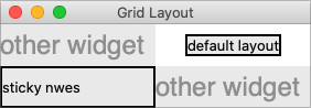 |
The sticky option can change this default behavior. Its value is a string of
0 or more of the compass directions nsew, specifying which edges of the cell
the widget should be "stuck" to. For example, a value of n (north) will jam
the widget up against the top side, with any extra vertical space on the bottom;
the widget will still be centered horizontally. A value of nw (north-west)
means the widget will be stuck to the top left corner, with extra space on the
bottom and right.
Specifying two opposite edges, such as we (west, east) means that the widget
will be stretched. In this case, it will be stuck to both the left and right
edge of the cell. So the widget will then be wider than its "ideal" size.
If you want the widget to expand to fill up the entire cell, grid it with a
sticky value of nsew (north, south, east, west), meaning it will stick to
every side. This is shown in the bottom left widget in the above figure.
Most widgets have options that can control how they are displayed if they are larger than needed. For example, a label widget has an
anchoroption that controls where the label's text will be positioned within the widget's boundaries. The bottom left label in the figure above uses the default anchor (w, i.e., left side, vertically centered).
If you're having trouble getting things to line up the way you want them to, first make sure you know how large the widget is. As we discussed with the
labelwidget in the previous chapter, changing the widget's background or border can help.
Handling Resize
If you've tried to resize the example, you'll notice that nothing moves at all, as shown below.
| Resizing the window |
|---|
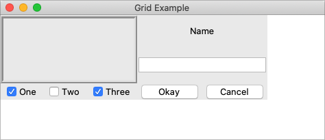 |
Even if you took a peek below and added the extra sticky options to our
example, you'd still see the same thing. It looks like sticky may tell Tk how
to react if the cell's row or column does resize, but doesn't actually say that
the row or columns should resize if extra room becomes available. Let's fix
that.
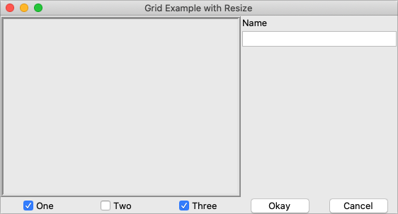
Every column and row in the grid has a weight option associated with it. This
tells grid how much the column or row should grow if there is extra room in
the master to fill. By default, the weight of each column or row is 0, meaning
it won't expand to fill any extra space.
For the user interface to resize then, we'll need to specify a positive weight
to the columns and rows that we'd like to expand. You must provide weights for
at least one column and one row. This is done using the columnconfigure and
rowconfigure methods of grid. This weight is relative. If two columns have
the same weight, they'll expand at the same rate. In our example, we'll give the
three leftmost columns (holding the checkbuttons) a weight of 3, and the two
rightmost columns a weight of 1. For every one pixel the right columns grow, the
left columns will grow by three pixels. So as the window grows larger, most of
the extra space will go to the left side.
| Resizing the window after adding weights |
|---|
 |
Both columnconfigure and rowconfigure also take a minsize grid option,
which specifies a minimum size which you really don't want the column or row to
shrink beyond.
Padding
Normally, each column or row will be directly adjacent to the next, so that widgets will be right next to each other. This is sometimes what you want (think of a listbox and its scrollbar), but often you want some space between widgets. In Tk, this is called padding, and there are several ways you can choose to add it.
We've already actually seen one way, and that is using a widget's own options to
add the extra space around it. Not all widgets have this, but one that does is a
frame; this is useful because frames are most often used as the master to grid
other widgets. The frame's padding option lets you specify a bit of extra
padding inside the frame, whether the same amount for each of the four sides or
even different for each.
A second way is using the padx and pady grid options when adding the widget.
As you'd expect, padx puts a bit of extra space to the left and right, while
pady adds extra space top and bottom. A single value for the option puts the
same padding on both left and right (or top and bottom), while a two-value list
lets you put different amounts on left and right (or top and bottom). Note that
this extra padding is within the grid cell containing the widget.
If you want to add padding around an entire row or column, the columnconfigure
and rowconfigure methods accept a pad option, which will do this for you.
Let's add the extra sticky, resizing, and padding behavior to our example (additions in bold).
// cargo run --example padding

use tk::*;
use tk::cmd::*;

fn main() -> TkResult<()> {
    let tk = make_tk!()?;
    let root = tk.root();

    let c = root.add_ttk_frame( "c" -padding((3,3,12,12)) )?;
    c.add_ttk_frame( "f" -borderwidth(5) -relief("ridge") -width(200) -height(100) )?;
    c.add_ttk_label( "namelbl" -text("Name") )?;
    c.add_ttk_entry( "name" )?;
    c.add_ttk_checkbutton( "one"   -text("One")   -variable("one")   -onvalue(1) )?; tk.set( "one"  , 1 );
    c.add_ttk_checkbutton( "two"   -text("Two")   -variable("two")   -onvalue(1) )?; tk.set( "two"  , 0 );
    c.add_ttk_checkbutton( "three" -text("Three") -variable("three") -onvalue(1) )?; tk.set( "three", 1 );
    c.add_ttk_button( "ok" -text("Okay") )?;
    c.add_ttk_button( "cancel" -text("Cancel") )?;

    tk.grid( ".c"         -column(0) -row(0) -sticky("nsew") )?;
    tk.grid( ".c.f"       -column(0) -row(0) -columnspan(3) -rowspan(2) -sticky("nsew") )?;
    tk.grid( ".c.namelbl" -column(3) -row(0) -columnspan(2)             -sticky("nw")  -padx(5) )?;
    tk.grid( ".c.name"    -column(3) -row(1) -columnspan(2)             -sticky("new") -padx(5) -pady(5) )?;
    tk.grid( ".c.one"     -column(0) -row(3) )?;
    tk.grid( ".c.two"     -column(1) -row(3) )?;
    tk.grid( ".c.three"   -column(2) -row(3) )?;
    tk.grid( ".c.ok"      -column(3) -row(3) )?;
    tk.grid( ".c.cancel"  -column(4) -row(3) )?;

    root.grid_columnconfigure( 0, -weight(1) )?;
    root.grid_rowconfigure(    0, -weight(1) )?;
    c.grid_columnconfigure(    0, -weight(3) )?;
    c.grid_columnconfigure(    1, -weight(3) )?;
    c.grid_columnconfigure(    2, -weight(3) )?;
    c.grid_columnconfigure(    3, -weight(1) )?;
    c.grid_columnconfigure(    4, -weight(1) )?;
    c.grid_rowconfigure(       1, -weight(1) )?;

    Ok( main_loop() )
}
This looks more promising. Play around with the example to get a feel for the resize behavior.
Grid example, handling in-cell layout and resize.
| Grid example, handling in-cell layout and resize |
|---|
 |
Additional Grid Features
If you look at the documentation
for grid, you'll see many other things you can do with grid. Here are a few of
the more useful ones.
Querying and Changing Grid Options
Like widgets themselves, it's easy to introspect the various grid options or change them. Setting options when you first grid the widget is certainly convenient, but you can change them anytime you'd like.
The slaves method will tell you all the widgets that have been gridded inside
a master, or optionally those within just a certain column or row. The info
method will return a list of all the grid options for a widget and their values.
Finally, the configure method lets you change one or more grid options on a
widget.
These are illustrated in this interactive session:
#![allow(unused)]
fn main() {
let got = c.grid_slaves(())?;
let got = got
    .iter()
    .map( |widget| widget.path() )
    .collect::<Vec<_>>();
let expected = vec![ ".c.cancel", ".c.ok", ".c.three", ".c.two", ".c.one", ".c.name", ".c.namelbl", ".c.f" ]
    .into_iter()
    .collect::<Vec<_>>();
assert_eq!( got, expected );

let got = c.grid_slaves( -row(3) )?;
let got = got
    .iter()
    .map( |widget| widget.path() )
    .collect::<Vec<_>>();
let expected = vec![ ".c.cancel", ".c.ok", ".c.three", ".c.two", ".c.one" ]
    .into_iter()
    .collect::<Vec<_>>();
assert_eq!( got, expected );

let got = c.grid_slaves( -column(0) )?;
let got = got
    .iter()
    .map( |widget| widget.path() )
    .collect::<Vec<_>>();
let expected = vec![ ".c.one", ".c.f" ]
    .into_iter()
    .collect::<Vec<_>>();
assert_eq!( got, expected );

let got = c_namelbl.grid_info()?
    .into_iter()
    .map( |(key, val)| (key, val.get_string() ))
    .collect::<HashMap<_,_>>();

let mut expected = HashMap::new();

expected.insert( "-in"        .to_owned(), ".c".to_owned() );
expected.insert( "-column"    .to_owned(), "3" .to_owned() );
expected.insert( "-row"       .to_owned(), "0" .to_owned() );
expected.insert( "-columnspan".to_owned(), "2" .to_owned() );
expected.insert( "-rowspan"   .to_owned(), "1" .to_owned() );
expected.insert( "-ipadx"     .to_owned(), "0" .to_owned() );
expected.insert( "-ipady"     .to_owned(), "0" .to_owned() );
expected.insert( "-padx"      .to_owned(), "5" .to_owned() );
expected.insert( "-pady"      .to_owned(), "0" .to_owned() );
expected.insert( "-sticky"    .to_owned(), "nw".to_owned() );

assert_eq!( got, expected );

c_namelbl.grid_configure( -sticky("ew") )?;

let got = c_namelbl.grid_info()?
    .into_iter()
    .map( |(key, val)| (key, val.get_string() ))
    .collect::<HashMap<_,_>>();

let mut expected = HashMap::new();

expected.insert( "-in"        .to_owned(), ".c".to_owned() );
expected.insert( "-column"    .to_owned(), "3" .to_owned() );
expected.insert( "-row"       .to_owned(), "0" .to_owned() );
expected.insert( "-columnspan".to_owned(), "2" .to_owned() );
expected.insert( "-rowspan"   .to_owned(), "1" .to_owned() );
expected.insert( "-ipadx"     .to_owned(), "0" .to_owned() );
expected.insert( "-ipady"     .to_owned(), "0" .to_owned() );
expected.insert( "-padx"      .to_owned(), "5" .to_owned() );
expected.insert( "-pady"      .to_owned(), "0" .to_owned() );
expected.insert( "-sticky"    .to_owned(), "ew".to_owned() );

assert_eq!( got, expected );
}
Internal Padding
You saw how the padx and pady grid options added extra space around the
outside of a widget. There's also a less used type of padding called "internal
padding" controlled by the grid options ipadx and ipady.
The difference can be subtle. Let's say you have a frame that's 20x20, and specify normal (external) padding of 5 pixels on each side. The frame will request a 20x20 rectangle (its natural size) from the geometry manager. Normally, that's what it will be granted, so it'll get a 20x20 rectangle for the frame, surrounded by a 5-pixel border.
With internal padding, the geometry manager will effectively add the extra
padding to the widget when figuring out its natural size, as if the widget has
requested a 30x30 rectangle. If the frame is centered, or attached to a single
side or corner (using sticky), we'll end up with a 20x20 frame with extra
space around it. If, however, the frame is set to stretch (i.e., a sticky
value of we, ns, or nwes), it will fill the extra space, resulting in a
30x30 frame, with no border.
Forget and Remove
The forget method of grid removes slaves from the grid they're currently part
of. It takes a list of one or more slave widgets as arguments. This does not
destroy the widget altogether but takes it off the screen as if it had not been
gridded in the first place. You can grid it again later, though any grid options
you'd originally assigned will have been lost.
The remove method of grid works the same, except that the grid options will be
remembered if you grid it again later.
Run Example
cargo run --example querying_and_changing_grid_options
Nested Layouts
As your user interface gets more complicated, the grid that you're using to organize all your widgets can get increasingly complicated. This can make changing and maintaining your program very difficult.
Luckily, you don't have to manage your entire user interface with a single grid. If you have one area of your user interface that is fairly independent of others, create a new frame to hold that area and grid the widgets in area within that frame. For example, if you were building a graphics editor with multiple palettes, toolbars, etc., each one of those areas might be a candidate for putting in its own frame.
In theory, these frames, each with its own grid, can be nested arbitrarily deep, though, in practice, this usually doesn't go beyond a few levels. This can be a big help in modularizing your program. If, for example, you have a palette of drawing tools, you can create the whole thing in a separate function or class. It would be responsible for creating all the component widgets, gridding them together, setting up event bindings, etc. The details of how things work inside that palette can be contained in that one piece of code. From the point of view of your main program, all it needs to know about is the single frame widget containing your palette.
Our examples have shown just a hint of this, where a content frame was gridded into the main window, and then all the other widgets gridded into the content frame.
As your own programs grow larger, you'll likely run into situations where making
a change in the layout of one part of your interface requires code changes to
the layout of another part. That may be a clue to reconsider how you're using
grid and if splitting out components into separate frames would help.
More Widgets
This chapter carries on introducing several more widgets: listbox, scrollbar, text, scale, spinbox, and progressbar. Some of these are starting to be a bit more powerful than the basic ones we looked at before. Here we'll also see a few instances of using the classic Tk widgets, in cases where there isn't (or there isn't a need for) a themed counterpart.
Listbox
A listbox widget displays a list of single-line text items, usually lengthy, and allows users to browse through the list, selecting one or more.
Listboxes are part of the classic Tk widgets; there is not presently a listbox in the themed Tk widget set.
Tk's treeview widget (which is themed) can also be used as a listbox (a one level deep tree), allowing you to use icons and styles with the list. It's also likely that a multi-column (table) list widget will make it into Tk at some point, whether based on treeview or one of the available extensions.
| Listbox widgets |
|---|
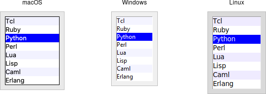 |
Listboxes are created using the add_tk_listbox method. A height configuration
option can specify the number of lines the listbox will display at a time
without scrolling:
#![allow(unused)]
fn main() {
parent.add_listbox( "l" -height(10) )?;
}
Populating the Listbox Items
There's an easy way and a hard way to populate and manage all the items in the listbox.
Here's the easy way. Each listbox has a listvariable configuration option,
which allows you to link a variable (which must hold a list) to the listbox.
Each element of this list is a string representing one item in the listbox. To
add, remove, or rearrange items in the listbox, you can simply modify this
variable as you would any other list. Similarly, to find out, e.g., which item
is on the third line of the listbox, just look at the third element of the list
variable.
The older, harder way to do things is to use a set of methods that are part of the listbox widget itself. They operate on the (internal) list of items maintained by the widget:
The insert( &self, idx: impl Into<ListboxIndex>, elements ) method is used to
add one or more items to the list; idx is a 0-based index indicating the
position of the item before which the item(s) should be added; specify
ListboxIndex::End to put the new items at the end of the list.
Use the delete( &self, index: impl Into<Index> ) or
delete_range( &self, range: impl Into<TkRange<Index>> ) method to delete one
or more items from the list.
Use the get( &self, index: impl Into<Index> ) method to return the contents of
a single item at the given position, or use the
get_range( &self, range: impl Into<TkRange<Index>> ) method to get a list of
the items in the range.
The size method returns the number of items in the list.
The reason there is a hard way at all is because the
listvariableoption was only introduced in Tk 8.3. Before that, you were stuck with the hard way. Because using the list variable lets you use all the standard list operations, it provides a much simpler API. It's certainly an upgrade worth considering if you have listboxes doing things the older way.
Selecting Items
You can choose whether users can select only a single item at a time from the
listbox, or if multiple items can simultaneously be selected. This is
controlled by the selectmode option: the default is only being able to select
a single item (browse), while a selectmode of extended allows users to
select multiple items.
The names
browseandextended, again for backward compatibility reasons, are truly awful. This is made worse by the fact that there are two other modes,singleandmultiple, which you should not use (they use an old interaction style that is inconsistent with modern user interface and platform conventions).
To find out which item or items in the listbox are currently selected, use the
curselection method. It returns a list of indices of all items currently
selected; this may be an empty list. For lists with a selectmode of browse,
it will never be longer than one item. You can also use the selection_includes
index method to check if the item with the given index is currently selected.
#![allow(unused)]
fn main() {
if lbox.selection_includes( 2 ) { /* omitted */ }
}
To programmatically change the selection, you can use the
selection_clear( &self, values: impl IntoTkValues<ListboxIndex> ) method to
deselect either a single item or any within the range of indices specified. To
select an item or all items in a range, use the
selection_set( &self, values: impl IntoTkValues<ListboxIndex> ) method. Both
of these will not touch the selection of any items outside the range specified.
If you change the selection, you should also make sure that the newly selected
item is visible (i.e., it is not scrolled out of view). To do this, use the
see_index method.
#![allow(unused)]
fn main() {
lbox.selection_set( idx )?;
lbox.see( idx )?;
}
When a user changes the selection, a event::virtual_event( "ListboxSelect" )
is generated. You can bind to this to take any action you need. Depending on
your application, you may also want to bind to a double-click
event::double().button_press_1() event and use it to invoke an action with the
currently selected item.
#![allow(unused)]
fn main() {
lbox.bind( event::virtual_event( "ListboxSelect" ),
    tclosure!( tk, || -> TkResult<()> {
        Ok( update_details( lbox.curselection()? ))
    }
))?;

lbox.bind( event::double().button_press_1(),
    tclosure!( tk, || -> TkResult<()> {
        Ok( invoke_action( lbox.curselection()? ))
    }
))?;
}
Stylizing the List
Like most of the "classic" Tk widgets, you have immense flexibility in modifying
the appearance of a listbox. As described in the
reference manual, you can
modify the font the listbox items are displayed in, the foreground (text) and
background colors for items in their normal state, when selected, when the
widget is disabled, etc. There is also an itemconfigure method that allows you
to change the foreground and background colors of individual items.
As is often the case, restraint is useful. Generally, the default values will be entirely suitable and a good match for platform conventions. In the example we'll get to momentarily, we'll show how restrained use of these options can be put to good effect, in this case displaying alternate lines of the listbox in slightly different colors.
Keeping Extra Item Data
The listvariable (or the internal list, if you're managing things the old way)
holds the strings that will be shown in the listbox. It's often the case,
though, that each string you're displaying is associated with some other data
item. This might be an internal object that is meaningful to your program, but
not meant to be displayed to users. In other words, what you're really
interested in is not so much the string displayed in the listbox, but the
associated data item. For example, a listbox may display a list of names to
users, but your program is really interested in the underlying user object (or
id number) for each one, not the particular name.
How can we associate this underlying value with the name that is displayed? Unfortunately, the listbox widget itself doesn't offer any facilities, so it's something we'll have to manage separately. There are a couple of obvious approaches. First, if the displayed strings are guaranteed unique, you could use a hash table to map each name to its associated underlying object. This wouldn't work well for peoples' names, where duplicates are possible, but could work for countries, which are unique.
A second approach is to keep a second list, parallel to the list of strings displayed in the listbox. This second list will hold the underlying object associated with each item that is displayed. So the first item in the displayed strings list corresponds to the first item in the underlying objects list, the second to the second, etc. Any changes that you make in one list (insert, delete, reorder), you must make in the other. You can then easily map from the displayed list item to the underlying object, based on their position in the list.
Example
Here is a silly example showing several of these listbox techniques. We'll have a list of countries displayed. We'll be able to select only a single country at a time. As we do so, a status bar will display the population of the country. You can press a button to send one of several gifts to the selected country's head of state (well, not really, but use your imagination). Sending a gift can also be triggered by double-clicking the list or hitting the Return key.
Behind the scenes, we maintain two lists in parallel. The first is a list of two-letter country codes. The other is the corresponding name for each country that we will display in the listbox. We also have a simple hash table that contains the population of each country, indexed by the two-letter country code.
| Country selector listbox example |
|---|
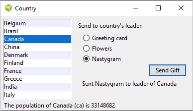 |
// cargo run --example listbox

use std::collections::HashMap;

use tcl::*;
use tk::*;
use tk::cmd::*;

fn main() -> TkResult<()> {
    let tk = make_tk!()?;
    let root = tk.root();

    // Initialize our country "databases":
    //  - the list of country codes (a subset anyway)
    //  - parallel list of country names, same order as the country codes
    //  - a hash table mapping country code to population
    tk.set( "countrycodes", vec![
        "ar", "au", "be", "br", "ca", "cn", "dk", "fi", "fr", "gr",
        "in", "it", "jp", "mx", "nl", "no", "es", "se", "ch" ]);

    tk.set( "countrynames", vec![
        "Argentina", "Australia", "Belgium", "Brazil", "Canada", "China",
        "Denmark", "Finland", "France", "Greece", "India", "Italy", "Japan",
        "Mexico", "Netherlands", "Norway", "Spain", "Sweden", "Switzerland" ]);

    let mut populations = HashMap::new();

    populations.insert( "ar",   41000000 );
    populations.insert( "au",   21179211 );
    populations.insert( "be",   10584534 );
    populations.insert( "br",  185971537 );
    populations.insert( "ca",   33148682 );
    populations.insert( "cn", 1323128240 );
    populations.insert( "dk",    5457415 );
    populations.insert( "fi",    5302000 );
    populations.insert( "fr",   64102140 );
    populations.insert( "gr",   11147000 );
    populations.insert( "in", 1131043000 );
    populations.insert( "it",   59206382 );
    populations.insert( "jp",  127718000 );
    populations.insert( "mx",  106535000 );
    populations.insert( "nl",   16402414 );
    populations.insert( "no",    4738085 );
    populations.insert( "es",   45116894 );
    populations.insert( "se",    9174082 );
    populations.insert( "ch",    7508700 );

    tk.set( "populations", populations );

    // Names of the gifts we can send
    tk.arr_set( "gifts", "card"     , "Greeting card" );
    tk.arr_set( "gifts", "flowers"  , "Flowers"       );
    tk.arr_set( "gifts", "nastygram", "Nastygram"     );

    // Create and grid the outer content frame
    let c = root.add_ttk_frame( "c" -padding(( 5, 5, 12, 0 )) )?
        .grid( -column(0) -row(0) -sticky("nwes") )?;
    root.grid_columnconfigure( 0, -weight(1) )?;
    root.grid_rowconfigure(    0, -weight(1) )?;

    // Create the different widgets; note the variables that many
    // of them are bound to, as well as the button callback.
    // The listbox is the only widget we'll need to refer to directly
    // later in our program, so for convenience we'll assign it to a variable.
    let lbox = c.add_listbox( "countries" -listvariable("countrynames") -height(5) )?;

    // Called when the user double clicks an item in the listbox, presses
    // the "Send Gift" button, or presses the Return key.  In case the selected
    // item is scrolled out of view, make sure it is visible.
    //
    // Figure out which country is selected, which gift is selected with the
    // radiobuttons, "send the gift", and provide feedback that it was sent.
    let send_gift = tclosure!( tk, || -> TkResult<()> {
        let interp = tcl_interp!();
        let idx = lbox.curselection()?;
        if idx.len() == 1 {
            let idx = idx[0];
            lbox.see( idx )?;
            let gift = interp.get("gift")?;
            let gift = interp.arr_get( "gifts", gift )?;
            let name = interp
                .get( "countrynames" )?
                .list_index( idx )?
                .map( |obj| obj.get_string() )
                .unwrap_or_default();
            // Gift sending left as an exercise to the reader
            interp.set( "sentmsg",
                format!( "Sent {} to leader of {}", gift, name ));
        }
        Ok(())
    });

    c.add_ttk_label( "lbl" -text("Send to country's leader:") )?;
    c.add_ttk_radiobutton( "g1" -text( tk.arr_get( "gifts", "card"      )? ) -variable("gift") -value("card") )?;
    c.add_ttk_radiobutton( "g2" -text( tk.arr_get( "gifts", "flowers"   )? ) -variable("gift") -value("flowers") )?;
    c.add_ttk_radiobutton( "g3" -text( tk.arr_get( "gifts", "nastygram" )? ) -variable("gift") -value("nastygram") )?;
    c.add_ttk_button( "send"    -text("Send Gift") -command(&*send_gift) -default_("active") )?;
    c.add_ttk_label(  "sentlbl" -textvariable("sentmsg")   -anchor("center") )?;
    c.add_ttk_label(  "status"  -textvariable("statusmsg") -anchor("w") )?;

    // Grid all the widgets
    tk.grid( ".c.countries" -column(0) -row(0) -rowspan(6) -sticky("nsew") )?;
    tk.grid( ".c.lbl"       -column(1) -row(0) -padx(10) -pady(5) )?;
    tk.grid( ".c.g1"        -column(1) -row(1) -sticky("w") -padx(20) )?;
    tk.grid( ".c.g2"        -column(1) -row(2) -sticky("w") -padx(20) )?;
    tk.grid( ".c.g3"        -column(1) -row(3) -sticky("w") -padx(20) )?;
    tk.grid( ".c.send"      -column(2) -row(4) -sticky("e") )?;
    tk.grid( ".c.sentlbl"   -column(1) -row(5) -columnspan(2) -sticky("n") -pady(5) -padx(5) )?;
    tk.grid( ".c.status"    -column(0) -row(6) -columnspan(2) -sticky("we") )?;
    c.grid_columnconfigure( 0, -weight(1) )?;
    c.grid_rowconfigure(    5, -weight(1) )?;

    // Called when the selection in the listbox changes; figure out
    // which country is currently selected, and then lookup its country
    // code, and from that, its population.  Update the status message
    // with the new population.  As well, clear the message about the
    // gift being sent, so it doesn't stick around after we start doing
    // other things.
    let show_population = tclosure!( tk, || -> TkResult<()> {
        let interp = tcl_interp!();
        let idx = lbox.curselection()?;
        if idx.len() == 1 {
            let idx = idx[0];
            let code = interp.get( "countrycodes" )?.list_index( idx )?
                .map( |obj| obj.get_string() ).unwrap_or_default();
            let name = interp.get( "countrynames" )?.list_index( idx )?
                .map( |obj| obj.get_string() ).unwrap_or_default();
            let popn = interp.get("populations")?.dict_get( code.clone() )?
                .map( |obj| obj.get_string() ).unwrap_or_default();
            interp.set( "statusmsg",
                format!( "The population of {}({}) is {}", name, code, popn ));
        }
        interp.set( "sentmsg", "" );
        Ok(())
    });

    // Set event bindings for when the selection in the listbox changes,
    // when the user double clicks the list, and when they hit the Return key
    lbox.bind( event::virtual_event( "ListboxSelect" ), &*show_population )?;
    lbox.bind( event::double().button_press_1(), &*send_gift )?;
    root.bind( event::key_press( TkKey::Return ), &*send_gift )?;

    // Colorize alternating lines of the listbox
    let len = tk.get( "countrynames" )?.list_length()?;
    (0..len).step_by(2).try_for_each( |i| -> InterpResult<()> {
        Ok( lbox.itemconfigure( i, -background("#f0f0ff") )? )
    })?;

    // Set the starting state of the interface, including selecting the
    // default gift to send, and clearing the messages.  Select the first
    // country in the list; because the <<ListboxSelect>> event is only
    // fired when users makes a change, we explicitly call showPopulation.
    tk.set( "gift", "card" );
    tk.set( "sentmsg", "" );
    tk.set( "statusmsg", "" );
    lbox.selection_set_range( 0.. )?;
    tk.run( &*show_population )?;

    //
    //lbox.bind( event::virtual_event( "ListboxSelect" ),
    //    tclosure!( tk, || -> TkResult<()> {
    //        Ok( update_details( lbox.curselection()? ))
    //    }
    //))?;
    //
    //lbox.bind( event::double().button_press_1(),
    //    tclosure!( tk, || -> TkResult<()> {
    //        Ok( invoke_action( lbox.curselection()? ))
    //    }
    //))?;

    Ok( main_loop() )
}
One obvious thing missing from this example was that while the list of countries could be quite long, only part of it fits on the screen at once. To show countries further down in the list, you had to either drag with your mouse or use the down arrow key. A scrollbar would have been nice. Let's fix that.
Scrollbar
A scrollbar widget helps users see all parts of another widget, whose content is typically much larger than what can be shown in the available screen space.
| Scrollbar widgets |
|---|
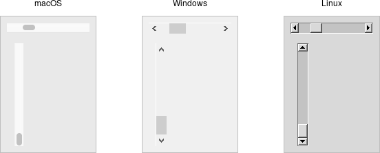 |
Scrollbars are created using the add_ttk_scrollbar method:
#![allow(unused)]
fn main() {
let s = parent
    .add_ttk_scrollbar( "s"
        -orient( "vertical" )
        -command( tclosure!( tk,
            |..| -> TkResult<(c_double, c_double)> {
                Ok( l.yview()? )
            }
        ))
    )?;

l.configure( -yscrollcommand( tclosure!( tk,
    |first:c_double, last:c_double| -> TkResult<()> {
        Ok( s.set( first, last )? )
    }
)))?;
}
Unlike in some user interface toolkits, Tk scrollbars are not a part of another widget (e.g., a listbox), but are a separate widget altogether. Instead, scrollbars communicate with the scrolled widget by calling methods on the scrolled widget; as it turns out, the scrolled widget also needs to call methods on the scrollbar.
If you're using a recent Linux distribution, you've probably noticed that the scrollbars you see in many applications have changed to look more like what you'd see on macOS. This newer look isn't supported on Linux by any of the default themes included with Tk. However, some third-party themes do support it.
The orient configuration option determines whether the scrollbar will scroll
the scrolled widget in the horizontal or vertical dimension. You then need
to use the command configuration option to specify how to communicate with the
scrolled widget. This is the method to call on the scrolled widget when the
scrollbar moves.
Every widget that can be scrolled vertically includes a method named yview,
while those that can be scrolled horizontally have a method named xview). As
long as this method is present, the scrollbar doesn't need to know anything else
about the scrolled widget. When the scrollbar is manipulated, it appends several
parameters to the method call, indicating how it was scrolled, to what position,
etc.
The scrolled widget also needs to communicate back to the scrollbar, telling it
what percentage of the entire content area is now visible. Besides the yview
and/or xview methods, every scrollable widget also has a yscrollcommand
and/or xscrollcommand configuration option. This is used to specify a method
call, which must be the scrollbar's set method. Again, additional parameters
will be automatically tacked onto the method call.
If, for some reason, you want to move the scrollbar to a particular position from within your program, you can call the
set( first, last )method yourself. Pass it two floating-point values (between 0 and 1) indicating the start and end percentage of the content area that is visible.
Example
Listboxes are one of several types of widgets that are scrollable. Here, we'll build a very simple user interface, consisting of a vertically scrollable listbox that takes up the entire window, with just a status line at the bottom.
| Scrolling a listbox |
|---|
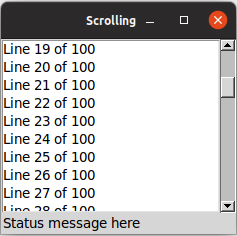 |
// cargo run --example scrollbar

use std::os::raw::c_double;

use tcl::*;
use tk::*;
use tk::cmd::*;

fn main() -> TkResult<()> {
    let tk = make_tk!()?;
    let root = tk.root();

    let l = root.add_listbox( "l" -height(5) )?
        .grid( -column(0) -row(0) -sticky("nwes") )?;

    let s = root.add_ttk_scrollbar( "s"
            -orient("vertical")
            -command( tclosure!( tk,
                |..| -> TkResult<()> { Ok( l.yview_( tcl_va_args!() )? )})))?
        .grid( -column(1) -row(0) -sticky("ns") )?;

    l.configure( -yscrollcommand( tclosure!( tk,
        |first:c_double, last:c_double| -> TkResult<()> { Ok( s.set( first, last )? )})))?;

    root.add_ttk_label( "stat" -text("Status message here") -anchor("w") )?
        .grid( -column(0) -columnspan(2) -row(1) -sticky("we") )?;

    root.grid_columnconfigure( 0, -weight(1) )?;
    root.grid_rowconfigure(    0, -weight(1) )?;

    for i in 0..100 {
       l.insert_end( Some( Obj::from( format!( "Line {} of 100", i ))))?;
    }

    Ok( main_loop() )
}
If you've seen an earlier version of this tutorial, you might recall that at this point we introduced a
sizegripwidget. It placed a small handle at the bottom right of the window, allowing users to resize the window by dragging the handle. This was commonly seen on some platforms, including older versions of macOS. Some older versions of Tk even automatically added this handle to the window for you.
Platform conventions tend to evolve faster than long-lived open source GUI toolkits. Mac OS X 10.7 did away with the size grip in the corner, in favor of allowing resizing from any window edge, finally catching up with the rest of the world. Unless there's a pressing need to be visually compatible with 10+ year old operating systems, if you have a
sizegripin your application, it's probably best to remove it
Run Example
cargo run --example scrollbar
Text
A text widget provides users with an area so that they can enter multiple lines of text. Text widgets are part of the classic Tk widgets, not the themed Tk widgets.
| Text widgets |
|---|
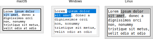 |
Tk's text widget is, along with the canvas widget, one of two uber-powerful widgets that provide amazingly deep but easily programmed features. Text widgets have formed the basis for full word processors, outliners, web browsers, and more. We'll get into some of the advanced stuff in a later chapter. Here, we'll show you how to use the text widget to capture fairly simple, multi-line text input.
Text widgets are created using the add_tk_text method:
#![allow(unused)]
fn main() {
parent.add_tk_text( "t" -width(40) -height(10) )?;
}
The width and height options specify the requested screen size of the text
widget, in characters and rows, respectively. The contents of the text can be
arbitrarily large. You can use the wrap configuration option to control how
line wrapping is handled: values are none (no wrapping, text may horizontally
scroll), char (wrap at any character), and word (wrapping will only occur at
word boundaries).
A text widget can be disabled so that no editing can occur. Because text is not
a themed widget, the usual state and instate methods are not available.
Instead, use the configuration option state, setting it to either disabled
or normal.
#![allow(unused)]
fn main() {
txt.configure( -state("disabled") )?;
}
Scrolling works the same way as in listboxes. The xscrollcommand and
yscrollcommand configuration options attach the text widget to horizontal
and/or vertical scrollbars, and the xview and yview methods are called from
scrollbars. To ensure that a given line is visible (i.e., not scrolled out of
view), you can use the see( index ) method.
Contents
Text widgets do not have a linked variable associated with them like, for
example, entry widgets do. To retrieve the contents of the entire text widget,
call the method get( text::line_char(1,0).. ); the text::line_char(1,0) is
an index into the text, and means the first character of the first line, and
std::ops::RangeTo is a shortcut for the index of the last character in the
last line. Other indices could be provided to retrieve smaller ranges of text if
needed.
Text can be added to the widget using the insert( index, string ) method;
index marks the character before which text is inserted; use Index::end() to
add text to the end of the widget. You can delete a range of text using the
delete( index ) or delete( range ) method, where range is in the form of
.., start.., start..=end, ..=end.
We'll get into the text widget's many additional advanced features in a later chapter.
Run Example
cargo run --example text
Scale
A scale widget allows users to choose a numeric value through direct manipulation.
| Scale widgets |
|---|
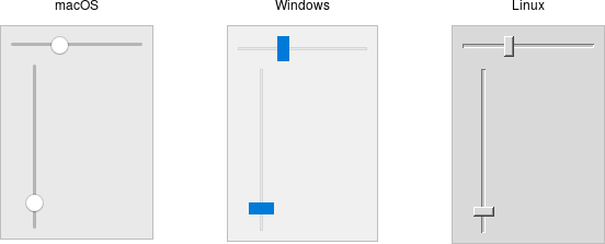 |
Scale widgets are created using the add_ttk_scale method:
#![allow(unused)]
fn main() {
parent.add_ttk_scale( "s"
    -orient("horizontal") -length("200") -from("1.0") -to("100.0") )?;
}
The orient option may be either horizontal or vertical. The length
option, which represents the longer axis of either horizontal or vertical
scales, is specified in screen units (e.g., pixels). You should also define the
range of the number that the scale allows users to choose; to do this, set a
floating-point number for each of the from and to configuration options.
There are several different ways you can set the current value of the scale
(which must be a floating-point value between the from and to values). You
can set (or read, to get the current value) the scale's value configuration
option. You can link the scale to a variable using the variable option. Or,
you can call the scale's set( value ) method to change the value, or the
get() method to read the current value.
A command configuration option lets you specify a script to call whenever the
scale is changed. Tk will append the current value of the scale as a parameter
each time it calls this script (we saw a similar thing with extra parameters
being added to scrollbar callbacks).
// cargo run --example scale

use std::os::raw::c_double;
use tcl::*;
use tk::*;
use tk::cmd::*;

fn main() -> TkResult<()> {
    let tk = make_tk!()?;
    let root = tk.root();

    // label tied to the same variable as the scale, so auto-updates
    root.add_ttk_label( "auto" -textvariable("num") )?
        .grid( -column(0) -row(0) -sticky("we") )?;

    // label that we'll manually update via the scale's command callback
    let manual = root.add_ttk_label( "manual" )?
        .grid( -column(0) -row(1) -sticky("we") )?;

    let scale =
        root.add_ttk_scale( "scale"
            -orient(   "horizontal" )
            -length(   "200"        )
            -from(     1.0          )
            -to(       100.0        )
            -variable( "num"        )
            -command( tclosure!( tk, |val: c_double| -> TkResult<()> {
                Ok( manual.configure( -text( format!( "Scale at {}", val )))? )
            }))
        )?
       .grid( -column(0) -row(2) -sticky("we") )?;

    scale.set( 20.0 )?;

    Ok( main_loop() )
}
As with other themed widgets, you can use the state( TkState::Disabled ),
state( !TkState::Disabled ), and instate( TkState::Disabled ) methods to
prevent users from modifying the scale.
As the scale widget does not display the actual values, you may want to add those separately, e.g., using label widgets.
Spinbox
A spinbox widget allows users to choose numbers (or, in fact, items from an arbitrary list). It does this by combining an entry-like widget showing the current value with a pair of small up/down arrows, which can be used to step through the range of possible choices.
| Spinbox widgets |
|---|
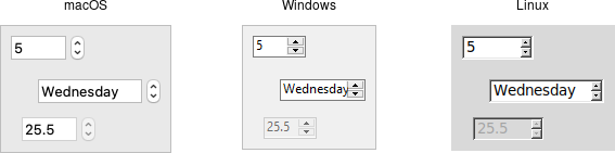 |
Spinbox widgets are created using the add_ttk_spinbox method:
#![allow(unused)]
fn main() {
parent.add_ttk_spinbox( "s" -from(1.0) -to(100.0) -textvariable("spinval") )?;
}
Like scale widgets, spinboxes let users choose a number between a certain range
(specified using the from and to configuration options), though through a
very different user interface. You can also specify an increment, which
controls how much the value changes every time you click the up or down button.
Like a listbox or combobox, spinboxes can also be used to let users choose an
item from an arbitrary list of strings; these can be specified using the
values configuration option. This works in the same way it does for
comboboxes; specifying a list of values will override to from and to
settings.
In their default state, spinboxes allow users to select values either via the up
and down buttons, or by typing them directly into the entry area that displays
the current value. If you'd like to disable the latter feature, so that only the
up and down buttons are available, you can set the TtkState::ReadOnly state
flag.
#![allow(unused)]
fn main() {
s.set_state( TtkState::ReadOnly )?;
}
Like other themed widgets, you can also disable spinboxes, via the
TtkState::Disabled state flag, or check the state via the instate method.
Spinboxes also support validation in the same manner as entry widgets, using the
validate and validatecommand configuration options.
You might be puzzled about when to choose a scale, listbox, combobox, entry, or a spinbox. Often, several of these can be used for the same types of data. The answer really depends on what you want users to select, platform user interface conventions, and the role the value plays in your user interface.
For example, both a combobox and a spinbox take up fairly small amounts of space compared with a listbox. They might make sense for a more peripheral setting. A more primary and prominent choice in a user interface may warrant the extra space a listbox occupies. Spinboxes don't make much sense when items don't have a natural and obvious ordering to them. Be careful about putting too many items in both comboboxes and spinboxes. This can make it more time consuming to select an item.
There is a boolean wrap option that determines whether the value should wrap
around when it goes beyond the starting or ending values. You can also specify a
width for the entry holding the current value of the spinbox.
Again there are choices as to how to set or get the current value in the
spinbox. Normally, you would specify a linked variable with the textvariable
configuration option. As usual, any changes to the variable are reflected in the
spinbox, while any changes in the spinbox are reflected in the linked variable.
As well, the set( value ) and get() methods allow you to set or get the
value directly.
Spinboxes generate virtual events when users press up
(event::virtual_event("Increment")) or down
(event::virtual_event("Decrement")). A command configuration option allows
you to provide a callback that is invoked on any changes.
Run Example
cargo run --example spinbox
Progressbar
A progressbar widget provides feedback to users about the progress of a lengthy operation.
In situations where you can estimate how long the operation will take to complete, you can display what fraction has already been completed. Otherwise, you can indicate the operation is continuing, but without suggesting how much longer it will take.
| Progressbar widgets |
|---|
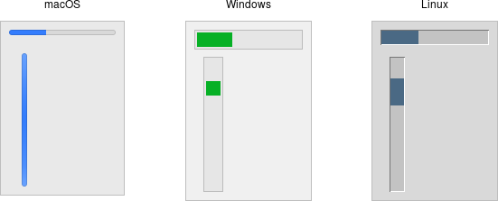 |
Progressbar widgets are created using the addttk_progressbar method:
#![allow(unused)]
fn main() {
parent.add_ttk_progressbar( -orient("horizontal") -length(200) -mode("determinate") )?;
}
As with scale widgets, they should be given an orientation (horizontal or
vertical) with the orient configuration option, and can be given an optional
length. The mode configuration option can be set to either determinate,
where the progressbar will indicate relative progress towards completion, or to
indeterminate, where it shows that the operation is still continuing but
without showing relative progress.
Determinate Progress
To use determinate mode, estimate the total number of "steps" the operation will
take to complete. This could be an amount of time but doesn't need to be.
Provide this to the progressbar using the maximum configuration option. It
should be a floating-point number and defaults to 100.0 (i.e., each step is
1%).
As you proceed through the operation, tell the progressbar how far along you are
with the value configuration option. So this would start at 0, and then count
upwards to the maximum value you have set.
There are two slight variations on this. First, you can just store the current value for the progressbar in a variable linked to it by the progressbar's
variableconfiguration option; that way, when you change the variable, the progressbar will update. The other alternative is to call the progressbar'sstep( amount )method. This increments the value by the given amount.
Indeterminate Progress
Use indeterminate mode when you can't easily estimate how far along in a
long-running task you actually are. However, you still want to provide feedback
that the operation is continuing (and that your program hasn't crashed). At the
start of the operation you'll just call the progressbar's start method. At the
end of the operation, call its stop method. The progressbar will take care of
the rest.
Unfortunately, "the progressbar will take care of the rest" isn't quite so
simple. In fact, if you start the progressbar, call a function that takes
several minutes to complete, and then stop the progressbar, your program will
appear frozen the whole time, with the progressbar not updating. In fact, it
will not likely appear onscreen at all. Yikes!
To learn why that is, and how to address it, the next chapter takes a deeper dive into Tk's event loop.
Run Example
cargo run --example progressbar
Event Loop
At the end of the last chapter, we explained how to use a progressbar to provide
feedback to users about long-running operations. The progressbar itself was
simple: call it's start method, perform your operation, and then call it's
stop method. Unfortunately, you learned that if you tried this, your application
will most likely appear completely frozen.
To understand why, we need to revisit our discussion of event handling, way back in the Tk Concepts chapter. As we've seen, after we construct an application's initial user interface, it enters the Tk event loop. In the event loop, it continually processes events, pulled from the system event queue, usually dozens of times a second. It watches for mouse or keyboard events, invoking command callbacks and event bindings as needed.
Less obviously, all screen updates are processed only in the event loop. For example, you may change the text of a label widget. However, that change doesn't appear onscreen immediately. Instead, the widget notifies Tk that it needs to be redrawn. Later on, in between processing other events, Tk's event loop will ask the widget to redraw itself. All drawing occurs only in the event loop. The change appears to happen immediately because the time between making the change to the widget and the actual redraw in the event loop is so small.
| Event loop showing application callbacks and screen updates |
|---|
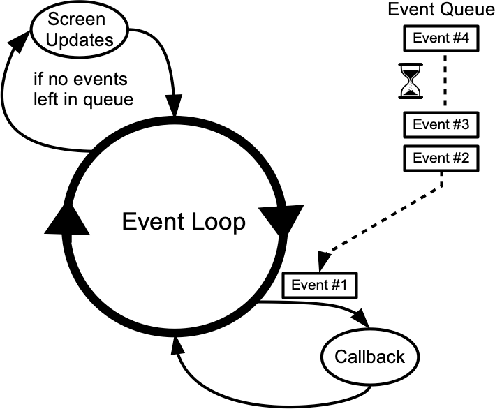 |
Blocking the Event Loop
Where you run into problems is when the event loop is prevented from processing events for a lengthy period of time. Your application won't redraw or respond to events and will appear to be frozen. The event loop is said to be blocked. How can this happen?
Let's start by visualizing the event loop as an execution timeline. In a normal situation, each deviation from the event loop (callback, screen update) takes only a fraction of a second before returning control to the event loop.
| Execution timeline for well-behaved event loop |
|---|
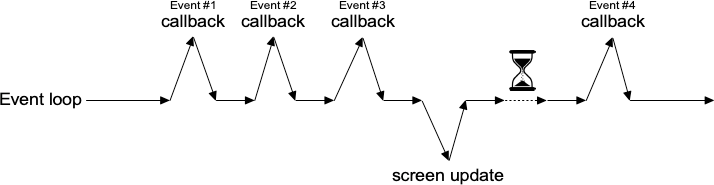 |
In our scenario, the whole thing probably got started from an event like a user pressing a button. So the event loop calls our application code to handle the event. Our code creates the progressbar, performs the (lengthy) operations, and stops the progressbar. Only then does our code return control back to the event loop. No events have been processed in the meantime. No screen redrawing has occurred. They've just been piling up in the event queue.
| Lengthy callback blocking the event loop |
|---|
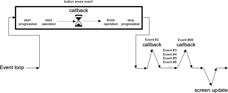 |
To prevent blocking the event loop, it's essential that event handlers execute quickly and return control back to the event loop.
If you do have a long-running operation to perform, or anything like network I/O that could potentially take a long time, there are a few different approaches you can take.
For the more technically-inclined, Tk uses a single-threaded, event-driven programming model. All the GUI code, the event loop, and your application run within the same thread. Because of this, any calls or computations that block event handlers are highly discouraged. Some other GUI toolkits use different models that allow for blocking code, runs the GUI and event handlers in separate threads from application code, etc. Attempting to shoehorn these models into Tk can be a recipe for frustration and lead to fragile and hacky code. If you respect Tk's model rather than try to fight with it, you won't run into problems.
One Step at a Time
If possible, the very best thing you can do is break your operation into very small steps, each of which can execute very quickly. You let the event loop be responsible for when the next step occurs. That way, the event loop continues to run, processing regular events, updating the screen, and, in between all that, calling your code to perform the next step of the operation.
To do this, we make use of timer events. Our program can ask the event loop to generate one of these events at some time in the future. As part of its regular work, when the event loop reaches that time, it will call back into our code to handle the event. Our code would perform the next step of the operation. It then schedules another timer event for the next step of the operation and immediately returns control back to the event loop.
| Breaking up a large operation into small steps tied together with timer events |
|---|
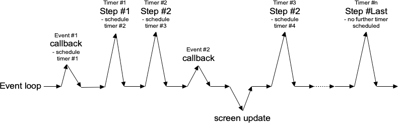 |
Tcl's after command can be used to generate timer events. You provide the
number of milliseconds to wait until the event should be fired. It may happen
later than that if Tk is busy processing other events but won't happen before
that. You can also ask that an idle event be generated; it will fire when no
other events in the queue need to be processed. (Tk's screen updates and redraws
occur in the context of idle events.) You can find more details on after in
the reference manual.
In the following example, we'll perform a long operation that is broken up into 20 small steps. While this operation is being performed, we'll update a progressbar, and also allow users to interrupt the operation.
In the following example, we'll perform a long operation that is broken up into 20 small steps. While this operation is being performed, we'll update a progressbar, and also allow users to interrupt the operation.
// cargo run --example one_step_at_a_time

use std::os::raw::c_int;
use tcl::*;
use tk::*;
use tk::cmd::*;

fn main() -> TkResult<()> {
    let tk = make_tk!()?;
    let root = tk.root();

    let f = root.add_ttk_frame( "f" )?
        .grid(())?;
    let f_b = f.add_ttk_button( "b" -text("Start!") )?
        .grid( -column(1) -row(0) -padx(5) -pady(5) )?;
    let f_l = f.add_ttk_label( "l" -text("No Answer") )?
        .grid( -column(0) -row(0) -padx(5) -pady(5) )?;
    let f_p = f.add_ttk_progressbar( "p" -orient("horizontal") -mode("determinate") -maximum(20) )?
        .grid( -column(0) -row(1) -padx(5) -pady(5) )?;

    tclfn!( tk, fn stop() -> TkResult<()> {
        tcl_interp!().set( "interrupt", 1 );
        Ok(())
    });

    tclosure!( tk, cmd: "result", |answer: String| -> TkResult<()> {
        f_p.configure( -value(0) )?;
        f_b.configure( -text("Start!") -command("start") )?;
        f_l.configure( -text({
            if answer.is_empty() {
                "No Answer".to_owned()
            } else {
                format!( "Answer: {}", answer )
            }
        }))?;
        Ok(())
    });

    tclosure!( tk, cmd: "step", |count: c_int| ->TkResult<()> {
        let interp = tcl_interp!();

        f_p.configure( -value(count) )?;
        if interp.get_boolean("interrupt")? {
            interp.eval( "result {}" )?;
            return Ok(());
        }
        interp.after_ms( 100 )?; // next step in our operation; don't take too long!

        if count == 20 {
            interp.eval( "result 42" )?;
            return Ok(());  // done!
        }

        interp.after( 100, ( tclosure!( tk, || -> TkResult<()> {
            tcl_interp!().eval(( "step", count+1 ))?;
            Ok(())
        }), ))?;

        Ok(())
    });

    f_b.configure( -command( tclosure!( tk, cmd:"start", || -> TkResult<()> {
        f_b.configure( -text("Stop") -command("stop") )?;
        f_l.configure( -text("Working...") )?;
        let interp = tcl_interp!();
        interp.set( "interrupt", 0 );
        interp.set( "count", 1 );
        interp.after( 1, ( "step 0", ))?;
        Ok(())
    })))?;

    Ok( main_loop() )
}
Asynchronous I/O
Timer events take care of breaking up a long-running computation, where you know that each step can be guaranteed to complete quickly so that your handler will return to the event loop. What if you have an operation that may not complete quickly? This can happen when you make a variety of calls to the operating system. The most common is when we're doing some kind of I/O, whether writing a file, communicating with a database, or retrieving data from a remote web server.
Most I/O calls are blocking. They don't return until the operation completes (or fails). What we want to use instead are non-blocking or asynchronous I/O calls. When you make an asynchronous I/O call, it returns immediately, before the operation is completed. Your code can continue running, or in this case, return back to the event loop. Later on, when the I/O operation completes, your program is notified and can process the result of the I/O operation.
If this sounds like treating I/O as another type of event, you're exactly right. In fact, it's also called event-driven I/O.
Threads or Processes
Sometimes it's either impossible or impractical to break up a long-running computation into discrete pieces that each run quickly. Or you may be using a library that doesn't support asynchronous operations. Or, like Python's asyncio, it doesn't play nice with Tk's event loop. In cases like these, to keep your Tk GUI responsive, you'll need to move those time-consuming operations or library calls out of your event handlers and run them somewhere else. Threads, or even other processes, can help with that.
Running tasks in threads, communicating with them, etc., is beyond the scope of this tutorial. However, there are some restrictions on using Tk with threads that you should be aware of. The main rule is that you must only make Tk calls from the thread where you loaded Tk.
It can be even more complicated. The Tcl/Tk libraries can be built either with
or without thread support. If you have more than one thread in your application,
make sure you're running in a threaded build. If you're unsure, check the Tcl
variable tcl_platform(threaded); it should be 1, not 0.
Most everyone should be running threaded builds. The ability to create non-threaded builds in Tcl/Tk is likely to go away in future. If you're using a non-threaded build with threaded code, consider this a bug in your application, not a challenge to make it work.
Nested Event Processing
The previous three approaches are the correct ways to handle long-running operations while still keeping you Tk GUI responsive. What they have in common is a single event loop that continuously processes events of all kinds. That event loop will call event handlers in your application code, which do their thing and quickly return.
There is one other way. Within your long-running operation, you can invoke the
event loop to process a bunch of events. You can do this with a single command,
update. There's no messing around with timer events or asynchronous I/O.
Instead, you just sprinkle some update calls throughout your operation. If you
want to only keep the screen redrawing but not process other events, there's
even an option for that (update_idletasks).
This approach is seductively easy. And if you're lucky, it might work. At least for a little while. But sooner or later, you're going to run into serious difficulties trying to do things that way. Something won't be updating, event handlers aren't getting called that should be, events are going missing or being fired out of order, or worse. You'll turn your program's logic inside out and tear your hair out trying to make it work again.
When you use
update, you're not returning control back to the running event loop. You're effectively starting a new event loop nested within the existing one. Remember, the event loop follows a single thread of execution: no threads, no coroutines. If you're not careful, you're going to end up with event loops called from within event loops called from... well, you get the idea. If you even realize you're doing this, unwinding the event loops (each of which may have different conditions to terminate it) will be an interesting exercise. The reality won't match with your mental model of a simple event loop dispatching events one at a time, independent of every other event. It's a classic example of fighting against Tk's model. In very specific circumstances, it's possible to make it work. In practice, you're asking for trouble. Don't say you haven't been warned...
| Nested event loops... this way madness lies |
|---|
 |
Menus
This chapter describes how to handle menubars and popup menus in Tk. For a polished application, these are areas you particularly want to pay attention to. Menus need special care if you want your application to fit in with other applications on your users' platform.
Speaking of which, the recommended way to figure out which platform you're running on is:
#![allow(unused)]
fn main() {
tk.windowingsystem()?.to_string();  // returns "x11", "win32" or "aqua"
}
This is more useful than examining global variables like
tcl_platformorsys.platform, and older checks that used these methods should be reviewed. While in the olden days, there was a pretty good correlation between platform and windowing system, it's less true today. For example, if your platform is identified as Unix, that might mean Linux under X11, macOS under Aqua, or even macOS under X11.
Menubars
In this section, we'll look at menubars: how to create them, what goes in them, how they're used, etc.
Properly designing a menubar and its set of menus is beyond the scope of this tutorial. However, if you're creating an application for someone other than yourself, here is a bit of advice. First, if you find yourself with many menus, very long menus, or deeply nested menus, you may need to rethink how your user interface is organized. Second, many people use the menus to explore what the program can do, particularly when they're first learning it, so try to ensure major features are accessible by the menus. Finally, for each platform you're targeting, become familiar with how applications use menus, and consult the platform's human interface guidelines for full details about design, terminology, shortcuts, and much more. This is an area you will likely have to customize for each platform.
| Menubars |
|---|
 |
You'll notice on some recent Linux distributions that many applications show their menus at the top of the screen when active, rather than in the window itself. Tk does not yet support this style of menus.
Menu Widgets and Hierarchy
Menus are implemented as widgets in Tk, just like buttons and entries. Each menu widget consists of a number of different items in the menu. Items have various attributes, such as the text to display for the item, a keyboard accelerator, and a command to invoke.
Menus are arranged in a hierarchy. The menubar is itself a menu widget. It has several items ("File," "Edit," etc.), each of which is a submenu containing more items. These items can include things like the "Open..." command in a "File" menu, but also separators between other items. It can even have items that open up their own submenu (so-called cascading menus). As you'd expect from other things you've seen already in Tk, anytime you have a submenu, it must be created as a child of its parent menu.
Menus are part of the classic Tk widgets; there is not presently a menu in the themed Tk widget set.Menus are implemented as widgets in Tk, just like buttons and entries. Each menu widget consists of a number of different items in the menu. Items have various attributes, such as the text to display for the item, a keyboard accelerator, and a command to invoke.
Menus are arranged in a hierarchy. The menubar is itself a menu widget. It has several items ("File," "Edit," etc.), each of which is a submenu containing more items. These items can include things like the "Open..." command in a "File" menu, but also separators between other items. It can even have items that open up their own submenu (so-called cascading menus). As you'd expect from other things you've seen already in Tk, anytime you have a submenu, it must be created as a child of its parent menu.
Menus are part of the classic Tk widgets; there is not presently a menu in the themed Tk widget set.
Before you Start
It's essential to put the following line in your application somewhere before you start creating menus.
#![allow(unused)]
fn main() {
tk.option_add( "*tearOff", 0 )?;
}
Without it, each of your menus (on Windows and X11) will start with what looks like a dashed line and allows you to "tear off" the menu, so it appears in its own window. You should eliminate tear-off menus from your application as they're not a part of any modern user interface style.
This is a throw-back to the Motif-style X11 that Tk's original look and feel were based on. Get rid of them unless your application is designed to run only on that old box collecting dust in the basement. We'll all look forward to a future version of Tk where this misguided paean to backward compatibility is removed.
While on the topic of ancient history, the
option_addbit uses the option database. On X11 systems, this provided a standardized way to customize certain elements of user interfaces through text-based configuration files. It's no longer used today. Older Tk programs may use theoptioncommand internally to separate style configuration options from widget creation code. This all pre-dated themed Tk styles, which should be used for that purpose today. However, it's somehow fitting to use the obsolete option database to automatically remove the obsolete tear-off menus.
Creating a Menubar
In Tk, menubars are associated with individual windows; each toplevel window can have at most one menubar. On Windows and many X11 window managers, this is visually obvious, as the menus are part of each window, sitting just below the title bar at the top.
On macOS, though, there is a single menubar along the top of the screen, shared by each window. As far as your Tk program is concerned, each window still does have its own menubar. As you switch between windows, Tk ensures that the correct menubar is displayed. If you don't specify a menubar for a particular window, Tk will use the menubar associated with the root window; you'll have noticed by now that this is automatically created for you when your Tk application starts.
Because all windows have a menubar on macOS, it's important to define one, either for each window or a fallback menubar for the root window. Otherwise, you'll end up with the "built-in" menubar, which contains menus that are only intended for typing commands directly into the interpreter.Because all windows have a menubar on macOS, it's important to define one, either for each window or a fallback menubar for the root window. Otherwise, you'll end up with the "built-in" menubar, which contains menus that are only intended for typing commands directly into the interpreter.
To create a menubar for a window, first, create a menu widget. Then, use the
window's menu configuration option to attach the menu widget to the window.
#![allow(unused)]
fn main() {
let win = root.add_toplevel(())?;
let menubar = win.add_menu(())?;
win.configure( -menu(menubar) )?;
}
You can use the same menubar for more than one window. In other words, you can specify the same menubar as the
menuconfiguration option for several toplevel windows. This is particularly useful on Windows and X11, where you may want a window to include a menu, but don't necessarily need to juggle different menus in your application. However, if the contents or state of menu items depends on what's going on in the active window, you'll have to manage this yourself.
This is truly ancient history, but menubars used to be implemented by creating a frame widget containing the menu items and packing it into the top of the window like any other widget. Hopefully, you don't have any code or documentation that still does this.
Adding Menus
We now have a menubar, but that's pretty useless without some menus to go in it. So again, we'll create a menu widget for each menu, each one a child of the menubar. We'll then add them all to the menubar.
#![allow(unused)]
fn main() {
let menu_file = menubar.add_menu(())?;
let menu_edit = menubar.add_menu(())?;
menubar.add_cascade( -menu(menu_file) -label("File") )?;
menubar.add_cascade( -menu(menu_edit) -label("Edit") )?;
}
The
add_cascademethod adds a menu item, which itself is a menu (a submenu).
Adding Menu Items
Now that we have a couple of menus in our menubar, we can add a few items to each menu.
Command Items
Regular menu items are called command items in Tk. We'll see some other types
of menu items shortly. Notice that menu items are part of the menu itself; we
don't have to create a separate menu widget for each one (submenus being the
exception).
#![allow(unused)]
fn main() {
menu_file.add_command( -label("New")     -command("newFile")   )?;
menu_file.add_command( -label("Open...") -command("openFile")  )?;
menu_file.add_command( -label("Close")   -command("closeFile") )?;
}
On macOS, the ellipsis ("...") is actually a special character, more tightly spaced than three periods in a row. Tk takes care of substituting this character for you automatically.
Each menu item has associated with it several configuration options, analogous
to widget configuration options. Each type of menu item has a different set of
available options. Cascade menu items have a menu option used to specify the
submenu, command menu items have a command option to specify the command to
invoke when the item is chosen. Both have a label option to specify the text
to display for the item.
Submenus
We've already seen cascade menu items used to add a menu to a menubar. Not
surprisingly, if you want to add a submenu to an existing menu, you also use a
cascade menu item in exactly the same way. You might use this to build a
"recent files" submenu, for example.
#![allow(unused)]
fn main() {
let menu_recent = menu_file.add_menu(())?;
menu_file.add_cascade( -menu(menu_recent) -label("Open Recent") )?;
for f in recent_files {
    let f = PathBuf::from(f);
    if let Some( file_name ) = f.file_name() {
        menu_recent.add_command(
            -label( file_name.to_str() )
            -command(( "openFile", f ))
        )?;
    }
}
}
Separators
A third type of menu item is the separator, which produces the dividing line
you often see between different menu items.
#![allow(unused)]
fn main() {
menu_file.add_separator(())?;
}
Checkbutton and Radiobutton Items
Finally, there are also checkbutton and radiobutton menu items that behave
analogously to checkbutton and radiobutton widgets. These menu items have a
variable associated with them. Depending on its value, an indicator (i.e.,
checkmark or selected radiobutton) may be shown next to its label.
#![allow(unused)]
fn main() {
menu_file.add_checkbutton( -label("Check") -variable("check") -onvalue(1) -offvalue(0) )?;
menu_file.add_radiobutton( -label("One")   -variable("radio") -value(1) )?;
menu_file.add_radiobutton( -label("Two")   -variable("radio") -value(2) )?;
}
When a user selects a checkbutton item that is not already checked, it sets the
associated variable to the value in onvalue. Selecting an item that is already
checked sets it to the value in offvalue. Selecting a radiobutton item sets
the associated variable to the value in value. Both types of items also react
to any changes you make to the associated variable.
Like command items, checkbutton and radiobutton menu items support a command
configuration option that is invoked when the menu item is chosen. The
associated variable and the menu item's state are updated before the callback is
invoked.
Radiobutton menu items are not part of the Windows or macOS human interface guidelines. On those platforms, the item's indicator is a checkmark, as it would be for a checkbutton item. The semantics still work. It's a good way to select between multiple items since it will show one of them selected (checked).
Manipulating Menu Items
As well as adding items to the end of menus, you can also insert them in the
middle of menus via the insert_{type}( index, opts ) method; here index is the
position (0..n-1) of the item you want to insert before. You can also delete one
or more menu items susing the delete( index ) or delete_range( index )
methods.
#![allow(unused)]
fn main() {
menu_recent.delete_range( 0.. )?;
}
Like most everything in Tk, you can look at or change the value of an item's options at any time. Items are referred to via an index. Usually, this is a number (0..n-1) indicating the item's position in the menu. You can also specify the label of the menu item (or, in fact, a "glob-style" pattern to match against the item's label).
#![allow(unused)]
fn main() {
println!( "{}", menu_file.entrycget( 0, label )? ); // get label of top entry in menu
println!( "{}", menu_file.entryconfigure_options(0)? ); // show all options for an item
}
State
You can disable a menu item so that users cannot select it. This can be done via
the state option, setting it to the value disabled. Use a value of normal
to re-enable the item.
Menus should always reflect the current state of your application. If a menu item is not presently relevant (e.g., the "Copy" item is only applicable if something in your application is selected), you should disable it. When your application state changes so that the item is applicable, make sure to enable it.
#![allow(unused)]
fn main() {
menu_file.entryconfigure( menu::Index::pattern("Close") -state("disabled") )?;
}
Sometimes you may have menu items whose name changes in response to application state changes, rather than the menu item being disabled. For example, A web browser might have a menu item that changes between "Show Bookmarks" and "Hide Bookmarks" as a bookmarks pane is hidden or displayed.
#![allow(unused)]
fn main() {
bookmarks.entryconfigure( 3, -label("Hide Bookmarks") )?;
}
As your program grows complex, it's easy to miss enabling or disabling some items. One strategy is to centralize all the menu state changes in one routine. Whenever there is a state change in your application, it should call this routine. It will examine the current state and update menus accordingly. The same code can also handle toolbars, status bars, or other user interface components.
Accelerator Keys
The accelerator option is used to indicate a keyboard equivalent that
corresponds to a menu item. This does not actually create the accelerator, but
only displays it next to the menu item. You still need to create an event
binding for the accelerator yourself.
Remember that event bindings can be set on individual widgets, all widgets of a certain type, the toplevel window containing the widget you're interested in, or the application as a whole. As menu bars are associated with individual windows, the event bindings you create will usually be on the toplevel window the menu is associated with.
Accelerators are very platform-specific, not only in terms of which keys are
used for what operation, but what modifier keys are used for menu accelerators
(e.g., on macOS, it is the "Command" key, on Windows and X11, it is usually the
"Control" key). Examples of valid accelerator options are Command-N,
Shift+Ctrl+X, and Command-Option-B. Commonly used modifiers include
Control, Ctrl, Option, Opt, Alt, Shift, "Command, Cmd, and
Meta.
On macOS, modifier names are automatically mapped to the different modifier icons that appear in menus, i.e.,
Shift⇒ ⇧,Command⇒ ⌘,Control⇒ ⌃, andOption⇒ ⌥.
#![allow(unused)]
fn main() {
edit.entryconfigure( menu::Index::pattern("Paste"), -accelerator("Command+V") )?;
}
Underline
All platforms support keyboard traversal of the menubar via the arrow keys. On
Windows and X11, you can also use other keys to jump to particular menus or menu
items. The keys that trigger these jumps are indicated by an underlined letter
in the menu item's label. To add one of these to a menu item, use the
underline configuration option for the item. Its value should be the index of
the character you'd like underlined (from 0 to the length of the string - 1).
Unlike with accelerator keys, the menu will watch for the keystroke, so no
separate event binding is needed.
#![allow(unused)]
fn main() {
menubar.add_command( -label("Path Browser") -underline(5) )?; // underline "B"
}
Images
It is also possible to use images in menu items, either beside the menu item's
label, or replacing it altogether. To do this, use the image and compound
options, which work just like in label widgets. The value for image must be a
Tk image object, while compound can have the values bottom, center,
left, right, top, or none.
Menu Virtual Events
Platform conventions for menus suggest standard menus and items that should be
available in most applications. For example, most applications have an "Edit"
menu, with menu items for "Copy," "Paste," etc. Tk widgets like entry or text
will react appropriately when those menu items are chosen. But if you're
building your own menus, how do you make that work? What command would you
assign to a "Copy" menu item?
Tk handles this with virtual events. As you'll recall from the Tk Concepts chapter, these are high-level application events, as opposed to low-level operating system events. Tk's widgets will watch for specific events. When you build your menus, you can generate those events rather than directly invoking a callback function. Your application can create event bindings to watch for those events too.
Some developers create virtual events for every item in their menus. They generate those events instead of calling routines in their own code directly. It's one way of splitting off your user interface code from the rest of your application. Remember that even if you do this, you'll still need code that enables and disables menu items, adjusts their labels, etc. in response to application state changes.
Here's a minimal example showing how we'd add two items to an "Edit" menu, the standard "Paste" item, and an application-specific "Find..." item that will open a dialog to find or search for something. We'll include an entry widget so that we can check that "Paste" works.
#![allow(unused)]
fn main() {
let _e = root.add_ttk_entry(())?;
let m = root.add_menu(())?;
let m_edit = m.add_menu( "edit" )?;
m.add_cascade( -menu(m_edit) -label("Edit") )?;
m_edit.add_command( -label("Paste")
    -command( tclosure!( tk, || -> TkResult<()> {
        Ok( tk.focus()?.event_generate( event::virtual_event("Paste"), () )? )})))?;
m_edit.add_command( -label("Find...")
    -command( tclosure!( tk, || -> TkResult<()> {
        Ok( root.event_generate( event::virtual_event("OpenFindDialog"), () )? )})))?;
root.configure( -menu(m) )?;

root.bind( event::virtual_event("OpenFindDialog"), tclosure!( tk, || -> TkResult<String> {
    Ok( tk.message_box( -message("I hope you find what you're looking for!") )? )
}))?;
}
When you generate a virtual event, you need to specify the widget that the event should be sent to. We want the "Paste" event to be sent to the widget with the keyboard focus (usually indicated by a focus ring). You can determine which widget has the keyboard focus using the
focuscommand. Try it out, choosing the Paste item when the window is first opened (when there's no focus) and after clicking on the entry (making it the focus). Notice the entry handles theevent::virtual_event("Paste")itself. There's no need for us to create an event binding.
The
event::virtual_event("OpenFindDialog")event is sent to the root window, which is where we create an event binding. If we had multiple toplevel windows, we'd send it to a specific window.
Tk predefines the following virtual events:
event::virtual_event("Clear")event::virtual_event("Copy")event::virtual_event("Cut")event::virtual_event("Paste")event::virtual_event("PasteSelection")event::virtual_event("PrevWindow")event::virtual_event("Redo")event::virtual_event("Undo").
For additional information, see the event mod.
Construct all menus in one statement
The tk crate provides add_menus(), a convenient API to construct all menus in
one place:
#![allow(unused)]
fn main() {
let win = root.add_toplevel(())?;
let created_widgets = win.add_menus( "menubar"
    -menu::cascade( "file" -label("File")
        -menu::command( -label("New")       -command("newFile") )
        -menu::command( -label("Open...")   -command("openFile") )
        -menu::command( -label("Close")     -command("closeFile") )
        -menu::cascade( "recent" -label("Open Recent") )
        -menu::separator( no_arg() )
        -menu::checkbutton( -label("Check") -variable("check") -onvalue(1) -offvalue(0) )
        -menu::radiobutton( -label("One")   -variable("radio") -value(1) )
        -menu::radiobutton( -label("Two")   -variable("radio") -value(2) )
    )
)?;
}
See add_menus example for more.
Run Example
cargo run --example menu
cargo run --example add_menus
Platform Menus
Each platform has a few menus in every menubar that are handled specially by Tk.
macOS
You've probably noticed that Tk on macOS supplies its own default menubar. It includes a menu named after the program being run (in this case, your programming language's shell, e.g., "Wish", "Python", etc.), a File menu, and standard Edit, Windows, and Help menus, all stocked with various menu items.
You can override this menubar in your own program, but to get the results you want, you'll need to follow some particular steps (in some cases, in a particular order).
Starting at Tk 8.5.13, the handling of special menus on macOS changed due to the underlying Tk code migrating from the obsolete Carbon API to Cocoa. If you're seeing duplicate menu names, missing items, things you didn't put there, etc., review this section carefully.
The first thing to know is that if you don't specify a menubar for a window (or its parent window, e.g., the root window), you'll end up with the default menubar Tk supplies, which unless you're just mucking around on your own, is almost certainly not what you want.
The Application Menu
Every menubar starts with the system-wide apple icon menu. To the right of that
is a menu for the frontmost application. It is always named after the binary
being run. If you do supply a menubar, at the time the menubar is attached to
the window, if there is not a specially named .apple menu (see below), Tk will
provide its default application menu. It will contain an "About Tcl & Tk" item,
followed by the standard menu items: preferences, the services submenu,
hide/show items, and quit. Again, you don't want this.
If you supply your own .apple menu, when the menubar is attached to the
window, Tk will add the standard items (preferences and onward) onto the end of
any items you have added. Perfect! Items you add after the menubar is attached
to the window will appear after the quit item, which, again, you don't want.
The application menu, which we're dealing with here, is distinct from the apple menu (the one with the apple icon, just to the left of the application menu). Despite that, we really mean the application menu, even though Tk still refer to it as the "apple" menu. This is a holdover from pre-OS X days when these sorts of items did go in the actual apple menu, and there was no separate application menu.
So, in other words, in your program, make sure you:
-
Create a menubar for each window or the root window. Do not attach the menubar to the window yet!
-
Add a menu to the menubar named .apple. It will be used as the application menu.
-
The menu will automatically be named the same as the application binary; if you want to change this, rename (or make a copy of) the binary used to run your script.
-
Add the items you want to appear at the top of the application menu, i.e., an "About yourapp" item, followed by a separator.
-
After you have done all this, you can then attach the menubar to your window via the window's menu configuration option.
#![allow(unused)]
fn main() {
let win = root.add_toplevel("win")?;
let menubar = win.add_menu("menubar")?;
let apple = menubar.add_menu("apple")?;
menubar.add_cascade( -menu(apple) )?;
apple.add_command( -label("About My Application") )?;
apple.add_separator(())?;
win.configure( -menu(menubar) )?;
}
The pathname of the application menu must be .apple.
Handling the Preferences Menu Item
As you've noticed, the application menu always includes a "Preferences..." menu item. If your application has a preferences dialog, this menu item should open it. If your application has no preferences dialog, this menu item should be disabled, which it is by default.
To hook up your preferences dialog, you'll need to define a Tcl procedure named
::tk::mac::ShowPreferences. This will be called when the Preferences menu item
is chosen; if the procedure is not defined, the menu item will be disabled.
#![allow(unused)]
fn main() {
tclosure!( tk, cmd: "tk::mac::ShowPreferences", || -> TkResult<()> {
    // show preferences
    Ok(())
});
}
Providing a Help Menu
Like the application menu, any help menu you add to your own menubar is treated
specially on macOS. As with the application menu that needed a special name
(.apple), the help menu must be given the name .help. Also, like the
application menu, the help menu should also be added before the menubar is
attached to the window.
The help menu will include the standard macOS search box to search help, as well
as an item named "yourapp Help." As with the name of the application menu, this
comes from your program's executable and cannot be changed. Similar to how
preferences dialogs are handled, to respond to this help item, you need to
define a Tcl procedure named ::tk::mac::ShowHelp. If this procedure is not
defined, it will not disable the menu item. Instead, it will generate an error
when the help item is chosen.
If you don't want to include help, don't add a help menu to the menubar, and none will be shown.
Unlike on X11 and earlier versions of Tk on macOS, the Help menu will not automatically be put at the end of the menubar, so ensure it is the last menu added.
You can also add other items to the help menu. These will appear after the application help item.
#![allow(unused)]
fn main() {
let menu_help = menubar.add_menu( "help" )?;
menubar.add_cascade( -menu(menu_help) -label("Help") )?;
tclosure!( tk, cmd: "::tk::mac::ShowHelp", || -> TkResult<()> {
    // show help
    Ok(())
});
}
Other Menu Handlers
You saw previously how handling certain standard menu items required you to
define Tcl callback procedures, e.g., tk::mac::ShowPreferences and
tk::mac::ShowHelp.
There are several other callbacks that you can define. For example, you might intercept the Quit menu item, prompting users to save their changes before quitting. Here is the complete list:
-
tk::mac::ShowPreferences:Called when the "Preferences..." menu item is selected.
-
tk::mac::ShowHelp:Called to display main online help for the application.
-
tk::mac::Quit:Called when the Quit menu item is selected, when a user is trying to shut down the system etc.
-
tk::mac::OnHide:Called when your application has been hidden.
-
tk::mac::OnShow:Called when your application is shown after being hidden.
-
tk::mac::OpenApplication:Called when your application is first opened.
-
tk::mac::ReopenApplication:Called when a user "reopens" your already-running application (e.g. clicks on it in the Dock)
-
tk::mac::OpenDocument:Called when the Finder wants the application to open one or more documents (e.g. that were dropped on it). The procedure is passed a list of pathnames of files to be opened.
-
tk::mac::PrintDocument:As with OpenDocument, but the documents should be printed rather than opened.
For additional information, see the tk_mac command reference.
Windows
On Windows, each window has a "System" menu at the top left of the window frame, with a small icon for your application. It contains items like "Close", "Minimize", etc. In Tk, if you create a system menu, you can add new items that will appear below the standard items.
#![allow(unused)]
fn main() {
menubar.add_cascade( -menu( menubar.add_menu( "system" )? ))?;
}
X11
On X11, if you create a help menu, Tk will ensure that it is always the last menu in the menubar.
#![allow(unused)]
fn main() {
menubar.add_cascade( -label("Help") -menu( menubar.add_menu("help")? ))?;
}
Run Example
cargo run --example platform_menus
Contextual Menus
Contextual menus ("popup" menus) are typically invoked by a right mouse button click on an object in the application. A menu pops up at the location of the mouse cursor. Users can then select an items from the menu (or click outside it to dismiss it without choosing any item).
To create a contextual menu, we'll use exactly the same commands we did to create menus in the menubar. Typically, we'd create one menu with several command items in it, and potentially some cascade menu items and their associated menus.
To activate the menu, users will perform a contextual menu click. We'll have to create an event binding to capture that click. That, however, can mean different things on different platforms. On Windows and X11, this is the right mouse button being clicked (the third mouse button). On macOS, this is either a click of the left (or only) button with the control key held down or a right-click on a multi-button mouse. Unlike Windows and X11, macOS refers to this as the second mouse button, not the third, so that's the event we'll see in our program.
Most earlier programs that have used popup menus assumed it was only "button 3" they needed to worry about.
Besides capturing the correct contextual menu event, we also need to capture the
mouse's location. It turns out we need to do this relative to the entire screen
(global coordinates) and not local to the window or widget you clicked on (local
coordinates). The %X and %Y substitutions in Tk's event binding system will
capture those for us.
The last step is simply to tell the menu to pop up at the particular location,
via the post method. Here's an example of the whole process, using a popup
menu on the application's main window.
// `cargo run --example contextual_menus`

use tcl::*;
use tk::*;
use tk::cmd::*;

fn main() -> TkResult<()> {
    let tk = make_tk!()?;
    let root = tk.root();

    let menu = root.add_menu(())?;
    for i in ["One", "Two", "Three"] {
        menu.add_command( -label(i) )?;
    }

    let handler = tclosure!( tk,
        |evt_rootx, evt_rooty| -> TkResult<()> {
            Ok( tk.popup( menu, evt_rootx, evt_rooty, None )? )
        }
    );

    use event::*;
    if tk.windowing_system()? == TkWindowingSystem::Aqua {
        root.bind( button_press_2(), &*handler )?;
        root.bind( control().button_press_1(), &*handler )?;
    } else {
        root.bind( button_press_3(), &*handler )?;
    }

    Ok( main_loop() )
}
Windows and Dialogs
Everything we've done up until now has been in a single window. In this chapter, we'll cover how to use multiple windows, changing various attributes of windows, and use some of the standard dialog boxes that are available in Tk.
Creating and Destroying Windows
We've seen that all Tk programs start out with a root toplevel window, and then widgets are created as children of that root window. Creating new toplevel windows works almost exactly the same as creating new widgets.
Toplevel windows are created using the toplevel method:
#![allow(unused)]
fn main() {
let window = parent.add_toplevel(())?;
}
Note: Toplevels are part of the classic Tk widgets, not the themed widgets.
Unlike regular widgets, we don't have to grid a toplevel for it to appear
onscreen. Once we've created a new toplevel, we can create other widgets as
children of that toplevel, and grid them inside the toplevel. The new toplevel
behaves exactly like the automatically created root window.
To destroy a window, use the destroy method:
#![allow(unused)]
fn main() {
tk.destroy( window )?;
}
Note that you can use destroy on any widget, not just a toplevel window. When
you destroy a window, all windows (widgets) that are children of that window are
also destroyed. Be careful! If you destroy the root window (that all other
widgets are descended from), that will terminate your application.
In a typical document-oriented application, we want to be able to close any windows while leaving the others open. In that case, we may want to create a new toplevel for every window, and not put anything directly inside the root window at all. While we can't just destroy the root window, we can remove it entirely from the screen using its
withdrawmethod, which we'll see shortly.
Window Behavior and Styles
There are lots of things about how windows behave and how they look that can be changed.
Window Title
To examine or change the title of the window:
#![allow(unused)]
fn main() {
let old_title = window.wm_title()?;
window.wm_title( "New title" )?;
}
The "wm" here stands for "window manager" which is an X11 term used for a program that manages all the windows onscreen, including their title bars, frames, and so on. What we're effectively doing is asking the window manager to change the title of this particular window for us. The same terminology has been carried over to Tk running on macOS and Windows.
Size and Location
Here is an example of changing the size and position. It places the window towards the top righthand corner of the screen:
#![allow(unused)]
fn main() {
window.set_wm_geometry( TkGeometry{ w: 300, h: 200, x: -5, y: 40 })?;
}
You can retrieve the current geometry using wm_geometry method. However, if
you try it immediately after changing the geometry, you'll find it doesn't
match. Remember that all drawing effectively occurs in the background, in
response to idle times via the event loop. Until that drawing occurs, the
internal geometry of the window won't be updated. If you do want to force things
to update immediately, you can.
#![allow(unused)]
fn main() {
tk.update_idletasks()?;
println!( "{}", window.wm_geometry()? );
}
We've seen that the window defaults to the size requested by the widgets that
are gridded into it. If we're creating and adding new widgets interactively in
the interpreter, or if our program adds new widgets in response to other events,
the window size adjusts. This behavior continues until either we explicitly
provide the window's geometry as above or a user resizes the window. At that
point, even if we add more widgets, the window won't change size. You'll want to
be sure you're using all of grid's features (e.g., sticky, weight) to make
everything fit nicely.
Resizing Behavior
By default, toplevel windows, including the root window, can be resized by
users. However, sometimes you may want to prevent users from resizing the
window. You can do this via the resizable method. It's first parameter
controls whether users can change the width, and the second if they can change
the height. So to disable all resizing:
#![allow(unused)]
fn main() {
window.set_wm_resizable( false, false )?;
}
If a window is resizable, you can specify a minimum and/or maximum size that you'd like the window's size constrained to (again, parameters are width and height):
#![allow(unused)]
fn main() {
window.set_wm_minsize( 200, 100 )?;
window.set_wm_maxsize( 500, 500 )?;
}
You saw earlier how to obtain the current size of the window via its geometry. Wondering how large it would be if you didn't specify its geometry, or a user didn't resize it? You can retrieve the window's requested size, i.e., how much space it requests from the geometry manager. Like with drawing, geometry calculations are only done at idle time in the event loop, so you won't get a useful response until the widget has appeared onscreen.
#![allow(unused)]
fn main() {
window.winfo_reqwidth()?; // or reqheight
}
You can use the
winfo_reqwidthandwinfo_reqheightmethods on any widget, not just toplevel windows. There are otherwinfo_*methods you can call on any widget, such as width and height, to get the actual (not requested) width and height. For more, see thewinfomod.
Intercepting the Close Button
Most windows have a close button in their title bar. By default, Tk will destroy the window if users click on that button. You can, however, provide a callback that will be run instead. A common use is to prompt the user to save an open file if modifications have been made.
#![allow(unused)]
fn main() {
unsafe { window.set_wm_protocol( "WM_DELETE_WINDOW", callback )?; }
}
The somewhat obscurely-named
WM_DELETE_PROTOCOLoriginated with X11 window manager protocols.
Transparency
Windows can be made partially transparent by specifying an alpha channel,
ranging from 0.0 (fully transparent) to 1.0 (fully opqaque).
#![allow(unused)]
fn main() {
window.set_wm_attributes( -alpha(0.5) )?;
}
On macOS, you can additionally specify a -transparent attribute (using the
same mechanism as with -alpha), which allows you to make the background of the
window transparent, and remove the window's show. You should also set the
background configuration option for the window and any frames to the color
ssytemTransparent.
Full Screen
You can make a window expand to take up the full screen:
#![allow(unused)]
fn main() {
window.set_wm_attributes( -fullscreen(true) )?;
}
Iconifying and Withdrawing
On most systems, you can temporarily remove the window from the screen by
iconifying it. In Tk, whether or not a window is iconified is referred to as the
window's state. The possible states for a window include normal and iconic
(for an iconified window), and several others: withdrawn, icon or zoomed.
You can query or set the current window state directly. There are also methods
iconify, deiconify, and withdraw, which are shortcuts for setting the
iconic, normal, and withdrawn states, respectively.
#![allow(unused)]
fn main() {
let the_state = window.wm_state()?;
window.set_wm_state( TkState::Normal )?;
window.wm_iconify()?;
window.wm_deiconify()?;
window.wm_withdraw()?;
}
Stacking Order
Stacking order refers to the order that windows are "placed" on the screen, from bottom to top. When the positions of two windows overlap each other, the one closer to the top of the stacking order will obscure or overlap the one lower in the stacking order.
You can ensure that a window is always at the top of the stacking order (or at least above all others where this attribute isn't set):
#![allow(unused)]
fn main() {
window.set_wm_attributes( -topmost(true) )?;
}
You can find the current stacking order, listed from lowest to highest:
#![allow(unused)]
fn main() {
window
    .wm_stackorder()?
    .iter()
    .for_each( |widget| println!( "stackorder: {}", widget.path() ));
}
You can also just check if one window is above or below another:
#![allow(unused)]
fn main() {
if window.wm_stackorder_isabove( &other ) {}
if window.wm_stackorder_isbelow( &other ) {}
}
You can also raise or lower windows, either to the very top (bottom) of the stacking order, or just above (below) a designated window:
#![allow(unused)]
fn main() {
window.raise()?;
window.raise_above( &other )?;
window.lower()?;
window.lower_below( &other )?;
}
Why do you need to pass a window to get the stacking order? Stacking order applies not only for toplevel windows, but for any sibling widgets (those with the same parent). If you have several widgets gridded together but overlapping, you can raise and lower them relative to each other:
#![allow(unused)]
fn main() {
let little = root.add_ttk_label( "little" -text("Little") )?
    .grid( -column(0) -row(0) )?;
root.add_ttk_label( "bigger" -text("Much Bigger Label") )?
    .grid( -column(0) -row(0) )?;
tk.after( 2000, (tclosure!( tk,
    || -> TkResult<()> { Ok( little.raise()? )}),))?;
}
Screen Information
We've previously used the winfo command to find out information about specific
widgets. It can also provide information about the entire display or screen. As
usual, see the winfo command reference for full details.
For example, you can determine the screen's color depth (how many bits per
pixel) and color model (usually truecolor on modern displays), it's pixel
density, and resolution.
#![allow(unused)]
fn main() {
println!( "color depth={} ({})", root.winfo_screendepth()?, root.winfo_screenvisual()? );
println!( "pixels per inch={}", root.winfo_pixels( TkDistance::Inches(1.0) )? );
println!( "width={} height={}", root.winfo_screenwidth()?, root.winfo_screenheight()? );
}
Multiple Monitors
While normally you shouldn't have to pay attention to it, if you do have multiple monitors on your system and want to customize things a bit, there are some tools in Tk to help.
First, there are two ways that multiple monitors can be represented. The first
is with logically separate displays. This is often the case on X11 systems,
though it can be changed, e.g., using the xrandr system utility. A downside of
this model is that once a window is created on a screen, it can't be moved to a
different one. You can determine the screen that a Tk window is running on,
which looks something like :0.0 (an X11-formatted display name).
#![allow(unused)]
fn main() {
root.winfo_screen()?;
}
When first creating a toplevel you can specify the screen it should be created
on using the screen configuration option.
Different monitors may have different resolutions, color depths, etc. You'll notice that all the screen information calls we just covered are methods invoked on a specific widget. They will return information about whatever screen that window is located on.
Alternatively, multiple monitors can also be represented as one big virtual display, which is the case on macOS and Windows. When you ask for information about the screen, Tk will return information on the primary monitor. For example, if you have two Full HD monitors side-by-side, the screen resolution will be reported as 1920 x 1080, not 3840 x 1080. This is probably a good thing; it means that if we're positioning or sizing windows, we don't need to worry about multiple monitors, and everything will just show up correctly on the primary monitor.
What if a user moves a window from the primary monitor to a different one? If
you ask for its position, it will be relative to the primary monitor. So in our
side-by-side FHD monitor setup, if you call the winfo_x method on a window
positioned near the left edge of a monitor, it might return 100 (if it's on
the primary monitor), -1820 (if it's on a monitor to the left of the primary
monitor), or 2020 (if it's on a monitor to the right of the primary monitor).
You can still use the geometry method we saw a bit earlier to position the
window on a different monitor, even though the geometry specification may look a
bit odd, e.g., x:-1820, y:100.
You can find out approximately how large the entire display is, spanning multiple monitors. To do so, check a toplevel widget's maximum size, i.e., how large the user can resize it (you can't do this after you've already changed it, of course). This may be a bit smaller than the full size of the display. For example, on macOS, it will be reduced by the size of the menubar at the top of the screen.
#![allow(unused)]
fn main() {
root.wm_maxsize()?;
}
Run Example
cargo run --example window_behavior_and_styles
Dialog Windows
Dialog boxes are a type of window used in applications to get some information from users, inform them that some event has occurred, confirm an action, and more. The appearance and usage of dialog boxes are usually quite specifically detailed in a platform's style guide. Tk comes with several dialog boxes built-in for common tasks. These help you conform to platform-specific style guidelines.
Selecting Files and Directories
Tk provides several dialogs to let users select files or directories. On Windows
and macOS, these invoke the underlying operating system dialogs directly. The
"open" variant on the dialog is used when you want users to select an existing
file (like in a "File | Open..." menu command), while the "save" variant is
used to choose a file to save into (usually used by the "File | Save As..."
menu command).
#![allow(unused)]
fn main() {
let filename = tk.get_open_file()?;
let filename = tk.get_save_file()?;
let dirname  = tk.choose_directory()?;
}
All of these commands produce modal dialogs. This means that the commands will not complete until a user submits the dialog. These commands return the full pathname of the file or directory a user has chosen, or an empty string if a user cancels out of the dialog.
| Open file dialogs |
|---|
 |
| Save file dialogs |
|---|
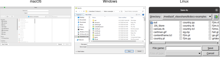 |
| Choose directory dialogs |
|---|
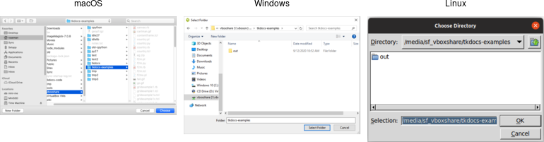 |
Various options can be passed to these dialogs, allowing you to set the
allowable file types, initial directory, default filename, and many more. These
are detailed in the getOpenFile (includes getSaveFile) and chooseDirectory
reference manual pages.
Selecting Colors
Another modal dialog lets users select a color. It will return a color value,
e.g. #ff62b8. The dialog takes an optional initialcolor option to specify an
existing color, i.e., that users might want to replace. More information is
available in the chooseColor reference manual pages.
#![allow(unused)]
fn main() {
tk.choose_color( -initialcolor("#ff0000") )?;
}
| Choose color dialogs |
|---|
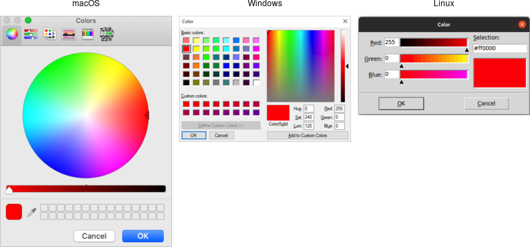 |
Selecting Fonts
Tk 8.6 added support for another system dialog: a font chooser. While the file dialogs and color chooser were modal dialogs, that block until the dialog is dismissed and then return a result, the font chooser doesn't work like that.
| Font chooser dialogs |
|---|
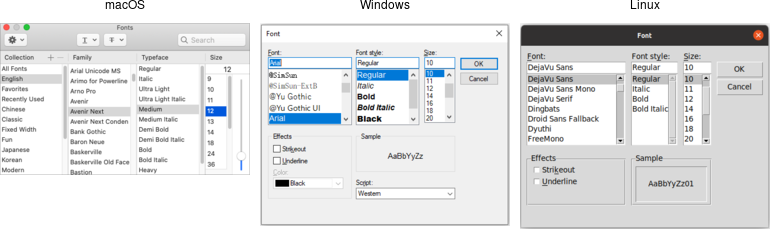 |
While the system font dialog is modal on some platforms, e.g., Windows, that's not the case everywhere. On macOS, the system font chooser works more like a floating tool palette in a drawing program, remaining available to change the font for whatever text is selected in your main application window. The Tk font dialog API has to accommodate both models. To do so, it uses callbacks (and virtual events) to notify your application of font changes.
To use the font dialog, first provide it with an initial font and a callback which will be invoked when a font is chosen. For illustration, we'll have the callback change the font on a label.
#![allow(unused)]
fn main() {
let l = root
    .add_ttk_label( "l" -text("Hello World") -font("helvetica 24") )?
    .grid( -padx(10) -pady(10) )?;
let font_changed = tclosure!( tk,
    |some_font:Obj| -> TkResult<()> { Ok( l.configure( -font(some_font) )? )});
tk.fontchooser_configure( -font("helvetica 24") -command(font_changed) )?;
}
You can query or change the font that is (or will be) displayed in the dialog at any time.
Next, put the dialog onscreen via the show method. On platforms where the font
dialog is modal, your program will block at this point until the dialog is
dismissed. On other platforms, show returns immediately; the dialog remains
onscreen while your program continues. At this point, a font has not been
chosen. There's also a hide method to remove it from the screen (not terribly
useful when the font dialog is modal).
#![allow(unused)]
fn main() {
tk.fontchooser_show()?;
tk.fontchooser_hide()?;
}
If the font dialog was modal, and the user chose a font, the dialog would have
invoked your callback, passing it a font specification. If they cancelled out of
the dialog, there'd be no callback. When the dialog isn't modal, and the user
chooses a font, it will invoke your callback. A
event::virtual_event( "TkFontchooserFontChanged" ) virtual event is also
generated; you can retrieve the current font via the dialog's font
configuration option. If the font dialog is closed, a
event::virtual_event( "TkFontchooserVisibility" ) is generated. You can also
find out if the font dialog is currently visible onscreen via the visible
configuration option (though changing it is an error; use the show and hide
methods instead).
Because of the significant differences between them, providing a good user experience on all platforms takes a bit of work. On platforms where the font dialog is modal,it's likely to be invoked from a button or menu item that says, e.g.,
Font.... On other platforms, the button or menu item should toggle betweenShow FontsandHide Fonts.
If you have several text widgets in your application that can be given different fonts, when one of them gains focus, it should update the font chooser with its current font. This also means that a callback from the font dialog may apply to a different text widget than the one you initially called
showfrom! Finally, be aware that the font chooser itself may gain the keyboard focus on some platforms.
As of Tk 8.6.10, there are a few bugs in the font chooser on various platforms. Here's a quick rundown including workarounds:
- on macOS, if you don't provide a font via the
fontconfiguration option, your callbacks won't be invoked ⇒ always provide an initial font
- on X11, if you don't provide values for all configuration options, those you don't include will be reset to their default values ⇒ whenever you change any option, change all of them, even if it's just to their current value
- on X11, the font dialog includes an
Applybutton when you provide a callback, but omits it when you don't (and just watch for virtual events); however, other bugs mean those virtual events are never generated ⇒ always provide a command callback
- on Windows, you can also leave off the
Applybutton by not providing a callback; while virtual events are generated on font changes, thefontconfiguration option is never updated ⇒ always provide a command callback, and hold onto the font yourself, rather than trying to ask the font dialog for it later
- on Windows, a font change virtual event is not generated if you change the
fontconfiguration option in your code, though it is on macOS and X11 ⇒ take any necessary actions when you change the font in your code rather than in a virtual event handler
Because of the differences between platforms and the various bugs, testing is far more important when using the font chooser than the other system dialogs.
Alert and Confirmation Dialogs
Many applications use various simple modal alerts or dialogs to notify users of an event, ask them to confirm an action, or make another similar choice via clicking on a button. Tk provides a versatile "message box" that encapsulates all these different types of dialogs.
#![allow(unused)]
fn main() {
tk.message_box( -message("Have a good day") )?;
}
| Simple message boxes |
|---|
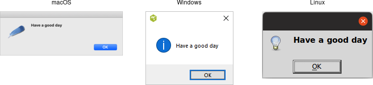 |
#![allow(unused)]
fn main() {
tk.message_box(
    -type_( "yesno" )
    -message( "Are you sure you want to install SuperVirus?" )
    -icon( "question" ) -title( "Install" )
)?;
}
| Example message boxes |
|---|
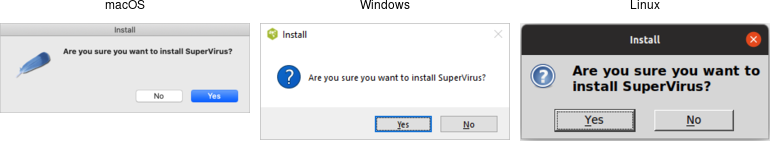 |
Like the previous dialogs that we've seen, these are modal and return the result
of a user's action to the caller. The exact return value will depend on the
type_ option passed to the command, as shown here:
ok (default): ⇒ ok
okcancel: ⇒ ok or cancel
yesno: ⇒ yes or no
yesnocancel: ⇒ yes, no or cancel
retrycancel: ⇒ retry or cancel
abortretryignore: ⇒ abort, retry or ignore
The full list of possible options is shown here:
type_: As described above.
message: The main message displayed inside the alert.
detail: A secondary message (if needed).
title: Title for the dialog window. Not used on macOS.
icon: Icon, one of info (default), error, question or warning.
default: Default button, e.g. ok or cancel for a okcancel dialog.
parent: Window of your application this dialog is being posted for.
Additional details can be found in the reference manual.
Run Example
cargo run --example dialog_windows
Organizing Complex Interfaces
If you have a complex user interface, you'll need to find ways to organize it that don't overwhelm your users. There are several different approaches to doing this. Both general-purpose and platform-specific human interface guidelines are good resources when designing your user interface.
When we talk about complexity in this chapter, we don't mean the underlying technical complexity of how the program is implemented. Instead, we mean how it's presented to users. A user interface can be pulled together from many different modules, built from hundreds of widgets combined in a deeply nested hierarchy, but that doesn't mean users need to perceive it as complex.
Multiple windows
One benefit of using multiple windows in an application can be to simplify the
user interface. Done well, it can require users to focus only on the contents of
one window at a time to complete a task. Forcing them to focus on or switch
between several windows can also have the opposite effect. Similarly, showing
only the widgets relevant to the current task (i.e., via grid) can help
simplify the user interface.
White space
If you do need to display a large number of widgets onscreen at the same time,
think about how to organize them visually. We've seen how grid makes it easy
to align widgets with each other. White space is another useful aid. Place
related widgets close to each other (possibly with an explanatory label
immediately above) and separate them from other widgets by white space. This
helps users organize the user interface in their own minds.
Separator
A second approach to grouping widgets in one display is to place a thin horizontal or vertical rule between groups of widgets; often, this can be more space-efficient than using white space, which may be relevant for a tight display. Tk provides a simple separator widget for this purpose.
| Separator widgets |
|---|
 |
Separators are created using the add_ttk_separator method:
#![allow(unused)]
fn main() {
parent.add_ttk_separator( "s" -orient("horizontal") )?;
}
The orient option may be specified as either horizontal or vertical.
Label Frames
A labelframe widget, also commonly known as a group box, provides another way
to group related components. It acts like a normal ttk_frame, in that it
contains other widgets that you grid inside it. However, it is visually set
off from the rest of the user interface. You can optionally provide a text label
to be displayed outside the labelframe.
| Labelframe widgets |
|---|
 |
Labelframes are created using the add_ttk_labelframe method:
#![allow(unused)]
fn main() {
parent.add_ttk_labelframe( "lf" -text("Label") )?;
}
Paned Windows
A panedwindow widget lets you stack two or more resizable widgets above and below each other (or to the left and right). Users can adjust the relative heights (or widths) of each pane by dragging a sash located between them. Typically the widgets you're adding to a panedwindow will be frames containing many other widgets.
| Panedwindow widgets(shown here managing several labelframes) |
|---|
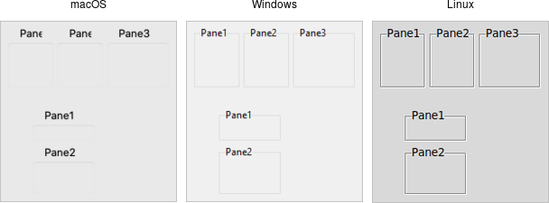 |
Panedwindows are created using the add_ttk_panedwindow method:
// cargo run --example paned_windows

use tk::*;
use tk::cmd::*;

fn main() -> TkResult<()> {
    let tk = make_tk!()?;
    let root = tk.root();

    let p = root.add_ttk_panedwindow( -orient("vertical") )?.pack(())?;

    // two panes, each of which would get widgets gridded into it:
    let f1 = p.add_ttk_labelframe( -text("Pane1") -width(100) -height(100) )?;
    let f2 = p.add_ttk_labelframe( -text("Pane2") -width(100) -height(100) )?;
    p.add( &f1, () )?;
    p.add( &f2, () )?;

    Ok( main_loop() )
}
A panedwindow is either vertical (its panes are stacked vertically on top of
each other) or horizontal. Importantly, each pane you add to the panedwindow
must be a direct child of the panedwindow itself.
Calling the add method adds a new pane at the end of the list of panes. The
insert( position, subwindow, options ) method allows you to place the pane at
the given position in the list of panes (0..n-1). If the pane is already managed
by the panedwindow, it will be moved to the new position. You can use the
forget( subwindow ) to remove a pane from the panedwindow (you can also pass a
position instead of a subwindow).
You can assign relative weights to each pane so that if the overall panedwindow resizes, certain panes will be allocated more space than others. As well, you can adjust the position of each sash between items in the panedwindow. See the command reference for details.
Notebook
A notebook widget uses the metaphor of a tabbed notebook to let users switch between one of several pages, using an index tab. Unlike with paned windows, users only see a single page (akin to a pane) at a time.
| Notebook widgets |
|---|
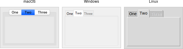 |
Notebooks are created using the add_ttk_notebook method:
// cargo run --example notebook

use tk::*;
use tk::cmd::*;

fn main() -> TkResult<()> {
    let tk = make_tk!()?;
    let root = tk.root();

    let n = root.add_ttk_notebook(())?.pack(())?;
    let f1 = n.add_ttk_frame(())?; // first page, which would get widgets gridded into it
    let f2 = n.add_ttk_frame(())?; // second page
    n.add( &f1, -text("One") )?;
    n.add( &f2, -text("Two") )?;

    Ok( main_loop() )
}
The operations on tabbed notebooks are similar to those on panedwindows. Each
page is typically a frame and again must be a direct child (subwindow) of the
notebook itself. A new page and its associated tab are added after the last tab
with the add( subwindow, options ) method. The text tab option sets the
label on the tab; also useful is the state tab option, which can have the
value normal, disabled (not selectable), or hidden.
To insert a tab at somewhere other than the end of the list, use the
insert( &self, position, subwindow options ), and to remove a given tab, use
the forget method, passing it either the position (0..n-1) or the tab's
subwindow. You can retrieve the list of all subwindows contained in the notebook
via the tabs method.
To retrieve the selected subwindow, call the select method, and change the
selected tab by passing it either the tab's position or the subwindow itself as
a parameter.
To change a tab option (like the text label on the tab or its state), you can
use the tab( &self, tabid, options ) method (where tabid is again the tab's
position or subwindow); use tabs( &self ) to return the current value of the
option.
Notebook widgets generate a event::virtual_event( "NotebookTabChanged" )
whenever a new tab is selected.
Again, there are a variety of less frequently used options and commands detailed in the command reference.
Fonts, Colors, Images
This chapter describes how Tk handles fonts, colors, and images. We've touched on all of these before, but here we'll provide a more in-depth treatment.
Fonts
Tk's label widget allows you to change the font used to display text via the
font configuration option. The canvas and text widgets, covered in the
following chapters, also allow you to specify fonts. Other themed widgets that
display text may not have a font configuration option, but their fonts can be
changed using styles.
We'll cover styles in detail later. In essence, they replace the old way of tweaking multiple configuration options on individual widgets. Instead, fonts, colors, and other settings that control appearance can be bundled together in a style. That style can then be applied to multiple widgets. It's akin to the difference between hardcoding display-oriented markup inside HTML pages vs. using CSS to keep display-specific information separate.
As with many things in Tk, the default fonts are usually a good choice. If you need to make changes, this section shows you the best way to do so, using named fonts. Tk includes named fonts suitable for use in all different components of your user interface. They take into account the conventions of the specific platform you're running on. You can also specify your own fonts when you need additional flexibility.
The font command reference provides full details on specifying fonts, as well as other font-related operations.
Many older Tk programs hardcoded fonts, using either the "family size style" format we'll see below, X11 font names, or the older and more arcane X11 font specification strings. These applications looked increasingly dated as platforms evolved. Worse, fonts were often specified on a per-widget basis, leaving font decisions spread throughout the code. Named fonts, particularly the standard fonts that Tk provides, are a far better solution. Reviewing and updating font decisions is an easy and important change to make in any existing applications.
Standard Fonts
Each platform defines specific fonts that should be used for standard user interface elements. Tk encapsulates many of these decisions into a standard set of named fonts. They are available on all platforms, though the exact font used will vary. This helps abstract away platform differences. Of course, the standard widgets use these named fonts. The predefined fonts are:
TkDefaultFont : Default for items not otherwise specified.
TkTextFont : Used for entry widgets, listboxes, etc.
TkFixedFont : A standard fixed-width font.
TkMenuFont : The font used for menu items.
TkHeadingFont : Font for column headings in lists and tables.
TkCaptionFont : A font for window and dialog caption bars.
TkSmallCaptionFont: A smaller caption font for tool dialogs.
TkIconFont : A font for icon captions.
TkTooltipFont : A font for tooltips.
Platform-Specific Fonts
Tk provides additional named fonts to help you comply with less common situations on specific platforms. Individual platform guidelines detail how and where these fonts should be used. These fonts are only defined on specific platforms. You'll need to take that into account if your application is portable across platforms.
Tk on X11 recognizes any valid X11 font name (see, e.g., the xlsfonts
command). However, these can vary with the operating system, installed software,
and the configuration of the individual machine. There is no guarantee that a
font available on your X11 system has been installed on any other X11 system.
On Windows, Tk provides named fonts for all the fonts that can be set in the
"Display" Control Panel. It recognizes the following font names: system,
ansi, device, systemfixed, ansifixed, and oemfixed.
On macOS, the Apple Human Interface Guidelines (HIG) specifies a number of
additional fonts. Tk recognizes the following names: systemSystemFont,
systemSmallSystemFont, systemApplicationFont, systemViewsFont,
systemMenuItemFont, systemMenuItemCmdKeyFont, systemPushButtonFont,
systemAlertHeaderFont, systemMiniSystemFont,
systemDetailEmphasizedSystemFont, systemEmphasizedSystemFont,
systemSmallEmphasizedSystemFont, systemLabelFont, systemMenuTitleFont,
systemMenuItemMarkFont, systemWindowTitleFont,
systemUtilityWindowTitleFont, systemToolbarFont, and
systemDetailSystemFont.
Working with Named Fonts
Tk provides several operations that help you work with named fonts. You can start by getting a list of all the currently defined named fonts.
#![allow(unused)]
fn main() {
println!( "{:#?}", tk.font_names()? );
}
You can find out the actual system font represented by an abstract named font.
This consists of the family (e.g., Times or Helvetica), the size (in
points if positive, in pixels if negative), the weight (normal or bold),
the slant (roman or italic), and boolean attributes for underline and
overstrike. You can find out the font's metrics (how tall characters in the
font can be and whether it is monospaced), and even measure how many pixels
wide a piece of text rendered in the font would be.
#![allow(unused)]
fn main() {
println!( "{:#?}", tk.font_actual_get_all( Font::<()>::Name( "TkTextFont" ))? );
// e.g. -family .AppleSystemUIFont -size 13 -weight normal -slant roman -underline 0 -overstrike 0

println!( "{:#?}", tk.font_metrics_get_all( Font::<()>::Name( "TkTextFont" ))? );
// e.g. -ascent 13 -descent 3 -linespace 16 -fixed 0

println!( "{:#?}", tk.font_measure( Font::<()>::Name( "TkTextFont" ), "The quick brown fox" )? );
// e.g. 124
}
}
You can also create your own fonts, which can then be used exactly like the predefined ones. To do so, choose a name for the font and specify its font attributes as above.
#![allow(unused)]
fn main() {
tk.font_create( "AppHighlightFont", -family("Helvetica") -size(12) -weight("bold") )?;
root.add_ttk_label( "l" -text("Attention!") -font("AppHighlightFont") )?
    .grid(())?;
}
}
The family attribute specifies the font family. Tk ensures the names
Courier, Times, and Helvetica are available, though they may be mapped to
an appropriate monospaced, serif, or sans-serif font). Other fonts installed on
your system can be used, but the usual caveats about portability apply. You can
get the names of all available families with:
#![allow(unused)]
fn main() {
println!( "{:#?}", tk.font_families()? );
}
Run Example
cargo run --example fonts
Colors
As with fonts, there are various ways to specify colors. Full details can be found in the colors command reference.
In general, Tk widgets default to the right colors for most situations. If you'd
like to change colors, you'll do so via widget-specific commands or options,
e.g., the label's foreground and background configuration options. For most
themed widgets, color changes are specified through styles, not by changing the
widget directly.
You can specify colors via RGB, as you would in HTML or CSS, e.g. #3FF or
#FF016A. Tk also recognizes names such as red, black, grey50,
light blue, etc.
Tk recognizes the standard names for colors defined by X11. You can find a complete list in the command reference (noted above).
As with fonts, both macOS and Windows specify many system-specific abstract color names (again, see the reference). The actual color these correspond to may depend on system settings and can change over time, e.g., dark mode, text highlight colors, default backgrounds.
If needed, you can find the RGB values (each between 0 and 65535) for a color
using the winfo_rgb method on any widget.
// cargo run --example colors

use tk::*;

fn main() -> TkResult<()> {
    let tk = make_tk!()?;
    let root = tk.root();

    println!( "{:?}", root.winfo_rgb( TkColor::Name("red") )? );

    Ok( main_loop() )
}
Images
We've seen the basics of using images already, displaying them in labels or buttons, for example. We create an image object, usually from a file on disk.
// cargo run --example images

use tk::*;
use tk::cmd::*;

fn main() -> TkResult<()> {
    let tk = make_tk!()?;
    let root = tk.root();

    let label_image = root
        .add_ttk_label( "label_image" -text("Full name") )?
        .pack(())?;

    let img = tk.image_create_photo( -file("book/src/images/tcl.gif") )?;
    label_image.configure( -image(img) )?;

    root.winfo_rgb( TkColor::Name("red") )?;
    Ok( main_loop() )
}
Canvas
A canvas widget manages a 2D collection of graphical objects — lines, circles, text, images, other widgets, and more. Tk's canvas is an incredibly powerful and flexible widget and truly one of Tk's highlights. It is suitable for a wide range of uses, including drawing or diagramming, CAD tools, displaying or monitoring simulations or actual equipment, and building more complex widgets out of simpler ones.
Note: Canvas widgets are part of the classic Tk widgets, not the themed Tk widgets.
| Canvas widgets |
|---|
 |
Canvas widgets are created using the canvas command:
#![allow(unused)]
fn main() {
parent.add_canvas( "canvas" -width(500) -height(400) -background("gray75") )?;
}
You'll often provide a width and height, either in pixels or any of the other
standard distance units. As always, you can ask the geometry manager to expand
it to fill the available space in the window. You might provide a default
background color for the canvas, specifying colors as you learned about in the
last chapter. Canvas widgets also support other appearance options like relief
and borderwidth that we've used before.
Canvas widgets have a tremendous number of features, and we won't cover everything here. Instead, we'll start with a simple example, a freehand sketching tool, and incrementally add new pieces, each showing another feature of canvas widgets.
Creating Items
When you create a new canvas widget, it is essentially a large rectangle with nothing on it, truly a blank canvas, in other words. To do anything useful with it, you'll need to add items to it. There are a wide variety of different types of items you can add. Here, we'll add a simple line item to the canvas.
To create a line, you need to specify its starting and ending coordinates. Coordinates are expressed as the number of pixels away from the top-left corner, horizontally and vertically, i.e. (x,y). The pixel at the top-left corner, known as the origin, has coordinates (0,0). The "x" value increases as you move to the right, and the "y" value increases as you move down. A line is described by two points, which we'd refer to as (x1,y1) and (x2,y2). This code creates a line from (10,5) to (200,50):
use tk::*;
use tk::cmd::*;

fn main() -> TkResult<()> {
    let tk = make_tk!()?;
    let root = tk.root();
    let canvas = root.add_canvas(())?.pack(())?;
    canvas.create_line( &[ (10.0,5.0), (200.0,50.0) ], () )?;
    Ok( main_loop() )
}
The create_line command returns an item id (an integer) that uniquely refers
to this item. We'll see how it can be used shortly. Often, we don't need to
refer to the item later and can ignore the returned id.
A Simple Sketchpad
Let's start our simple sketchpad example. For now, we'll implement freehand drawing on the canvas with the mouse. We create a canvas widget and attach event bindings to it to capture mouse clicks and drags. When the mouse is first pressed, we'll remember that location as the "start" of our next line. As the mouse is moved with the mouse button held down, we create a line item from this "start" position to the current mouse location. This current location becomes the "start" position for the next line item. Every mouse drag creates a new line item.
// cargo run --example canvas_a_simple_sketchpad

use std::os::raw::c_double;
use tcl::*;
use tk::*;
use tk::cmd::*;

fn main() -> TkResult<()> {
    let tk = make_tk!()?;
    let root = tk.root();
    let canvas = root
        .add_canvas(())?
        .grid( -sticky("nwes") -column(0i32) -row(0i32) )?;
    root.grid_columnconfigure( 0, -weight(1) )?;
    root.grid_rowconfigure( 0, -weight(1) )?;
    Widget::bind( &canvas, event::button_press_1(), "set lastx %x; set lasty %y" )?;
    Widget::bind( &canvas, event::button_1().motion(), tclosure!( tk,
        |evt_x:c_double, evt_y:c_double| -> TkResult<()> {
            let last_x = tk.get_double("lastx")?;
            let last_y = tk.get_double("lasty")?;
            canvas.create_line( &[ (last_x,last_y), (evt_x,evt_y) ], () )?;
            tk.set( "lastx", evt_x );
            tk.set( "lasty", evt_y );
            Ok(())
        }
    ))?;
    Ok( main_loop() )
}
Item Attributes
When creating items, you can also specify one or more item attributes, affecting how it appears. For example, we can specify that the line should be red and three pixels wide.
#![allow(unused)]
fn main() {
canvas.create_line( &[ (10.0,10.0), (200.0,50.0) ], -fill("red")-width(3) )?;
}
The exact set of attributes will vary according to the type of item. Some commonly used ones are:
| attribute | description |
|---|---|
fill | color to draw the object |
width | line width of the item (or its outline) |
outline | for filled shapes like rectangles, the color to draw the item's outline |
dash | draw a dashed line instead of a solid one, e.g., 2 4 6 4 alternates short (2 pixels) and long (6 pixels) dashes with 4 pixels between |
stipple | instead of a solid fill color, use a pattern, typically gray75, gray50, gray25, or gray12; stippling is currently not supported on macOS |
state | assign a state of normal(default), disabled(item event bindings are ignored), or hidden(removed from display) |
disabledfill, disabledwidth, ... | if the item's state is set to disabled, the item will display using these variants of the usual attributes |
activefill, activewidth, ... | when the mouse pointer is over the item, it will display using these variants of the usual attributes |
If you have canvas items that change state, creating the item with both the regular and
disabled*attribute variants can simplify your code. You simply need to change the item'sstaterather than writing code to change multiple display attributes. The same applies to theactive*attribute variants. Both encourage a more declarative style that can remove a lot of boilerplate code.
Just like with Tk widgets, you can change the attributes of canvas items after they're created.
#![allow(unused)]
fn main() {
let id = canvas.create_line( &[ (0.0,0.0), (10.0,10.0) ], -fill("red") )?;
canvas.itemconfigure( id.into(), -fill("blue") -width(2) )?;
}
Item Types
Canvas widgets support a wide variety of item types.
Line
Our sketchpad created simple line items, each a single segment with a start point and an end point. Lines items can also consist of multiple segments.
Lines have several interesting additional attributes, allowing for drawing curves, arrows, and more.
| attribute | description |
|---|---|
arrow | place an arrowhead at the start(first), end(last), or both ends(both); default is none |
arrowshape | allows changing the appearance of any arrowheads |
capstyle | for wide lines without arrowheads, this controls how the end of lines are drawn; one of butt(default), projecting, or round |
joinstyle | for wide lines with multiple segments, this controls drawings of each vertex; one of round (default), bevel, or miter |
smooth | if specified as true (or bezier), draws a smooth curve (via quadratic splines) between multiple segments rather than using straight lines; raw specifies a different type of curve (cubic splines) |
splinesteps | controls the smoothness of curved lines, i.e., those with the smooth option set |
Rectangle
Rectangles are specified by the coordinates of opposing corners, e.g., top-left
and bottom-right. They can be filled in (via fill) with one color, and the
outline given a different color.
#![allow(unused)]
fn main() {
canvas.create_rectangle( 10.0, 10.0, 200.0, 50.0, -fill("red") -outline("blue") )?;
}
Oval
Ovals items work exactly the same as rectangles.
#![allow(unused)]
fn main() {
canvas.create_oval( 10.0, 10.0, 200.0, 50.0, -fill("red") -outline("blue") )?;
}
Polygon
Polygon items allow you to create arbitrary shapes as defined by a series of
points. The coordinates are given in the same way as multipoint lines. Tk
ensures the polygon is "closed," attaching the last point to the first if
needed. Like ovals and rectangles, they can have separate fill and outline
colors. They also support the joinstyle, smooth, and splinesteps
attributes of line items.
#![allow(unused)]
fn main() {
canvas.create_polygon(
    &[ (10.0,10.0), (200.0,50.0), (90.0,150.0), (50.0,80.0), (120.0,55.0) ],
    -fill("red") -outline("blue") )?;
}
Arc
Arc items draw a portion of an oval; think of one piece of a pie chart. Its display is controlled by three attributes:
start: how far along the oval the arc should start, in degrees (0 is the 3-o'clock position)- The
extent: how many degrees "wide" the arc should be, positive for counter-clockwise from the start, negative for clockwise style: one ofpieslice(the default),arc(draws just the outer perimeter), orchord(draws the area between a line connecting the start and end points of the arc and the outer perimeter).
#![allow(unused)]
fn main() {
canvas.create_arc( 10.0, 10.0, 200.0, 50.0,
    -fill("yellow") -outline("black") -start(45) -extent(135) -width(5) )?;
}
Widget
One of the coolest things you can do with the canvas widget is embed other widgets inside it. This can be a lowly button, an entry (think in-place editing of text items), a listbox, a frame itself containing a complex set of widgets... anything! Remember when we said way back when that a canvas widget could act as a geometry manager? This is what we meant.
Canvas items that display other widgets are known as window items (Tk's
longstanding terminology for widgets). They are positioned like text and image
items. You can give them explicit width and height attributes; they default
to the widget's preferred size. Finally, it's important that the widget you're
placing on the canvas (via the window) attribute be a child widget of the
canvas.
#![allow(unused)]
fn main() {
let button = root.add_ttk_button( -text("Implode!") )?;
canvas.create_window( 10.0, 10.0, -anchor("nw") -window(button) )?;
}
Modifying Items
We've seen how you can modify the configuration options on an item — its color, width, etc. There are several other things you can do with items.
To delete items, use the delete method.
To change an item's size and position, you can use the coords method. You
supply new coordinates for the item, specified the same way as when you first
created it. Calling this method without a new set of coordinates will return the
current coordinates of the item. You can use the move_ method to offset one or
more items horizontally or vertically from their current position.
All items are ordered from top to bottom in what's called the stacking order. If
an item later in the stacking order overlaps an item below it, the first item
will be drawn on top of the second. The raise (lift in Tkinter) and lower
methods allow you to adjust an item's position in the stacking order.
There are several more operations detailed in the reference manual to modify items and retrieve information about them.
Run Example
cargo run --example canvas_creating_itemscargo run --example canvas_a_simple_sketchpadcargo run --example canvas_item_types
Event Bindings
We've already seen that the canvas widget as a whole, like any other Tk widget, can capture events using the bind command.
You can also attach bindings to individual items in the canvas (or groups of them, as we'll see in the next section using tags). So if you want to know whether or not a particular item has been clicked on, you don't need to watch for mouse click events for the canvas as a whole and then figure out if that click happened on your item. Tk will take care of all this for you.
To capture these events, you use a bind command built into the canvas. It works exactly like the regular bind command, taking an event pattern and a callback. The only difference is you specify the canvas item this binding applies to.
#![allow(unused)]
fn main() {
canvas.bind(
    id.into(),
    event::button_press_1(),
    tclosure!( tk, || l.configure( -text("...") )))?;
}
Let's add some code to our sketchpad example to allow changing the drawing color. We'll first create a few different rectangle items, each filled with a different color. We'll then attach a binding to each of these. When they're clicked on, they'll set a global variable to the new drawing color. Our mouse motion binding will look at that variable when creating the line segments.
// cargo run --example canvas_event_binding

use std::os::raw::c_double;
use tcl::*;
use tk::*;
use tk::cmd::*;

fn main() -> TkResult<()> {
    let tk = make_tk!()?;
    let root = tk.root();
    let canvas = root
        .add_canvas(())?
        .grid( -sticky("nwes") -column(0i32) -row(0i32) )?;
    root.grid_columnconfigure( 0, -weight(1) )?;
    root.grid_rowconfigure( 0, -weight(1) )?;
    Widget::bind( &canvas, event::button_press_1(), "set lastx %x; set lasty %y" )?;
    Widget::bind( &canvas, event::button_1().motion(), tclosure!( tk,
        |evt_x:c_double, evt_y:c_double| -> TkResult<()> {
            let last_x = tk.get_double("lastx")?;
            let last_y = tk.get_double("lasty")?;
            let color = tk.get("color")?;
            canvas.create_line( &[ (last_x,last_y), (evt_x,evt_y) ], -fill(color) )?;
            tk.set( "lastx", evt_x );
            tk.set( "lasty", evt_y );
            Ok(())
        }
    ))?;

    let id = canvas.create_rectangle( 10.0, 10.0, 30.0, 30.0, -fill("red") )?;
    canvas.bind( id,
        event::button_press_1(),
        tclosure!( tk, || { tk.set( "color", "red" ); Ok(()) }))?;

    let id = canvas.create_rectangle( 10.0, 35.0, 30.0, 55.0, -fill("blue") )?;
    canvas.bind( id,
        event::button_press_1(),
        tclosure!( tk, || { tk.set( "color", "blue" ); Ok(()) }))?;

    let id = canvas.create_rectangle( 10.0, 60.0, 30.0, 80.0, -fill("black") )?;
    canvas.bind( id,
        event::button_press_1(),
        tclosure!( tk, || { tk.set( "color", "black" ); Ok(()) }))?;

    tk.set( "color", "black" );
    Ok( main_loop() )
}
Tags
We've seen that every canvas item can be referred to by a unique id number. There is another handy and powerful way to refer to items on a canvas, using tags.
A tag is just an identifier of your creation, something meaningful to your program. You can attach tags to canvas items; each item can have any number of tags. Unlike item id numbers, which are unique for each item, many items can share the same tag.
What can you do with tags? We saw that you can use the item id to modify a canvas item (and we'll see soon there are other things you can do to items, like move them around, delete them, etc.). Any time you can use an item id, you can use a tag. For example, you can change the color of all items having a specific tag.
Tags are a good way to identify collections of items in your canvas (items in a drawn line, items in a palette, etc.). You can use tags to correlate canvas items to particular objects in your application (for example, tag all canvas items that are part of the robot with id #X37 with the tag "robotX37"). With tags, you don't have to keep track of the ids of canvas items to refer to groups of items later; tags let Tk do that for you.
You can assign tags when creating an item using the tags item configuration
option. You can add tags later with the addtag method or remove them with the
dtags method. You can get the list of tags for an item with the gettags
method or return a list of item id numbers having the given tag with the find
command.
For example:
// cargo run --example canvas_tags

use tk::*;
use tk::canvas::*;
use tk::cmd::*;

fn main() -> TkResult<()> {
    let tk = make_tk!()?;
    let root = tk.root();
    let canvas = root.add_canvas(())?.pack(())?;
    let _tag1 = canvas.create_line( &[ (10.0,10.0), (20.0,20.0) ], -tags("firstline drawing") )?;
    let tag2 = canvas.create_rectangle( 30.0, 30.0, 40.0, 40.0, -tags("firstline drawing") )?;
    canvas.addtag( "rectangle", SearchSpec::WithTag( tag2.clone().into() ))?;
    canvas.addtag( "polygon", SearchSpec::WithTag( item_tag( "drawing" ).into() ))?;

    let tags = canvas.gettags( tag2.clone() )?;
    for name in &[ "drawing", "rectangle", "polygon" ] {
        assert!( tags.iter().find( |&tag| tag.0.as_str() == *name ).is_some() );
    }

    canvas.dtag( tag2.clone(), Some( ItemTag( "polygon".to_owned() )))?;

    let tags = canvas.gettags( tag2.clone() )?;
    for name in &[ "drawing", "rectangle" ] {
        assert!( tags.iter().find( |&tag| tag.0.as_str() == *name ).is_some() );
    }
    assert!( tags.iter().find( |&tag| tag.0.as_str() == "polygon" ).is_none() );

    let items = canvas.find( SearchSpec::WithTag( item_tag( "drawing" ).into() ))?;

    assert_eq!(
        items.get_elements()?.map( |item| item.get_string() ).collect::<Vec<_>>(),
        vec![ "1".to_owned(), "2".to_owned() ]);

    Ok( main_loop() )
}
As you can see, methods like withtag accept either an individual item or a
tag; in the latter case, they will apply to all items having that tag (which
could be none). The addtag and find methods have many other options,
allowing you to specify items near a point, overlapping a particular area, etc.
Let's use tags first to put a border around whichever item in our color palette is currently selected.
// cargo run --example canvas_a_simple_sketchpad_border_around_selected

use std::os::raw::c_double;
use tcl::*;
use tk::*;
use tk::canvas::*;
use tk::cmd::*;

fn set_color<Inst:TkInstance>( tk: &Tk<Inst>, canvas: &TkCanvas<Inst>, color: &Obj ) -> TkResult<()> {
    tk.set( "color", color.clone() );
    canvas.dtag( item_tag( "all" ), Some( item_tag( "paletteSelected" )))?;
    canvas.itemconfigure( item_tag( "palette" ), -outline("white") )?;
    canvas.addtag( "paletteSelected", SearchSpec::WithTag( item_tag( &format!( "palette{}", color.clone() )).into() ))?;
    canvas.itemconfigure( item_tag( "paletteSelected" ), -outline("#999999") )?;
    Ok(())
}

fn main() -> TkResult<()> {
    let tk = make_tk!()?;
    let root = tk.root();
    let canvas = root
        .add_canvas(())?
        .grid( -sticky("nwes") -column(0i32) -row(0i32) )?;
    root.grid_columnconfigure( 0, -weight(1) )?;
    root.grid_rowconfigure( 0, -weight(1) )?;
    Widget::bind( &canvas, event::button_press_1(), "set lastx %x; set lasty %y" )?;
    Widget::bind( &canvas, event::button_1().motion(), tclosure!( tk,
        |evt_x:c_double, evt_y:c_double| -> TkResult<()> {
            let last_x = tk.get_double("lastx")?;
            let last_y = tk.get_double("lasty")?;
            let color = tk.get("color")?;
            set_color( &tk, &canvas, &color )?;
            canvas.create_line( &[ (last_x,last_y), (evt_x,evt_y) ], -fill(color) )?;
            tk.set( "lastx", evt_x );
            tk.set( "lasty", evt_y );
            Ok(())
        }
    ))?;

    let id = canvas.create_rectangle( 10.0, 10.0, 30.0, 30.0,
        -fill("red") -tags("palette palettered") )?;
    canvas.bind( id,
        event::button_press_1(),
        tclosure!( tk, || { tk.set( "color", "red" ); Ok(()) }))?;

    let id = canvas.create_rectangle( 10.0, 35.0, 30.0, 55.0,
        -fill("blue") -tags("palette paletteblue") )?;
    canvas.bind( id,
        event::button_press_1(),
        tclosure!( tk, || { tk.set( "color", "blue" ); Ok(()) }))?;

    let id = canvas.create_rectangle( 10.0, 60.0, 30.0, 80.0,
        -fill("black") -tags("palette paletteblack paletteSelected") )?;
    canvas.bind( id,
        event::button_press_1(),
        tclosure!( tk, || { tk.set( "color", "black" ); Ok(()) }))?;

    set_color( &tk, &canvas, &Obj::from("black") )?;
    canvas.itemconfigure( item_tag( "palette" ), -width(5) )?;

    Ok( main_loop() )
}
The canvas itemconfigure method provides another way to change the properties
of a canvas item. The advantage over dealing with the canvas item object
directly is that we can specify a tag, so that the change we're making applies
to all items having that tag. Without this, we could use gettags to get all
the items, iterate through them, and set the option, but itemconfigure is more
convenient.
Let's also use tags to make the current stroke being drawn appear more prominent. When the mouse button is released, we'll return the line to normal.
#![allow(unused)]
fn main() {
Widget::bind( &canvas, event::button_1().motion(), tclosure!( tk,
    |evt_x:c_double, evt_y:c_double| -> TkResult<()> {
        // ...
        canvas.create_line( &[ (last_x,last_y), (x,y) ],
            -fill(color) -width(5) -tags("currentline") )?;

        tk.set( "lastx", x );
        tk.set( "lasty", y );
        // ...
        Ok(())
    }
))?;

Widget::bind(
    &canvas,
    event::button_1().button_pelease(),
    tclosure!( tk, || ->TkResult<()> {
        Ok( canvas.itemconfigure( item_tag( "currentline" ), -width(1) )? )
    })
)?;
}
Run Example
cargo run --example canvas_tagscargo run --example canvas_a_simple_sketchpad_border_around_selectedcargo run --example canvas_a_simple_sketchpad_more_prominent
Scrolling
In many applications, you'll want the canvas to be larger than what appears on
the screen. You can attach horizontal and vertical scrollbars to the canvas in
the usual way via the xview and yview methods.
You can specify both how large you'd like it to be on screen and its full size
(which would require scrolling to see). The width and height configuration
options control how much space the canvas widget requests from the geometry
manager. The scrollregion configuration option tells Tk how large the canvas
surface is by specifying its left, top, right, and bottom coordinates, e.g.,
0 0 1000 1000.
You should be able to modify the sketchpad program to add scrolling, given what you already know. Give it a try.
Once you've done that, scroll the canvas down just a little bit, and then try drawing. You'll see that the line you're drawing appears above where the mouse is pointing! Surprised?
What's going on is that the global bind command doesn't know that the canvas
is scrolled (it doesn't know the details of any particular widget). So if you've
scrolled the canvas down by 50 pixels, and you click on the top left corner,
bind will report that you've clicked at (0,0). But we know that because of the
scrolling, that position should really be (0,50).
The canvasx and canvasy methods translate the position onscreen (which bind
reports) into the actual point on the canvas (taking into account scrolling).
Be careful if you're adding
canvasxandcanvasymethods directly to the event binding scripts. You need to watch the quoting and substitutions to ensure the conversions are done when the event fires. As always, it's better to place that code in a procedure separate from the event binding itself.
Here then, is our complete example. We probably don't want the palette to be scrolled away when the canvas is scrolled, but we'll leave that for another day.
// cargo run --example canvas_scrolling

use std::os::raw::c_double;
use tcl::*;
use tk::*;
use tk::canvas::*;
use tk::cmd::*;

fn main() -> TkResult<()> {
    let tk = make_tk!()?;
    let root = tk.root();

    let canvas = root
        .add_canvas( "canvas" -scrollregion("0 0 1000 1000") -yscrollcommand(".v set") -xscrollcommand(".h set") )?
        .grid( -sticky("nwes") -column(0i32) -row(0i32) )?;

    root.grid_columnconfigure( 0, -weight(1) )?;
    root.grid_rowconfigure( 0, -weight(1) )?;

    let _h = root
        .add_ttk_scrollbar( "h" -orient("horizontal") -command(".canvas xview") )?
        .grid( -column(0) -row(1) -sticky("we") )?;

    let _v = root
        .add_ttk_scrollbar( "v" -orient("vertical") -command(".canvas yview") )?
        .grid( -column(1) -row(0) -sticky("ns") )?;

    Widget::bind( &canvas, event::button_press_1(),
        "set lastx [.canvas canvasx %x]; set lasty [.canvas canvasy %y]" )?;
    Widget::bind( &canvas, event::button_1().motion(), tclosure!( tk,
        |evt_x:c_double, evt_y:c_double| -> TkResult<()> {
            let x = canvas.canvasx( evt_x, None )?;
            let y = canvas.canvasy( evt_y, None )?;

            let last_x = tk.get_double("lastx")?;
            let last_y = tk.get_double("lasty")?;
            let color = tk.get("color")?;

            canvas.dtag( item_tag( "all" ),
                Some( ItemTag( "paletteSelected".to_owned() )))?;
            canvas.itemconfigure( item_tag( "palette" ),
                -outline("white") )?;
            canvas.addtag( "paletteSelected",
                SearchSpec::WithTag(
                    item_tag( &format!( "palette{}", color.clone().get_string() )).into() ))?;
            canvas.itemconfigure( item_tag( "paletteSelected" ), -outline("#999999") )?;

            canvas.create_line( &[ (last_x,last_y), (x,y) ],
                -fill(color) -width(5) -tags("currentline") )?;

            tk.set( "lastx", x );
            tk.set( "lasty", y );
            Ok(())
        }
    ))?;

    Widget::bind(
        &canvas,
        event::button_1().button_release(),
        tclosure!( tk, || ->TkResult<()> {
            Ok( canvas.itemconfigure( item_tag( "currentline" ), -width(1) )? )
        })
    )?;

    let id = canvas.create_rectangle( 10.0, 10.0, 30.0, 30.0,
        -fill("red") -tags("palette palettered") )?;
    canvas.bind( id,
        event::button_press_1(),
        tclosure!( tk, || { tk.set( "color", "red" ); Ok(()) }))?;

    let id = canvas.create_rectangle( 10.0, 35.0, 30.0, 55.0,
        -fill("blue") -tags("palette paletteblue") )?;
    canvas.bind( id,
        event::button_press_1(),
        tclosure!( tk, || { tk.set( "color", "blue" ); Ok(()) }))?;

    let id = canvas.create_rectangle( 10.0, 60.0, 30.0, 80.0,
        -fill("black") -tags("palette paletteblack paletteSelected") )?;
    canvas.bind( id,
        event::button_press_1(),
        tclosure!( tk, || { tk.set( "color", "black" ); Ok(()) }))?;

    tk.set( "color", "black" );
    canvas.itemconfigure( item_tag( "palette" ), -width(5) )?;

    Ok( main_loop() )
}
Text
A text widget manages a multi-line text area. Like the canvas widget, Tk's text widget is an immensely flexible and powerful tool that can be used for a wide variety of tasks. It can provide a simple multi-line text area as part of a form. But text widgets can also form the basis for a stylized code editor, an outliner, a web browser, and much more.
Note: Text widgets are part of the classic Tk widgets, not the themed Tk widgets.
| Text widgets |
|---|
 |
While we briefly introduced text widgets in an earlier chapter, we'll go into more detail here. You'll get a better sense of the level of sophistication they allow. Still, if you plan to do any significant work with the text widget, the reference manual is a well-organized, helpful, and highly-recommended read.
#![allow(unused)]
fn main() {
parent.add_tk_text( "t" -width(40) -height(10) )?;
}
You'll often provide a width (in characters) and height (in lines). As always, you can ask the geometry manager to expand it to fill the available space in the window.
The Basics
If you simply need a multi-line text field for a form, there are only a few things to worry about: create and size the widget (check), provide an initial value, and retrieve the text after a user has submitted the form.
Providing Initial Content
Text widgets start with nothing in them, so we'll need to add any initial
content ourselves. Because text widgets can hold a lot more than plain text, a
simple mechanism (like the entry widget's textvariable configuration option)
isn't sufficient.
Instead, we'll use the widget's insert method:
#![allow(unused)]
fn main() {
txt.insert( Index::line_char(1,0), "here is my\ntext to insert" )?;
}
The Index::line_char(1,0) here is the position where to insert the text, and
can be read as "line 1, character 0". This refers to the first character of the
first line. Historically, especially on Unix, programmers tend to think about
line numbers as 1-based and character positions as 0-based.
The text to insert is just a string. Because the widget can hold multi-line
text, the string we supply can be multi-line as well. To do this, simply embed
\n (newline) characters in the string at the appropriate locations.
Retrieving the Text
After users have made any changes and submitted the form (for example), your
program can retrieve the contents of the widget via the get method:
#![allow(unused)]
fn main() {
let the_text = txt.get_range( Index::line_char(1,0).. )?;
}
Index::line_char(1,0).. indicates the start position is "line 1, character 0"
and the end position is "the end"; You can provide different start and end
positions if you want to obtain only part of the text. You'll see more on
positions shortly.
Customizing Appearance
We previously saw the width and height configuration options for text
widgets. Several other options control its appearance. The most useful are:
| attribute | description |
|---|---|
| foreground | color to draw the text in |
| background | background color of the widget |
| padx, pady | extra padding along the inside border of the widget |
| borderwidth | width of the border around widget |
| relief | border style: flat, raised, sunken, solid, ridge, groove |
Wrapping and Scrolling
What if some lines of text in the widget are very long, longer than the width of
the widget? By default, the text wraps around to the next line. This behavior
can be changed with the wrap configuration option. It defaults to char,
meaning wrap lines at any character. Other options are word to wrap lines only
at word breaks (e.g., spaces), and none meaning to not wrap lines at all. In
the latter case, some text of longer lines won't be visible unless we attach a
horizontal scrollbar to the widget. (Users can also scroll through the text
using arrow keys, even if scrollbars aren't present).
Both horizontal and vertical scrollbars can be attached to the text widget in the same way as with other widgets, e.g., canvas, listbox.
// cargo run --example text_wrapping_and_scrolling

use tk::*;
use tk::cmd::*;

fn main() -> TkResult<()> {
    let tk = make_tk!()?;
    let root = tk.root();

    let txt = root.add_text( "t"
        -width(40) -height(5) -wrap("none")
        -yscrollcommand(".ys set") -xscrollcommand(".xs set") )?
        .grid( -column(0) -row(0) -sticky("nwes") )?;
    let _xs = root
        .add_ttk_scrollbar( "xs" -orient("horizontal") -command(".t xview") )?
        .grid( -column(0) -row(1) -sticky("we") )?;
    let _ys = root
        .add_ttk_scrollbar( "ys" -orient("vertical") -command(".t yview") )?
        .grid( -column(1) -row(0) -sticky("ns") )?;

    txt.insert( text::Index::end(), "Lorem ipsum...\n...\n... " )?;
    root.grid_columnconfigure( 0, -weight(1) )?;
    root.grid_rowconfigure( 0, -weight(1) )?;

    Ok( main_loop() )
}
We can also ask the widget to ensure that a certain part of the text is visible.
For example, let's say we've added more text to the widget than will fit
onscreen (so it will scroll). However, we want to ensure that the top of the
text rather than the bottom is visible. We can use the see method.
#![allow(unused)]
fn main() {
txt.see( Index::line_char(1,0) )?;
}
Disabling the Widget
Some forms will temporarily disable editing in particular widgets unless certain
conditions are met (e.g., some other options are set to a certain value). To
prevent users from changing a text widget, set the state configuration option
to disabled. Re-enable editing by setting this option back to normal.
#![allow(unused)]
fn main() {
txt.configure( -state("disabled") )?;
}
As text widgets are part of the classic widgets, the usual
stateandinstatemethods are not available.
Run Example
cargo run --example text_the_basicscargo run --example text_wrapping_and_scrolling
Modifying the Text in Code
While users can modify the text in the text widget interactively, your program
can also make changes. Adding text is done with the insert method, which we
used above to provide an initial value for the text widget.
Text Positions and Indices
When we specified a position of Index::line_char( 1, 0 ) (first
line, first character), this was an example of an index. It tells the insert
method where to put the new text (just before the first line, first character,
i.e., at the very start of the widget). Indices can be specified in a variety of
ways. We used another one with the get method: Index::end() means just
past the end of the text. (Why "just past?" Text is inserted right before the
given index, so inserting at End will add text to the end of the widget). Note
that Tk will always add a newline at the very end of the text widget.
Here are a few additional examples of indices and how to interpret them:
| attribute | description |
|---|---|
Index::line(3).. | The newline at the end of line 3 |
Index::line_char(1,0).chars(3) | Three characters past the start of line 1 |
Index::line(2)..Index::end().chars(-1) | The last character before the new line in line 2 |
Index::end().chars(-1) | The newline that Tk always adds at the end of the text |
Index::end().chars(-2) | The actual last character of the text |
Index::end().lines(-1) | The start of the last actual line of text |
Index::line_char(2,2).lines(2) | The third character (index 2) of the fourth line of text |
Index::line_char(2,5).linestart() | The first character of line 2 |
Index::line_char(2,5).lineend() | The position of the newline at the end of line 2 |
Index::line_char(2,5).wordstart() | First char. of the word with the char. at index 2.5 |
Index::line_char(2,5).wordend() | First char. after the word with the char. at index 2.5 |
Some additional things to keep in mind:
- An index past the end of the text (e.g.,
Index::end().chars(100)is interpreted asIndex::end(). - Indices wrap to subsequent lines as needed; e.g.,
Index::line_char(1,0).chars(10)on a line with only five characters will refer to a position on the second line. - Line numbers in indices are interpreted as logical lines, i.e., each line ends
only at the "\n." With long lines and wrapping enabled, one logical line may
represent multiple display lines. If you'd like to move up or down a single
line on the display, you can specify this as, e.g.,
Index::line_char(1,0).display_lines(2).
To determine the canonical position of an index, use the
index( &self, index: Index ) method. Pass it any index expression, and it
returns the corresponding index in the form "line.char". For example, to find
the position of the last character (ignoring the automatic newline at the end),
use:
#![allow(unused)]
fn main() {
txt.index( Index::end() )?;
}
You can compare two indices using the compare method, which lets you check for
equality, whether one index is later in the text than the other, etc.
#![allow(unused)]
fn main() {
if txt.compare( index1, TkCmp::Equal, index2 )? {
    // same position
}
}
Deleting Text
While the insert method adds new text anywhere in the widget, the
delete( &self, index: Index ) and
delete_ranges( &self, ranges: Vec<Range<Index>> ) methods removes it. We can
delete either a single character (specified by index) or a range of characters
(specified by start and end indices). In the latter case, characters from (and
including) the start index until just before the end index are deleted (the
character at the end index is not deleted). So if we assume for each of these we
start off with "abcd\nefgh" in the text widget:
#![allow(unused)]
fn main() {
txt.delete( Index::line_char(1,2) )?; // "abd\nefgh"
txt.delete_ranges( vec![ Index::line_char(1,1), Index::line_char(1,2) ])?; // "acd\nefgh"
txt.delete_ranges( vec![ Index::line_char(1,0), Index::line_char(2,0) ])?; // "efgh"
txt.delete_ranges( vec![ Index::line_char(1,2), Index::line_char(2,1) ])?; // "abfgh"
}
There is also a replace method that performs a delete followed by an
insert at the same location.
Example: Logging Window
Here's a short example using a text widget as an 80x24 logging window for an application. Users don't edit the text widget at all. Instead, the program writes log messages to it. We'd like to display more than 24 lines (so no scrolling). If the log is full, old messages are removed from the top before new ones are added at the end.
// cargo run --example logging_window

use tk::*;
use tk::cmd::*;
use tk::text::*;

fn main() -> TkResult<()> {
    let tk = make_tk!()?;
    let root = tk.root();

    let log = root
        .add_text( -width(80) -height(24) -wrap("none") )?
        .grid(())?;

    let write_to_log = | msg: &str| -> TkResult<()> {
        let index = log.index( Index::end().lines(-1) )?;
        log.configure( -state("normal") )?;
        log.insert( Index::end(), msg )?;
        if log.index( Index::end().chars(-1) )? != Index::line_char(1,0) {
            log.insert( Index::end(), "\n" )?;
        }
        if let Index::LineChar( num_line, _, _ ) = index {
            if num_line > 24 {
                log.delete_ranges( vec![ Index::line_char(1,0)..Index::line_char(num_line-23,0) ])?;
            }
        }
        log.configure( -state("disabled") )?;
        Ok(())
    };

    for c in 'a'..='z' {
        write_to_log( &format!( "{0}{0}{0}{0}{0}{0}{0}{0}{0}{0}", c ))?;
    }

    Ok( main_loop() )
}
Note that because the program placed the widget in a disabled state, we had to re-enable it to make any changes, even from our program.
Formatting with Tags
So far, we've used text widgets when all the text is in a single font. Now it's time to add formatting like bold, italic, strikethrough, background colors, font sizes, and much more. Tk's text widget implements these using a feature called tags.
Tags are objects associated with the text widget. Each tag is referred to via a name chosen by the programmer. Each tag has several configuration options. These are things like fonts and colors that control formatting. Though tags are objects having state, they don't need to be explicitly created but are automatically created the first time the tag name is used.
Adding Tags to Text
Tags can be associated with one or more ranges of text in the widget. As before,
ranges are specified via indices. A single index represents a single character,
and a pair of indices represent a range from the start character to just before
the end character. Tags are added to a range of text using the tag_add method.
#![allow(unused)]
fn main() {
txt.tag_add( "highlightline", vec![ Index::line_char(5,0), Index::line_char(6,0) ] )?;
}
Tags can also be provided when first inserting text. The insert_with_tags
method supports an optional parameter containing a list of one or more tags to
add to the text being inserted.
#![allow(unused)]
fn main() {
log.insert_with_tags( Index::end(), &[
    ( "new material to insert", &["highlightline","recent","warning"] )
])?;
}
As the widget's contents are modified (whether by a user or your program), the tags will adjust automatically. For example, if we tagged the text "the quick brown fox" with the tag "nounphrase", and then replaced the word "quick" with "speedy," the tag still applies to the entire phrase.
Applying Formatting to Tags
Formatting is applied to tags via configuration options; these work similarly to configuration options for the entire widget. As an example:
#![allow(unused)]
fn main() {
txt.tag_configure( "highlightline",
    -background("yellow") -font("TkFixedFont") -relief("raised") )?;
}
Tags support the following configuration options: background, bgstipple,
borderwidth, elide, fgstipple, font, foreground, justify,
lmargin1, lmargin2, offset, overstrike, relief, rmargin, spacing1,
spacing2, spacing3, tabs, tabstyle, underline, and wrap. Check the
reference manual for detailed descriptions of these. The
tag_cget( tag, option ) method allows us to query the configuration options of
a tag.
Because multiple tags can apply to the same range of text, there is the
possibility of conflict (e.g., two tags specifying different fonts). A priority
order is used to resolve these; the most recently created tags have the highest
priority, but priorities can be rearranged using the
tag_raise( tag, above_this ) and tag_lower( tag, below_this ) methods.
More Tag Manipulations
To delete one or more tags altogether, we can use the tag_delete( tags)
method. This also, of course, removes any references to the tag in the text. We
can also remove a tag from a range of text using the tag_remove( tag, ranges )
method. Even if that leaves no ranges of text with that tag, the tag object
itself still exists.
The tag_ranges( tag ) method will return a list of ranges in the text that the
tag has been applied to. There are also tag_nextrange( tag, range ) and
tag_prevrange( tag, range ) methods to search forward or backward for the
first such range from a given position.
The tag_names_all() method will return a list of all tags currently defined in
the text widget (including those that may not be presently used). The
tag_names( index ) method will return the list of tags applied to just the
character at the index.
Finally, we can use the first and last characters in the text having a given tag
as indices, the same way we can use Index::end() or Index::line_char(2,5).
To do so, just specify Index::TagFirst( name, _ ) or
Index::TagLast( name, _ ).
Differences between Tags in Canvas and Text Widgets
Both canvas and text widgets support "tags" that can be applied to several objects, style them, etc. However, canvas and text tags are not the same and there are substantial differences to take note of.
In canvas widgets, only individual canvas items have configuration options that control their appearance. When we refer to a tag in a canvas, the meaning of that is identical to "all canvas items presently having that tag." The tag itself doesn't exist as a separate object. So in the following snippet, the last rectangle added will not be colored red.
#![allow(unused)]
fn main() {
canvas.itemconfigure( item_tag("important"), -fill("red") )?;
canvas.create_rectangle( 10, 10, 40, 40, -tags("important") )?;
}
In contrast, with text widgets, it's not the individual characters that retain the state information about appearance, but tags, which are objects in their own right. So in this snippet, the newly added text will be colored red.
#![allow(unused)]
fn main() {
txt.insert_with_tags( Index::end(), &[ "first text", &[ "important" ]])?;
txt.tag_configure( "important" -foreground("red") )?;
txt.insert_with_tags( Index::end(), &[ "second text", &[ "important" ]])?;
}
Events and Bindings
One very cool thing we can do is define event bindings on tags. That allows us
to easily do things like recognize mouse clicks on particular ranges of text and
popup a menu or dialog in response. Different tags can have different bindings.
This saves the hassle of sorting out questions like "what does a click at this
location mean?". Bindings on tags are implemented using the tag_bind method:
#![allow(unused)]
fn main() {
txt.tag_bind( "important", event::button_press_1(), popup_important_menu )?;
}
Widget-wide event bindings continue to work as they do for every other widget,
e.g., to capture a mouse click anywhere in the text. Besides the normal
low-level events, the text widget generates a Modified virtual event whenever
a change is made to the content of the widget, and a Selection virtual event
whenever there is a change made to which text is selected.
Selecting Text
We can identify the range of text selected by a user, if any. For example, an editor may have a toolbar button to bold the selected text. While you can tell when the selection has changed (e.g., to update whether or not the bold button is active) via the Selection virtual event, that doesn't tell you what has been selected.
The text widget automatically maintains a tag named sel, which refers to the selected text. Whenever the selection changes, the sel tag will be updated. So we can find the range of text selected using the tag_ranges tag method, passing it sel as the tag to report on.
Similarly, we can change the selection by using tag_add to set a new
selection, or tag_remove to remove the selection. The sel tag cannot be
deleted, however.
Though the default widget bindings prevent this from happening,
selis like any other tag in that it can support multiple ranges, i.e., disjoint selections. To prevent this from happening, when changing the selection from your code, make sure to remove any old selection before adding a new one.
Marks
Marks indicate a particular place in the text. In that respect, they are like indices. However, as the text is modified, the mark will adjust to be in the same relative location. In that way, they resemble tags but refer to a single position rather than a range of text. Marks actually don't refer to a position occupied by a character in the text but specify a position between two characters.
Tk automatically maintains two different marks. The first, named insert, is the present location of the insertion cursor. As the cursor is moved (via mouse or keyboard), the mark moves with it. The second mark, named current, tracks the position of the character underneath the current mouse position.
To create your own marks, use the widget's mark_set( name, index) method, passing it the name of the mark and an index (the mark is positioned just before the character at the given index). This is also used to move an existing mark to a different position. Marks can be removed using the mark_unset( name ) method, passing it the name of the mark. If you delete a range of text containing a mark, that also removes the mark.
The name of a mark can also be used as an index (in the same way
Index::line_char(1,0) or Index::end().chars(-1) are indices). You can find
the next mark (or previous one) from a given index in the text using the
mark_next( index ) or mark_previous( index ) methods. The mark_names
method will return a list of the names of all marks.
Marks also have a gravity, which can be modified with the
set_mark_gravity( name, direction ) method, which affects what happens when
text is inserted at the mark. Suppose we have the text "ac" with a mark in
between that we'll symbolize with a pipe, i.e., "a|c." If the gravity of that
mark is TkTextMarkGravity::Right (the default), the mark attaches itself to
the "c." If the new text "b" is inserted at the mark, the mark will remain stuck
to the "c," and so the new text will be inserted before the mark, i.e., "ab|c."
If the gravity is instead TkTextMarkGravity::Left, the mark attaches itself to
the "a," and so new text will be inserted after the mark, i.e., "a|bc."
Images and Widgets
Like canvas widgets, text widgets can contain images and any other Tk widgets (including frames containing many other widgets). In a sense, this allows the text widget to work as a geometry manager in its own right. The ability to add images and widgets within the text opens up a world of possibilities for your program.
Images are added to a text widget at a particular index, with the image specified as an existing Tk image. Other options that allow you to fine-tune padding, etc.
#![allow(unused)]
fn main() {
let img = tk.image_create_photo( -file("book/src/images/tcl.gif") )?;
txt.image_create( Index::tag_first("sel"), -image(img) )?;
}
Other widgets are added to a text widget in much the same way as images. The widget being added must be a descendant of the text widget in the widget hierarchy.
#![allow(unused)]
fn main() {
let b = txt.add_ttk_button( -text("Push Me") )?;
txt.window_create( Index::line_char(1,0), -window(b) )?;
}
Run Example
cargo run --example text_images_and_widgets
Even More
Text widgets can do many more things. Here, we'll briefly mention just a few more of them. For details on any of these, see the reference manual.
Search
The text widget includes a powerful search method to locate a piece of text
within the widget. This is useful for a "Find" dialog, as one obvious example.
You can search backward or forward from a particular position or within a given
range, specify the search term using exact text, case insensitive, or via
regular expressions, find one or all occurrences of the search term, etc.
Modifications, Undo and Redo
The text widget keeps track of whether changes have been made (useful to know
whether it needs to be saved to a file, for example). We can query (or change)
using the set_edit_modified( modified ) method. There is also a complete
multi-level undo/redo mechanism, managed automatically by the widget when we set
its undo configuration option to true. Calling edit_undo or edit_redo
modifies the current text using information stored on the undo/redo stack.
Eliding Text
Text widgets can include text that is not displayed. This is known as "elided"
text, and is made available using the elide configuration option for tags. It
can be used to implement an outliner, a "folding" code editor, or even to bury
extra meta-data intermixed with displayed text. When specifying positions within
elided text, you have to be a bit more careful. Methods that work with positions
have extra options to either include or ignore the elided text.
Introspection
Like most Tk widgets, the text widget goes out of its way to expose information
about its internal state. We've seen this in terms of the get method, widget
configuration options, names and cget for both tags and marks, etc. There is
even more information available that can be useful for a wide variety of tasks.
Check out the debug, dlineinfo, bbox, count, and dump methods in the
reference manual.
Peering
The Tk text widget allows the same underlying text data structure (containing
all the text, marks, tags, images, etc.) to be shared between two or more
different text widgets. This is known as peering and is controlled via
peer_create and peer_names methods.
Treeview
A treeview widget displays a hierarchy of items and allows users to browse through it. One or more attributes of each item can be displayed as columns to the right of the tree. It can be used to build user interfaces similar to the tree display you'd find in file managers like the macOS Finder or Windows Explorer. As with most Tk widgets, it offers incredible flexibility so it can be customized to suit a wide range of situations.
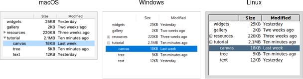 |
|---|
| Treeview widgets |
Treeview widgets are created using the add_ttk_treeview command:
#![allow(unused)]
fn main() {
let tree = root.add_ttk_treeview(())?;
}
Horizontal and vertical scrollbars can be added in the usual manner if desired.
Adding Items to the Tree
To do anything useful with the treeview, we'll need to add one or more items to it. Each item represents a single node in the tree, whether a leaf node or an internal node containing other nodes. Items are referred to by a unique id. You can assign this id when the item is first created, or the widget can automatically generate one.
Items are created by inserting them into the tree, using the treeview's insert
method. To insert an item, we need to know where to insert it. That means
specifying the parent item and where within the list of the parent's existing
children the new item should be inserted.
The treeview widget automatically creates a root node (which is not displayed).
Its id is the empty string. It serves as the parent of the first level of items
that are added. Positions within the list of a node's children are specified by
index (0 being the first, and Index::End meaning insert after all existing
children).
Normally, you'll also specify the name of each item, which is the text displayed in the tree. Other options allow you to add an image beside the name, specify whether the node is open or closed, etc.
Inserting the item returns the id of the newly created item.
// cargo run --example adding_items_to_the_tree

use tk::*;
use tk::ttk_treeview::*;
use tk::cmd::*;

fn main() -> TkResult<()> {
    let tk = make_tk!()?;
    let root = tk.root();

    let tree = root.add_ttk_treeview(())?.pack(())?;

    // Inserted at the root, program chooses id:
    tree.insert( "", Index::End, "widgets" -text("Widget Tour") )?;

    // Same thing, but inserted as first child:
    tree.insert( "", 0, "gallery" -text("Applications") )?;

    // Treeview chooses the id:
    let id = tree
        .insert( "", Index::End, -text("Tutorial") )?
        .unwrap();

    // Inserted underneath an existing node:
    tree.insert( "widgets", Index::End, -text("Canvas") )?;
    tree.insert( &id, Index::End, -text("Tree") )?;

    Ok( main_loop() )
}
Rearranging Items
A node (and its descendants, if any) can be moved to a different location in the tree. The only restriction is that a node cannot be moved underneath one of its descendants for obvious reasons. As before, the target location is specified via a parent node and a position within its list of children.
#![allow(unused)]
fn main() {
// move widgets under gallery
tree.move_item( "widgets", "gallery", Index::End )?;
}
Items can be detached from the tree. This removes the item and its descendants
from the hierarchy but does not destroy the items. This allows us to later
reinsert them with move_item.
Items can also be deleted, which does completely destroy the item and its descendants.
#![allow(unused)]
fn main() {
tree.delete( &[ "widgets" ])?;
}
To traverse the hierarchy, there are methods to find the parent of an item
(parent_item), its next or previous sibling (next_item and prev_item), and
return the list of children of an item.
We can control whether or not the item is open and shows its children by
modifying the open item configuration option.
#![allow(unused)]
fn main() {
tree.set_item( "widgets", -open("true") )?;
let is_open = tree.item( "widgets", open )?;
}
Run Example
cargo run --example rearranging_items
Displaying Information for each Item
The treeview can display one or more additional pieces of information about each item. These are shown as columns to the right of the main tree display.
Each column is referenced by a symbolic name that we assign. We can specify the
list of columns using the columns configuration option of the treeview widget,
either when first creating the widget or later on.
#![allow(unused)]
fn main() {
root.add_ttk_treeview( -columns("size modified") )?;
tree.configure( -columns("size modified owner") )?;
}
We can specify the width of the column, how the display of item information in the column is aligned, and more. We can also provide information about the column's heading, such as the text to display, an optional image, alignment, and a script to invoke when the item is clicked (e.g., to sort the tree).
#![allow(unused)]
fn main() {
tree.set_column( "size", -width(100) -anchor("center") )?;
tree.set_heading( "size", -text("Size") )?;
}
What to display in each column for each item can be specified individually by
using the set_item_at_column method. You can also provide a list describing
what to display in all the columns for the item. This is done using the values
item configuration option. It takes a list of values and can be provided when
first inserting the item or changed later. The order of the list must be the
same as the order in the columns widget configuration option.
#![allow(unused)]
fn main() {
tree.set_item_at_column( "widgets", "size", "12KB" )?;
let size = tree.item_at_column( "widgets", "size" )?;
assert_eq!( size.to_string(), "12KB" );
tree.insert( "", Index::End,
    -text("Listbox") -values(&["15KB","Yesterday","mark"]) )?;
}
Run Example
cargo run --example displaying_information_for_each_item
Item Appearance and Events
Like the text and canvas widgets, the treeview widget uses tags to modify the
appearance of items in the tree. We can assign a list of tags to each item using
the tags item configuration option (again, when creating the item or later
on).
Configuration options can then be specified on the tag, applied to all items
having that tag. Valid tag options include foreground (text color),
background, font, and image (not used if the item specifies its own
image).
We can also create event bindings on tags to capture mouse clicks, keyboard events, etc.
#![allow(unused)]
fn main() {
tree.insert( "", Index::End, -text("button") -tags("ttk simple") )?;
tree.tag_configure( "ttk", -background("yellow") )?;
tree.tag_bind( "ttk", event::button_1(), item_clicked )?;
// the item clicked can be found via tree.focus()
}
The treeview will generate virtual events TreeviewSelect, TreeviewOpen, and
TreeviewClose, which allow us to monitor changes to the widget made by users.
We can use the selection method to determine the current selection (the
selection can also be changed from your program).
Run Example
cargo run --example item_appearance_and_events
Customizing the Display
There are many aspects of how the treeview widget is displayed that we can customize. We've already seen some of them, such as the text of items, fonts and colors, names of column headings, and more. Here are a few additional ones.
- Specify the desired number of rows to show using the
heightwidget configuration option. - Control the width of each column using the column's
widthorminwidthoptions. The column holding the tree can be accessed with the symbolic name#0. The overall requested width for the widget is based on the sum of the column widths. - Choose which columns to display and the order to display them in using the
displaycolumnswidget configuration option. - You can optionally hide one or both of the column headings or the tree itself
(leaving just the columns) using the
showwidget configuration option (default is "tree headings" to show both). - You can specify whether a single item or multiple items can be selected by
users via the
selectmodewidget configuration option, passingbrowse(single item),extended(multiple items, the default), ornone.
Styles and Themes
The themed aspect of the modern Tk widgets is one of the most powerful and exciting aspects of the newer widget set. Yet, it's also one of the most confusing.
This chapter explains styles (which control how widgets like buttons look) and themes (which are a collection of styles that define how all the widgets in your application look). Changing themes can give your application an entirely different look.
| Applying different themes. |
|---|
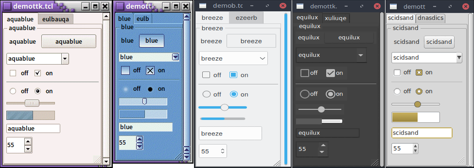 |
Note that it's not just colors that have changed, but the actual shape of individual widgets. Styles and themes are extremely flexible.
Why?
However, before you get carried away, very few applications will benefit from switching themes like this. Some games or educational programs might be exceptions. Using the standard Tk theme for a given platform will display widgets the way people expect to see them, particularly if they're running macOS and Windows.
On Linux systems, there's far less standardization of look and feel. Users expect (and are more comfortable with) some variability and "coolness." Because different widget sets (typically GTK and QT) are used by window managers, control panels, and other system utilities, Tk can't seamlessly blend in with the current settings on any particular system. Most of the Linux screenshots in this tutorial use Tk's alt theme. Despite users being accustomed to variability, there are limits to what most users will accept. A prime example is the styling of core widgets in Tk's classic widget set, matching circa-1992 OSF/Motif.
Styles and themes, used in a more targeted manner and with significant restraint, can have a role to play in modern applications. This chapter explains why and when you might want to use them and how to go about doing so. We'll begin by drawing a parallel between Tk's styles and themes and another realm of software development.
Understanding Styles and Themes
If you're familiar with web development, you know about cascading stylesheets
(CSS). There are two ways it can be used to customize the appearance of an
element in your HTML page. One way is to add a bunch of style attributes (fonts,
colors, borders, etc.) directly to an element in your HTML code via the style
attribute. For example:
<label style="color:red; font-size:14pt; font-weight:bold; background-color:yellow;">
    Meltdown imminent!
</label>
The other way to use CSS is to attach a class to each widget via the class
attribute. The details of how elements of that class appear are provided
elsewhere, often in a separate CSS file. You can attach the same class to many
elements, and they will all have the same appearance. You don't need to repeat
the full details for every element. More importantly, you separate the logical
content of your site (HTML) from its appearance (CSS).
<label class="danger">Meltdown imminent!</label>
...
<style type="text/css">
label.danger {color:red; font-size:14pt; font-weight:bold; background-color:yellow;}
</style>
Back to Tk.
- In the classic Tk widgets, all appearance customizations require specifying
each detail on individual widgets, akin to always using the
styleHTML attribute. - In the themed Tk widgets, all appearance customizations are made via attaching
a style to a widget, akin to using the
classHTML attribute. Separately, you define how widgets with that style will appear, akin to writing CSS. - Unlike with HTML, you can't freely mix and match. You can't customize some themed entries or buttons with styles and others by directly changing appearance options.
Yes, there are a few exceptions, like labels where you can customize the font and colors through both styles and configuration options.
Benefits
So why use styles and themes in Tk? They take the fine-grained details of appearance decisions away from individual instances of widgets.
That makes for cleaner code and less repetition. If you have 20 entry widgets in your application, you don't need to repeat the exact appearance details every time you create one (or write a wrapper function). Instead, you assign them a style.
Styles also put all appearance decisions in one place. And because styles for a button and styles for other widgets can share common elements, it promotes consistency and improves reuse.
Styles also have many benefits for widget authors. Widgets can delegate most appearance decisions to styles. A widget author no longer has to hardcode logic to the effect of "when the state is disabled, consult the 'disabledforeground' configuration option and use that for the foreground color." Not only did that make coding widgets longer (and more repetitive), but it also restricted how a widget could be changed based on its state. If the widget author omitted logic to change the font when the state changed, you were out of luck as an application developer using the widget.
Using styles, widget authors don't need to provide code for every possible appearance option. That not only simplifies the widget but paradoxically ensures that a wider range of appearances can be set, including those the widget author may not have anticipated.
Run Example
Example code in this chapter can be executed via:
cargo run --example styles_and_themes
Using Existing Themes
Before delving into the weightier matters of tastefully and selectively modifying and applying styles to improve the usability of your application and cleanliness of your code, let's deal with the fun bits: using existing themes to completely reskin your application.
Themes are identified by a name. You can obtain the names of all available themes:
#![allow(unused)]
fn main() {
let names = tk.theme_names()?
    .iter()
    .fold( String::new(), |acc,name| format!( "{} {}", acc, name ));
println!( "{}", names ); // clam alt default classic
}
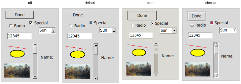 |
|---|
| Built-in themes. |
Besides the built-in themes (alt, default, clam, and classic), macOS
includes a theme named aqua to match the system-wide style, while Windows
includes themes named vista, winxpnative, and winnative.
Only one theme can be active at a time. To obtain the name of the theme currently in use, use the following:
#![allow(unused)]
fn main() {
let theme = tk.theme_in_use()?;
println!( "{}", theme.name ); // aqua
}
This API, which was originally targeted for Tk 8.6, was back-ported to Tk 8.5.9. If you're using an earlier version of Tk getting this info is a bit trickier.
Switching to a new theme can be done with:
#![allow(unused)]
fn main() {
new_theme.theme_use()?;
}
What does this actually do? Obviously, it sets the current theme to the indicated theme. Doing this, therefore, replaces all the currently available styles with the set of styles defined by the theme. Finally, it refreshes all widgets, so they take on the appearance described by the new theme.
Third-Party Themes
With a bit of looking around, you can find some existing add-on themes available for download. A good starting point is https://wiki.tcl-lang.org/page/List+of+ttk+Themes.
Though themes can be defined in any language that Tk supports, most that you will find are written in Tcl. How can you install them so that they are available to use in your application?
As an example, let's use the "awdark" theme, available from https://sourceforge.net/projects/tcl-awthemes/. Download and unzip the awthemes-*.zip file somewhere. You'll notice it contains a bunch of .tcl files, a subdirectory i containing more directory with images used by the theme, etc.
One of the files is named pkgIndex.tcl. This identifies it as a Tcl package,
which is similar to a module in other languages. If we look inside, you'll see a
bunch of lines like package ifneeded awdark 7.7. Here, awdark is the name of
the package, and 7.7 is its version number. It's not unusual, as in this case,
for a single pkgIndex.tcl file to provide several packages.
To use it, we need to tell Tcl where to find the package (via adding its
directory to Tcl's auto_path) and the name of the package to use.
#![allow(unused)]
fn main() {
let path = std::path::Path::new( "/full/path/to/awthemes-9.3.1" );
tk.package_load( "awdark", path )?;
}
If the theme is instead implemented as a single Tcl source file, without a
pkgIndex.tcl, you can make it available like this:
#![allow(unused)]
fn main() {
let path = std::path::Path::new( "/full/path/to/themefile.tcl" );
tk.source( path )?;
}
You should now be able to use the theme in your own application, just as you would a built-in theme.
Using Styles
We'll now tackle the more complex issue of taking full advantage of styles and themes within your application, not just reskinning it with an existing theme.
Definitions
We first need to introduce a few essential concepts.
Widget Class
A widget class identifies the type of a particular widget, whether it is a
button, a label, a canvas, etc. All themed widgets have a default class. Buttons
have the class TButton, labels TLabel, etc.
Widget State
A widget state allows a single widget to have more than one appearance or behavior, depending on things like mouse position, different state options set by the application, and so on.
As you'll recall, all themed widgets maintain a set of binary state flags,
accessed by the state and instate methods. The flags are: active,
disabled, focus, pressed, selected, background, readonly,
alternate, and invalid. All widgets have the same set of state flags,
though they may ignore some of them (e.g., a label widget would likely ignore an
invalid state flag). See the
[themed widget(https://tcl.tk/man/tcl8.6/TkCmd/ttk_widget.htm) page in the
reference manual for the exact meaning of each state flag.
Style
A style describes the appearance (or appearances) of a widget class. All themed widgets having the same widget class will have the same appearance(s).
Styles are referred to by the name of the widget class they describe. For
example, the style TButton defines the appearance of all widgets with the
class TButton.
Styles know about different states, and one style can define different
appearances based on a widget's state. For example, a style can specify how a
widget's appearance should change if the pressed state flag is set.
Theme
A theme is a collection of styles. While each style is widget-specific (one for buttons, one for entries, etc.), a theme collects many styles together. All styles in the same theme will be designed to visually "fit" together with each other. (Tk doesn't technically restrict bad design or judgment, unfortunately!)
Using a particular theme in an application really means that, by default, the appearance of each widget will be controlled by the style within that theme responsible for that widget class.
Style Names
Every style has a name. If you're going to modify a style, create a new one, or use a style for a widget, you need to know its name.
How do you know what the names of the styles are? If you have a particular
widget, and you want to know what style it is currently using, you can first
check the value of its style configuration option. If that is empty, it means
the widget is using the default style for the widget. You can retrieve that via
the widget's class. For example:
#![allow(unused)]
fn main() {
let b = root.add_ttk_button(())?;
assert!( b.cget( style )?.is_empty() ); // empty string as a result
assert_eq!( b.winfo_class()?, "TButton" );
}
In this case, the style that is being used is TButton. The default styles for
other themed widgets are named similarly, e.g., TEntry, TLabel, etc.
It's always wise to check the specifics. For example, the treeview widget's class is
Treeview, notTTreeview.
Beyond the default styles, though, styles can be named pretty much anything. You
might create your own style (or use a theme that has a style) named FunButton,
NuclearReactorButton, or even GuessWhatIAm (not a wise choice).
More often, you'll find names like Fun.TButton or NuclearReactor.TButton.
These suggest variations of a base style; as you'll see, this is something Tk
supports for creating and modifying styles.
The ability to retrieve a list of all currently available styles is currently not supported. This will likely appear in Tk 8.7 in the form of a new command,
theme_styles(), returning the list of styles implemented by a theme. It also proposes adding astylemethod for all widgets, so you don't have to examine both the widget'sstyleconfiguration option and its class. See TIP #584.
Applying a Style
To use a style means to apply that style to an individual widget. All you need is the style's name and the widget to apply it to. Setting the style can be done at creation time:
#![allow(unused)]
fn main() {
root.add_ttk_button( -text("Hello") -style("Fun.TButton") )?;
}
A widget's style can also be changed later with the style configuration
option:
#![allow(unused)]
fn main() {
b.configure( -style("Emergency.TButton") )?;
}
Creating a Simple Style
So how do we create a new style like Emergency.TButton?
In situations like this, you're creating a new style only slightly different from an existing one. This is the most common reason for creating new styles.
For example, you want most of the buttons in your application to keep their
usual appearance but have certain "emergency" buttons highlighted differently.
Creating a new style (e.g., Emergency.TButton), derived from the base style
(TButton), is appropriate.
Prepending another name (Emergency) followed by a dot onto an existing style
creates a new style derived from the existing one. The new style will have
exactly the same options as the existing one except for the indicated
differences:
#![allow(unused)]
fn main() {
some_style.configure( -font("helvetica 24") -foreground("red") -padding(10) )?;
}
As shown earlier, you can then apply that style to an individual button widget via its style configuration option. Every other button widget would retain its normal appearance.
How do you know what options are available to change for a given style? That requires diving a little deeper inside styles.
You may have existing code using the classic widgets that you'd like to move to the themed widgets. Most appearance changes made to classic widgets through configuration options can probably be dropped. For those that can't, you may need to create a new style, as shown above.
State-specific appearance changes can be treated similarly. In classic Tk, several widgets supported a few state changes via configuration options. For example, setting a button's
stateoption todisabledwould draw it with a greyed-out label. Some allowed an additional state, active, which represented a different appearance. You could change the widget's appearance in multiple states via a set of configuration options, e.g.,foreground,disabledforeground, andactiveforeground.
State changes via configuration options should be changed to use the
statemethod on themed widgets. Configuration options to modify the widget's appearance in a particular state should be dealt with in the style.
Classic Tk widgets also supported a very primitive form of styles that you may encounter. This used the option database, a now-obscure front end to X11-style configuration files.
In classic Tk, all buttons had the same class (
Button), all labels had the same class (Label), etc. You could use this widget class both for introspection and for changing options globally through the option database. It let you say, for example, that all buttons should have a red background.
A few classic Tk widgets, including frame and toplevel widgets, let you change the widget class of a particular widget when it was first created by providing a
classconfiguration option. For example, you could specify that one specific frame widget had a class ofSpecialFrame, while others would have the default classFrame. You could use the option database to change the appearance of just theSpecialFrameframes.
Styles and themes take that simple idea and give it rocket boosters.
What's Inside a Style?
If all you want to do is use a style or create a new one with a few tweaks, you now know everything you need. If, however, you want to make more substantial changes, things start to get "interesting."
Elements
While each style controls a single type of widget, each widget is usually composed of smaller pieces, called elements. It's the job of the style author to construct the entire widget out of these smaller elements. What these elements are depends on the widget.
Here's an example of a button. It might have a border on the very outside. That's one element. Just inside that, there may be a focus ring. Normally, it's just the background color, but could be highlighted when a user tabs into the button. So that's a second element. Then there might be some spacing between that focus ring and the button's label. That spacing is a third element. Finally, the text label of the button itself is a forth element.
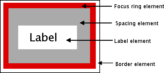 |
|---|
| Possible elements of a button. |
Why might the style author have divided it up that way? If you have one part of the widget that may be in a different location or a different color than another, it may be a good candidate for an element. Note that this is just one example of how a button could be constructed from elements. Different styles and themes could (and do) accomplish this in different ways.
Here is an example of a vertical scrollbar. It consists of a "trough" element, which contains other elements. These include the up and down arrow elements at either end and a "thumb" element in the middle (it might have additional elements, like borders).
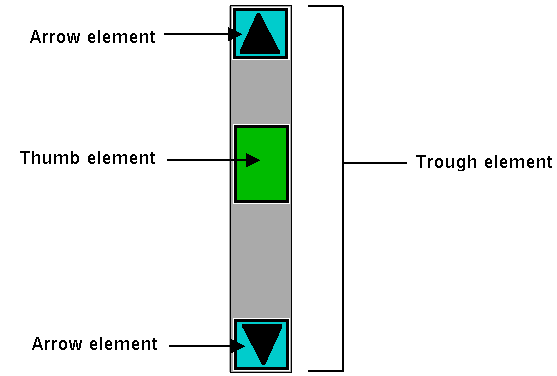 |
|---|
| Possible elements of a scrollbar. |
Layout
Besides specifying which elements make up a widget, a style also defines how those elements are arranged within the widget. This is called their layout. Our button had a label element inside a spacing element, inside a focus ring element, inside a border element. Its logical layout is this:
border {
    focus {
        spacing {
            label
        }
    }
}
We can ask Tk for the layout of the TButton style:
#![allow(unused)]
fn main() {
println!( "{}", tbutton_style.layout()? );
// "Button.border -sticky nswe -border 1 -children {Button.focus -sticky nswe -children {Button.spacing -sticky nswe -children {Button.label -sticky nswe}}}"
}
If we clean this up and format it a bit, we get something with this structure:
Button.border -sticky nswe -border 1 -children {
    Button.focus -sticky nswe -children {
        Button.spacing -sticky nswe -children {
            Button.label -sticky nswe
        }
    }
}
This starts to make sense; we have four elements, named Button.border,
Button.focus, Button.spacing, and Button.label. Each has different element
options, such as children, sticky, and border that specify layout or
sizes. Without getting into too much detail at this point, we can clearly see
the nested layout based on the children and sticky attributes.
Styles uses a simplified version of Tk's
packgeometry manager to specify element layout. This is detailed in the style reference manual page.
Element Options
Each of these elements has several different options. For example, a label element has a font and a foreground color. An element representing the thumb of a scrollbar may have one option to set its background color and another to provide the width of a border. These can be customized to adjust how the elements within the overall widget look.
You can determine what options are available for each element? Here's an example
of checking what options are available for the label inside the button (which we
know from the layout method is identified as Button.label):
#![allow(unused)]
fn main() {
let options = tk
    .element("Button.label")
    .element_options()?
    .iter()
    .fold( String::new(), |acc,opt| format!( "{} {}", acc, opt ));
println!( "{}", options ); // " -compound -space -text -font -foreground -underline -width -anchor -justify -wraplength -embossed -image -stipple -background"
}
In the following sections, we'll look at the not-entirely-straightforward way to work with element options.
Manipulating Styles
In this section, we'll see how to change the style's appearance by modifying style options. You can do this either by modifying an existing style, or more typically, by creating a new style. We saw how to create a simple style that was derived from another one earlier:
#![allow(unused)]
fn main() {
let emergency_tbutton_style = tk.new_ttk_style( "Emergency.TButton", None );
emergency_tbutton_style
    .configure( -font("helvetica 24") -foreground("red") -padding(10) )?;
}
Modifying a Style Option
Modifying an option for an existing style is done similarly to modifying any other configuration option, by specifying the style, name of the option, and new value:
#![allow(unused)]
fn main() {
tbutton_style.configure( -font("helvetica 24") )?;
}
You'll learn more about what the valid options are shortly.
If you modify an existing style, like we've done here with
TButton, that modification will apply to all widgets using that style (by default, all buttons). That may well be what you want to do.
To retrieve the current value of an option, use the lookup method:
#![allow(unused)]
fn main() {
println!( "{}", tbutton_style.lookup_normal( font )? ); // "helvetica 24"
}
State Specific Style Options
Besides the normal configuration options for the style, the widget author may have specified different options to use when the widget is in a particular widget state. For example, when a button is disabled, it may change the button's label to grey.
Remember that the state is composed of one or more state flags (or their negation), as set by the widget's
statemethod or queried via theinstatemethod.
You can specify state-specific variations for one or more of a style's configuration options with a map. For each configuration option, you can specify a list of widget states, along with the value that option should be assigned when the widget is in that state.
The following example provides for the following variations from a button's normal appearance:
-
when the widget is in the disabled state, the background color should be set to
#d9d9d9 -
when the widget is in the active state (mouse over it), the background color should be set to
#ececec -
when the widget is in the disabled state, the foreground color should be set to
#a3a3a3(this is in addition to the background color change we already noted) -
when the widget is in the state where the button is pressed, and the widget is not disabled, the relief should be set to
sunken
#![allow(unused)]
fn main() {
tbutton_style.map(
    -background([ "disabled", "#d9d9d9", "active", "#ececec" ].as_slice())
    -foreground([ "disabled", "#a3a3a3" ].as_slice())
    -relief([ "pressed !disabled", "sunken" ].as_slice()))?;
}
Because widget states can contain multiple flags, more than one state may match an option (e.g.,
pressedandpressed!disabledwill both match if the widget'spressedstate flag is set). The list of states is evaluated in the order you provide in the map command. The first state in the list that matches is used.
Sound Difficult to you?
You now know that styles consist of elements, each with various options, composed together in a layout. You can change options on styles to make all widgets using the style appear differently. Any widgets using that style take on the appearance that the style defines. Themes collect an entire set of related styles, making it easy to change the appearance of your entire user interface.
So what makes styles and themes so difficult in practice? Three things. First:
You can only modify options for a style, not element options (except sometimes).
We talked earlier about identifying the elements used in the style by examining its layout and identifying what options were available for each element. But when we went to make changes to a style, we seemed to be configuring an option for the style without specifying an individual element. What's going on?
Again, using our button example, we had an element Button.label, which, among
other things, had a font configuration option. What happens is that when that
Button.label element is drawn, it looks at the font configuration option set
on the style to determine what font to draw itself in.
To understand why, you need to know that when a style includes an element as a piece of it, that element does not maintain any (element-specific) storage. In particular, it does not store any configuration options itself. When it needs to retrieve options, it does so via the containing style, which is passed to the element. Individual elements, therefore, are "flyweight" objects in GoF pattern parlance.
Similarly, any other elements will look up their configuration options from options set on the style. What if two elements use the same configuration option (like a background color)? Because there is only one background configuration option (stored in the style), both elements will use the same background color. You can't have one element use one background color and the other use a different background color.
Except when you can. There are a few nasty, widget-specific things called sublayouts in the current implementation, which let you sometimes modify just a single element, via configuring an option like
TButton.Label(rather than justTButton, the name of the style).
Some styles also provide additional configuration options that let you specify what element the option affects. For example, the
TCheckbuttonstyle provides abackgroundoption for the main part of the widget and anindicatorbackgroundoption for the box that shows whether it is checked.
Are the cases where you can do this documented? Is there some way to introspect to determine when you can do this? The answer to both questions is "sometimes" (believe it or not, this is an improvement; the answer to both used to be a clear "no"). You can sometimes find some of the style's options by calling the style's
configuremethod without providing any new configuration options. The reference manual pages for each themed widget now generally include a styling options section that lists options that may be available to change.
This is one area of the themed widget API that continues to evolve over time.
The second difficulty is also related to modifying style options:
Available options don't necessarily have an effect, and it's not an error to
modify a bogus option.
You'll sometimes try to change an option that is supposed to exist according to
element options, but it will have no effect. For example, you can't modify the
background color of a button in the aqua theme used by macOS. While there are
valid reasons for these cases, it's not easy to discover them, which can make
experimenting frustrating at times.
Perhaps more frustrating when you're experimenting is that specifying an
incorrect style name or option name does not generate an error. When doing a
configure or lookup you can provide an entirely arbitrary name for a style
or an option. So if you're bored with the background and font options, feel
free to configure a dowhatimean option. It may not do anything, but it's not
an error. Again, it may make it hard to know what you should be modifying and
what you shouldn't.
This is one of the downsides of having a very lightweight and dynamic system. You can create new styles by providing their name when configuring style options without explicitly creating a style object. At the same time, this does open itself to errors. It's also not possible to find out what styles currently exist or are used. And remember that style options are really just a front end for element options, and the elements in a style can change at any time. It's not obvious that options should be restricted to those referred to by current elements alone, which may themselves not all be introspectable.
Finally, here is the last thing that makes styles and themes so difficult:
The elements available, the names of those elements, which options are
available or affect each of those elements, and which are used for a
particular widget can be different in every theme.
So? Remember, the default theme for each platform (Windows, macOS, and Linux) is different (which is a good thing). Some implications of this:
-
If you want to define a new type of widget (or a variation of an existing widget) for your application, you'll need to do it separately and differently for each theme your application uses (i.e., at least three for a cross-platform application).
-
As the elements and options available may differ for each theme/platform, you may need a quite different customization approach for each theme/platform.
-
The elements, names, and element options available with each theme are not typically documented (outside of reading the theme definition files themselves) but are generally identified via theme introspection (which we'll see soon). Because all themes aren't available on all platforms (e.g.,
aquais only available on macOS), you'll need ready access to every platform and theme you need to run on.
Consider trying to customize a button. You know it uses the TButton style. But
that style is implemented using a different theme on each platform. If you
examine the layout of that style in each theme, you'll discover each uses
different elements arranged differently. If you try to find the advertised
options available for each element, you see those are different too. And of
course, even if an option is nominally available, it may not have an effect).
The bottom line is that in classic Tk, where you could modify any of a large set of attributes for an individual widget, you'd be able to do something on one platform, and it would sorta-kinda work (but probably need tweaking) on others. In themed Tk, the easy option just isn't there, and you're pretty much forced to do it the right way if you want your application to work with multiple themes/ platforms. It's more work upfront.
Advanced: More on Elements
While that's about as far as we're going to go on styles and themes in this tutorial, for curious users and those who want to delve further into creating new themes, we can provide a few more interesting tidbits about elements.
Because elements are the building blocks of styles and themes, it begs the question of "where do elements come from?" Practically speaking, we can say that elements are normally created in C code and conform to a particular API that the theming engine understands.
At the very lowest level, elements come from something called an element
factory. At present, there is a default one, which most themes use, and uses Tk
drawing routines to create elements. A second allows you to create elements from
images and is accessible at the script level using the Tk::element_create
method (from Tcl). Any image format supported by Tk is available, including
scalable image formats like SVG, if you have the right extension. Finally, there
is a third, Windows-specific engine using the underlying "Visual Styles"
platform API.
If a theme uses elements created via a platform's native widgets, the calls to use those native widgets will normally appear within that theme's element specification code. Of course, themes whose elements depend on native widgets or API calls can only run on the platforms that support them.
Themes will then take a set of elements and use those to assemble the styles that are actually used by the widgets. And given the whole idea of themes is that several styles can share the same appearance, it's not surprising that different styles share the same elements.
So while the TButton style includes a Button.padding element, and the
TEntry style includes an Entry.padding element, underneath, these padding
elements are more than likely one and the same. They may appear differently, but
that's because of different configuration options, which, as we recall, are
stored in the style that uses the element.
It's also probably not surprising to find out that a theme can provide a set of
common options that are used as defaults for each style if the style doesn't
specify them otherwise. This means that if pretty much everything in an entire
theme has a green background, the theme doesn't need to explicitly say this for
each style. This uses a root style named ".". If Fun.TButton can inherit
from TButton, why can't TButton inherit from "."?
Finally, it's worth having a look at how existing themes are defined, both at
the C code level in Tk's C library and via the Tk scripts found in Tk's
"library/ttk" directory or in third-party themes. Search for
Ttk_RegisterElementSpec in Tk's C library to see how elements are specified.