Button
A button, unlike a frame or label, is very much there to interact with. Users press a button to perform an action. Like labels, they can display text or images, but accept additional options to change their behavior.
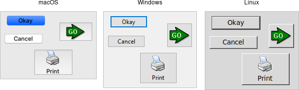
| Button widgets |
|---|
 |
Buttons are created using the add_ttk_button method. Typically, their contents
and command callback are specified at the same time:
#![allow(unused)]
fn main() {
parent.add_ttk_button( "button" -text("Okay") -command("submitForm") )?;
}
Typically, their contents and command callback are specified at the same time.
As with other widgets, buttons can take several different configuration options,
including the standard style option, which can alter their appearance and
behavior.
Text or Image
Buttons take the same text, textvariable (rarely used), image, and
compound configuration options as labels. These control whether the button
displays text and/or an image.
Buttons have a default configuration option. If specified as active, this
tells Tk that the button is the default button in the user interface; otherwise
it is normal. Default buttons are invoked if users hit the Return or Enter
key). Some platforms and styles will draw this default button with a different
border or highlight. Note that setting this option doesn't create an event
binding that will make the Return or Enter key activate the button; that you
have to do yourself.
The Command Callback
The command option connects the button's action and your application. When a
user presses the button, the script provided by the option is evaluated by the
interpreter.
You can also ask the button to invoke the command callback from your application. That way, you don't need to repeat the command to be invoked several times in your program. If you change the command attached to the button, you don't need to change it elsewhere too. Sounds like a useful way to add that event binding on our default button, doesn't it?
#![allow(unused)]
fn main() {
let button = parent
    .add_ttk_button( "action" -text("Action") -default("active") -command("myaction") )?
    .pack(())?;

parent.bind(
    event::key_press( TkKey::Return ),
    tclosure!( tk, || -> InterpResult<Obj> { button.invoke() })
)?;
}
Standard behavior for dialog boxes and many other windows on most platforms is to set up a binding on the window for the Return key (
event::key_press( TkKey::Return ), to invoke the active button if it exists, as we've done here. If there is a "Close" or "Cancel" button, create a binding to the Escape key (event::key_press( TkKey::Escape )). On macOS, you should additionally bind the Enter key on the keyboard (event::key_press( TkKey::Enter )) to the active button, and Command-period (event::command().key_press( TkKey::period )) to the close or cancel button.
Button State
Buttons and many other widgets start off in a normal state. A button will respond to mouse movements, can be pressed, and will invoke its command callback. Buttons can also be put into a disabled state, where the button is greyed out, does not respond to mouse movements, and cannot be pressed. Your program would disable the button when its command is not applicable at a given point in time.
All themed widgets maintain an internal state, represented as a series of binary
flags. Each flag can either be set (on) or cleared (off). You can set or clear
these different flags, and check the current setting using the state and
instate methods. Buttons make use of the disabled flag to control whether or
not users can press the button. For example:
#![allow(unused)]
fn main() {
b.set_state(    TtkState::Disabled )?; // set the disabled flag
b.set_state(   !TtkState::Disabled )?; // clear the disabled flag
b.instate(      TtkState::Disabled )?; // 1 if disabled, else 0
b.instate(     !TtkState::Disabled )?; // 1 if not disabled, else 0
b.instate_run( !TtkState::Disabled,
                        "myaction" )?; // execute 'myaction' if not disabled
}
Run Example
cargo run --example button